Harvey Balls Status Dashboard Template Dark
This template is part of a deck featuring multiple slides. To check out all slides.
See All
Product Description
Harvey Balls Progress and Comparison Presentation Template
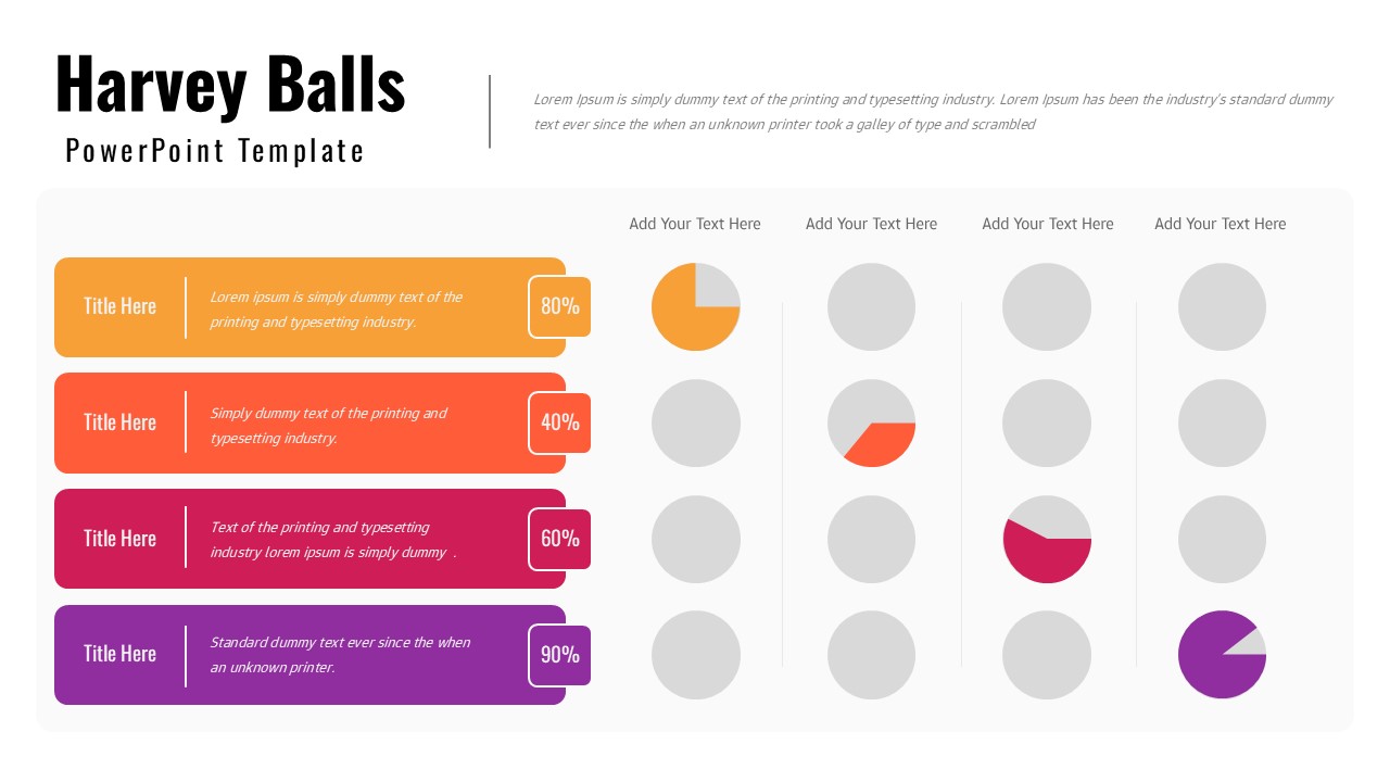
This Harvey Balls presentation is designed to help you communicate status, progress, and comparative metrics with clarity and visual efficiency. The slide combines horizontal title cards with percentage indicators and a structured grid of Harvey Balls, making it easy to represent levels of completion, performance, or priority at a glance. Each row aligns a descriptive label with a percentage value and a corresponding visual indicator, allowing audiences to quickly interpret complex data without lengthy explanations. This Harvey Balls layout is ideal for dashboards, reports, and summary presentations where clarity and speed matter.
The design features a clean white background paired with bold accent colors, ensuring strong contrast and easy readability in meetings or shared documents. Circular Harvey Balls on the right visually reinforce numeric values, helping stakeholders compare progress across categories or teams. The consistent alignment and spacing create a professional, organized look that supports data-driven storytelling and structured analysis.
Fully editable in PowerPoint and Google Slides, this Harvey Balls slide allows you to adjust percentages, colors, titles, and descriptions effortlessly. You can adapt it for project tracking, KPI reporting, risk assessment, performance reviews, or executive summaries. With its intuitive structure and professional appearance, this template transforms abstract metrics into a clear, visual snapshot that supports faster understanding and better decision-making.
Features of this Harvey Balls template
• Harvey Balls visualization for clear status and progress comparison.
• Percentage labels paired with visual indicators for quick interpretation.
• Structured multi-row layout suitable for dashboards and reports.
• Fully editable colors, text, and values in PowerPoint and Google Slides.
Why use this Harvey Balls template
• Simplifies complex status data into an easy-to-read visual format.
• Enhances dashboards and reports with clear comparative insights.
• Saves time creating consistent status and progress slides.
• Ideal for executive updates and data-driven presentations.
Who is it for
Project managers, analysts, consultants, executives, and teams who need to present status updates, KPIs, or comparative performance data clearly and professionally.
Login to download this file