Background for Presentation: How to Choose the Perfect Slide Background (With Examples and Templates)
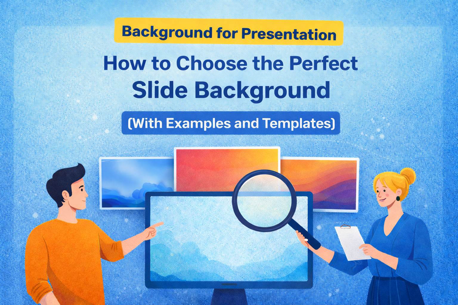
Most people spend hours writing their presentation content and less than five minutes picking a background. That imbalance matters more than you think.
According to research from the Nielsen Norman Group on visual hierarchy, audiences scan slides in predictable patterns and a cluttered or poorly contrasted background actively disrupts that natural reading flow. Your slide background is the foundation of everything your audience sees. Get it right and they focus on your message. Get it wrong and they are quietly distracted before you have made your first point.
This guide covers every major background style, when to use each, and closes with a curated list of top SlidesDepot templates you can use today.
Why Your Presentation Background Matters
A good slide background does three things well. It keeps your text readable at any distance. It matches the emotional tone of your content. And it stays consistent across every slide so your deck feels like a single, considered piece of work rather than a collection of individual slides.
A report from Prezi’s State of Attention found that 79 percent of presenters believe design quality directly impacts audience engagement. Yet default slide themes remain the most commonly used option. The sections below help you make a better choice.
Minimal Backgrounds – When Clarity Is Everything
Minimal backgrounds work by stripping away everything that is not essential. Clean layouts, light tones, and generous white space let your content take center stage without competition.
This approach is grounded in cognitive load theory, developed by psychologist John Sweller, which shows that people absorb information more effectively when irrelevant visual elements are removed. A busy background is irrelevant visual noise. A clean one is not.
Use minimal backgrounds for data-heavy slides, corporate briefings, academic research presentations, investor decks, and product demos where the content itself needs to carry the visual weight.
Professional Abstract Backgrounds – Color That Signals Credibility
Professional abstract backgrounds use structured geometry and intentional color to communicate expertise before a single word is read. Color psychology does a significant amount of work in this style.
Research published in the Journal of the Academy of Marketing Science found that color is one of the primary drivers of brand personality perception. Blue signals trust and reliability, making it the dominant choice in corporate and technology presentations. Red creates urgency and energy, ideal for sales and marketing contexts. Green communicates growth and sustainability, a natural fit for environmental and health-focused content.
The key difference between a professional abstract background and a generic one is restraint. Two to three colors, clean geometry, and a clear visual hierarchy make the difference between a designed deck and an assembled one.
Creative and Aesthetic Backgrounds – Personality as Strategy
Not every presentation should look like a quarterly earnings report. For creative industries, personal brands, workshops, and social media content, a distinctive aesthetic background is a genuine strategic advantage. It communicates taste, sets expectations, and makes your slides memorable in a way that a corporate template simply cannot.
A 2023 Canva visual communication trends report noted a significant rise in soft aesthetic and organic design styles moving from social media into professional presentation contexts. Pastel palettes, delicate patterns, and considered feminine design are no longer niche. In the right context, they outperform traditional corporate styles in audience connection and recall.
Education Backgrounds – Design That Supports Learning
Educational presentations face a challenge that business presentations do not. The audience cannot simply disengage if the slides lose them. A thoughtful background creates a sense of environment and purpose that primes people to pay attention.
Research from the University of Melbourne on learning environment design found that visual context affects student engagement and information retention. Applied to slides, this means a background that signals the right environment reduces the cognitive resistance your audience has to new information.
Avoid stark white backgrounds for sessions longer than 20 minutes. They create eye strain under projection lights. Warmer, thematic backgrounds are easier on the eyes and create a more inviting atmosphere for learning.
Futuristic and Tech Backgrounds – Looking the Part
Technology and innovation presentations need to communicate ambition from slide one. Research published in Behaviour and Information Technology found that first impressions are formed within 50 milliseconds. For tech presentations, that first impression needs to say innovation, not legacy.
Dark backgrounds with flowing abstract forms and high-contrast accents have become the established visual language of the technology industry. Apple, Google, and NVIDIA use this style consistently in major keynotes. The visual signal is intentional: this is what the future looks like. Your slide background can make that same statement before you have said a word.
Nature and Seasonal Backgrounds – Connection Through Organic Design
Natural and floral backgrounds achieve something that abstract geometry rarely can: they create a warm, human connection with the audience. This is supported by biophilic design research from the University of Exeter, which found that exposure to natural visual elements improved wellbeing and cognitive engagement by up to 15 percent.
These backgrounds work across more industries than you might expect. They are natural for environmental organizations, wellness brands, and outdoor lifestyle businesses. But they are equally effective for seasonal marketing campaigns, spring events, school presentations, and hospitality or event planning decks.
Three Rules That Apply to Every Background
Contrast is non-negotiable. The Web Content Accessibility Guidelines recommend a minimum contrast ratio of 4.5:1 between text and background. This is the threshold at which most people can read comfortably across different screens and room lighting conditions. Test it before you finalize any slide.
One background per deck. Switching styles mid-presentation breaks visual cohesion and signals a lack of preparation. Choose one template and use layout variations within it to create rhythm without sacrificing consistency.
Design for the room, not the laptop. Dark backgrounds perform better in dimly lit spaces. Light backgrounds hold up better in bright offices and classrooms. Always preview your slides in conditions close to the real presentation environment.
Top Picks: 10 SlidesDepot Presentation Background Templates
These ten templates cover every style discussed in this guide. Each one is available for both PowerPoint and Google Slides, free to browse and ready to customize.
1.Minimal Botanical Background
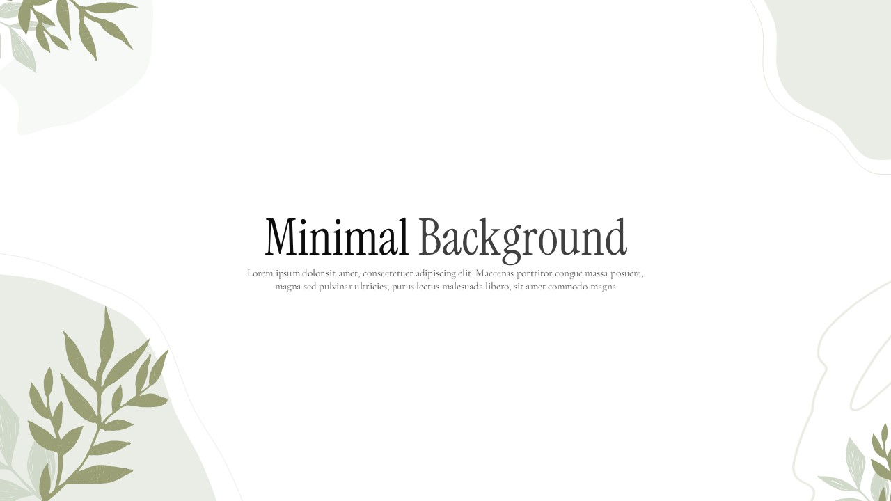
Clean white space with soft botanical illustrations. The ideal choice when you want a professional, uncluttered look with a touch of warmth. Works well for wellness, lifestyle, and education presentations.
2.Blue Abstract Background

Flowing geometric forms in a trusted corporate blue palette. Built for tech companies, consultants, finance teams, and any professional context where credibility needs to be visible from the first slide.
3.Abstract Red Background
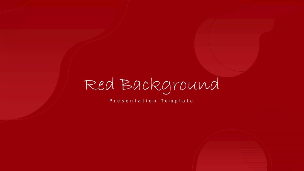
Bold, high-contrast, and designed to command attention. The right pick for sales presentations, product launches, and marketing pitches where energy and urgency are part of the message.
4.Green Abstract Background
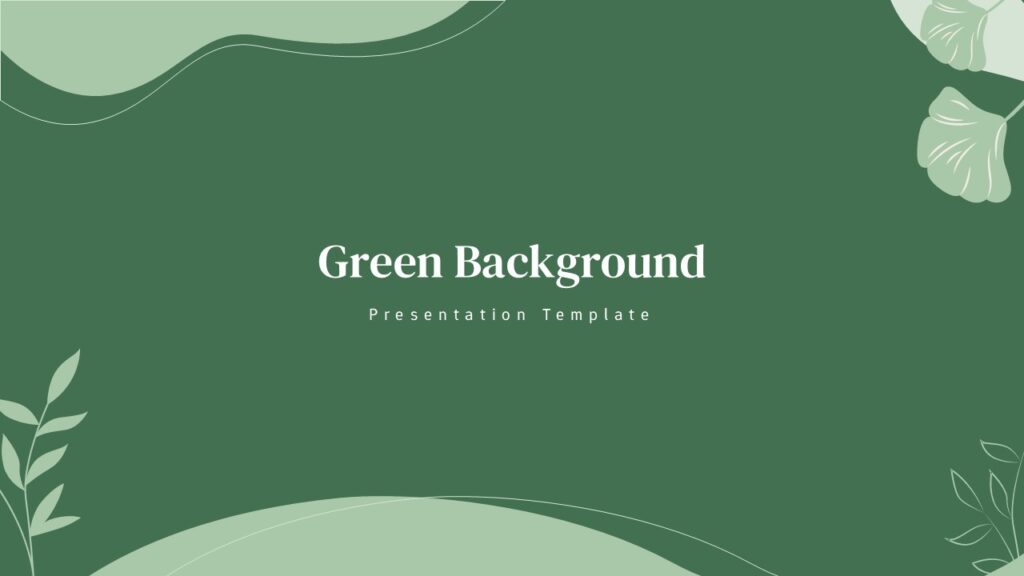
Modern abstract forms in a growth-oriented green palette. A natural fit for sustainability reports, health and wellness brands, environmental organizations, and financial growth narratives.
5.Coquette Soft Pink Bow Design

Dreamy, feminine, and full of personality. Soft pink tones and delicate bow motifs make this the standout choice for beauty brands, fashion presentations, lifestyle content, and social media planning decks.
6.Cute Aesthetic Abstract Background
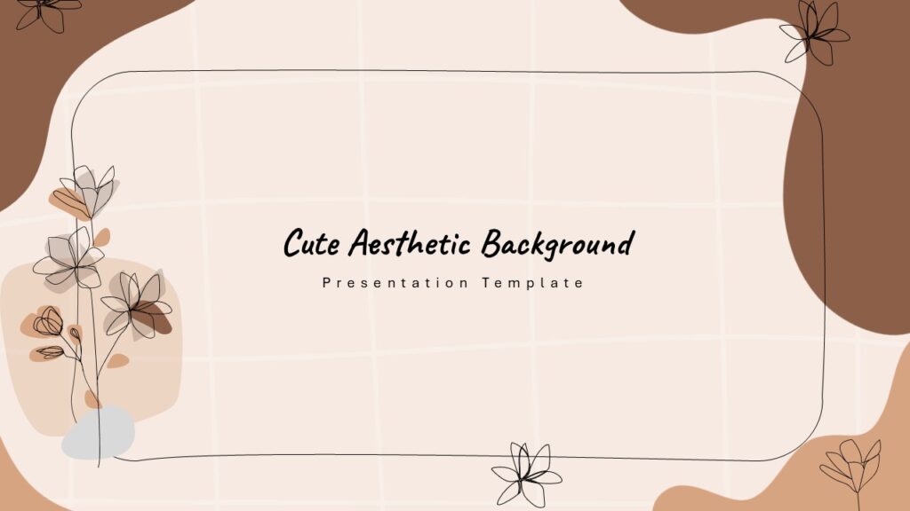
Playful and contemporary with soft abstract shapes in a curated palette. Great for content creators, educators, and small businesses that want their slides to reflect a considered visual identity.
7.Pink Aesthetic Background

Elegant and muted with an aspirational feel. Works beautifully for personal brand presentations, beauty product launches, and any project where the tone needs to feel elevated and intentional.
8.Chalkboard Education Background
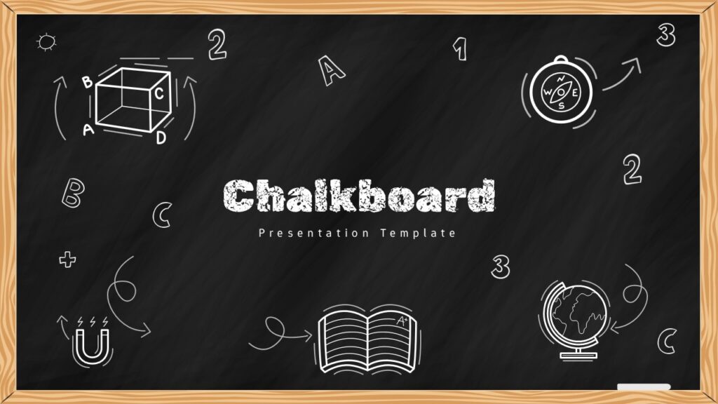
The familiar chalkboard texture signals learning mode instantly and provides excellent contrast for white and warm-toned text. Effective across all age groups for classroom lessons, e-learning courses, and educational video content.
9.Futuristic Abstract Wave Background

Flowing digital wave forms on a deep, high-contrast background. Built for startup pitch decks, AI and technology briefings, innovation keynotes, and any presentation that needs to communicate ambition from the very first slide.
10.Spring Floral Background

Soft illustrated florals in a warm, considered palette that complements clean typography and gives any content a polished, intentional look. Ideal for seasonal campaigns, spring events, wellness brands, and hospitality decks.
Final Thought
The right background for your presentation is the one your audience never consciously notices. It supports your message, stays out of the way, and makes every slide look like it belongs in the same deck.
Browse the full library at SlidesDepot and find the background that does justice to the content you have worked hard to create.

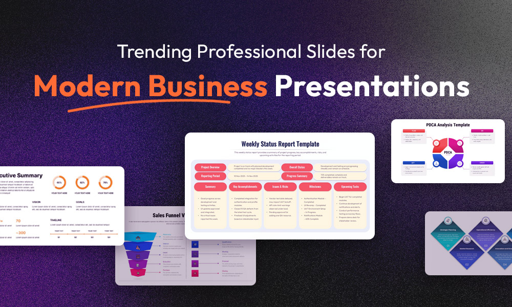
Trending Professional Slides for Modern Business Presentations
In today’s fast-moving business environment, presentations play a critical role in how ideas are shared, decisions are made, and deals are closed. Yet many professionals still struggle with slides that feel outdated, cluttered, or inconsistent. Boring visuals, unclear messaging, and time wasted on formatting often weaken otherwise strong content. This is where professional slides come…
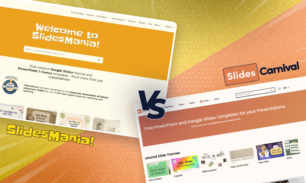
SlidesCarnival vs SlidesMania: A Complete Guide to Choosing the Best Google Slides Templates for Your Needs
When searching for high-quality Google Slides templates, two platforms consistently stand out: SlidesCarnival and SlidesMania. Both offer free, well-designed presentation themes. Both are widely used. But they serve different audiences and presentation goals. Instead of asking which platform is better, This guide will help you understand their strengths, differences, and ideal use cases so you can confidently choose the option…
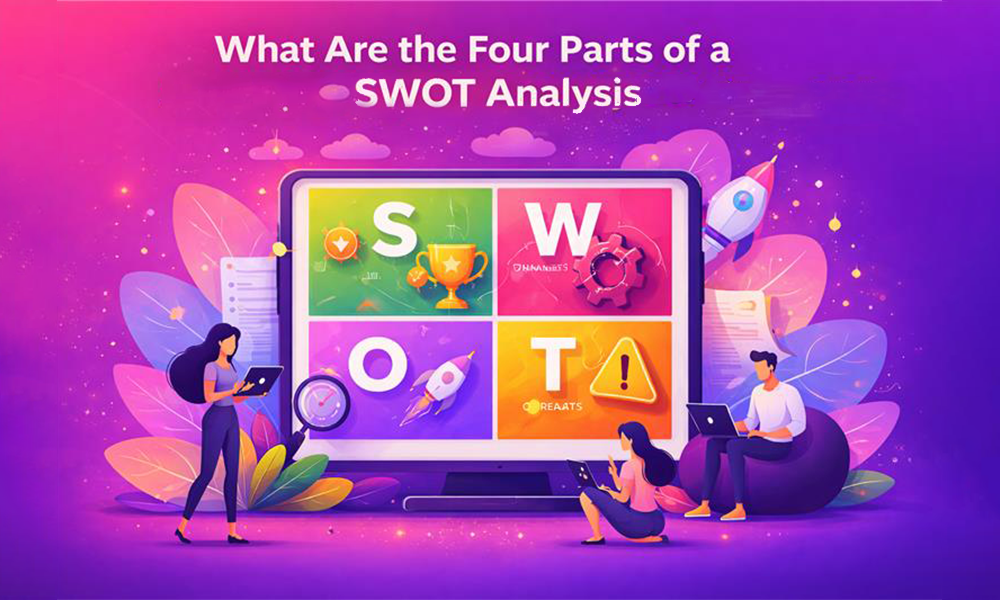
What Are the Four Parts of a SWOT Analysis – and Why Each One Matters?
Most business decisions feel harder than they need to be. You have data, opinions, and competing priorities pulling in every direction. A SWOT analysis cuts through that noise by giving your thinking a clear structure. It organizes what you know into four categories, so you can make decisions with confidence rather than guesswork. Understanding what…