

How to Make Google Slides Look Good: 18 Tips for an Aesthetically Pleasing Presentation


Most people open Google Slides, pick a random theme, and start typing. The result is a deck that looks like every other presentation in the room: mismatched fonts, crowded slides, and a colour palette that nobody consciously chose. Then they wonder why the audience checks their phones.
Knowing How to Make Google Slides Look Good does not require design experience. It requires understanding a small set of repeatable principles and applying them with intention. Whether you are preparing a pitch deck, a school project, or a client report, these 18 tips will walk you through every layer of presentation design, from structure and typography to visuals and final polish.
Why an Aesthetically Pleasing Presentation Actually Matters
Before getting into the tips, it helps to understand what is actually at stake when your slides look good or bad.
Visually appealing slides reduce cognitive load. When a layout is clean and well-structured, your audience spends less mental energy processing what they are looking at and more energy absorbing your message. Research shows that people are more likely to trust and be persuaded by information presented with visual clarity. Good design signals that the presenter values the audience’s time.
There is also a competitive reality. Your audience has sat through hundreds of forgettable presentations. An aesthetically pleasing deck stands out before you have spoken a single word. It builds credibility, improves information retention, and makes the whole experience more engaging for everyone in the room.
18 Tips on How to Make Google Slides Look Good
1. Plan Your Content Before You Open a Single Slide
The most common presentation design mistake is jumping straight into Google Slides without a clear outline. When you start designing before you know what you want to say, you end up cramming content into whatever layout you picked first.
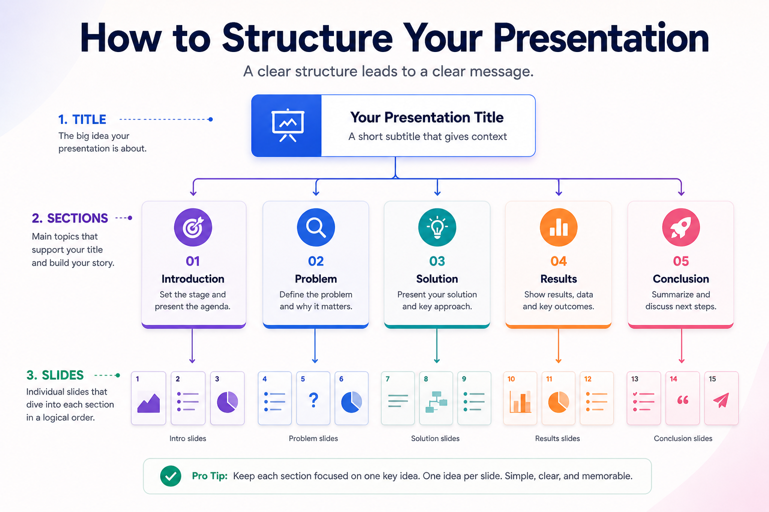
Start with a simple outline. Write out your slide titles, the key point each slide needs to make, and how one slide connects to the next. Once your content is mapped, designing each slide becomes straightforward. Structure your thinking first, and the visual design will follow naturally.
2. Start with a Professional Template
A well-designed template handles your font pairings, colour palette, layout hierarchy, and spacing before you type a single word. This is one of the fastest ways to make Google Slides look good without spending hours on design decisions.
At SlidesDepot, templates are designed to give you a strong starting point, with a range of layouts including infographic slides like timelines, comparisons, and process flows, as well as full presentation decks for different use cases. They’re built to work smoothly in both Google Slides and PowerPoint, so you can focus on your content without worrying about formatting issues.
Starting with a professionally designed template is not a shortcut. It is a practical approach used by designers to maintain consistency and visual clarity. You still bring your own content and branding the template simply provides a solid foundation to build on.
3. Configure Your Slide Master Before Anything Else
The Slide Master is the single most important tool for maintaining a consistent look across your entire presentation. Go to Slide > Edit Theme and set your fonts, colours, and background choices once. Every slide in the deck will automatically inherit those settings.
This approach saves significant time and eliminates the subtle inconsistencies that make a presentation feel thrown together. Headings that are slightly different sizes on different slides, colours that are almost but not quite the same shade, text boxes that sit in slightly different positions: all of these are avoided when you configure the Slide Master at the start.
4. Build a Focused Colour Palette
Colour is one of the most powerful tools for making a presentation feel intentional and aesthetically pleasing. It is also one of the easiest things to get wrong.
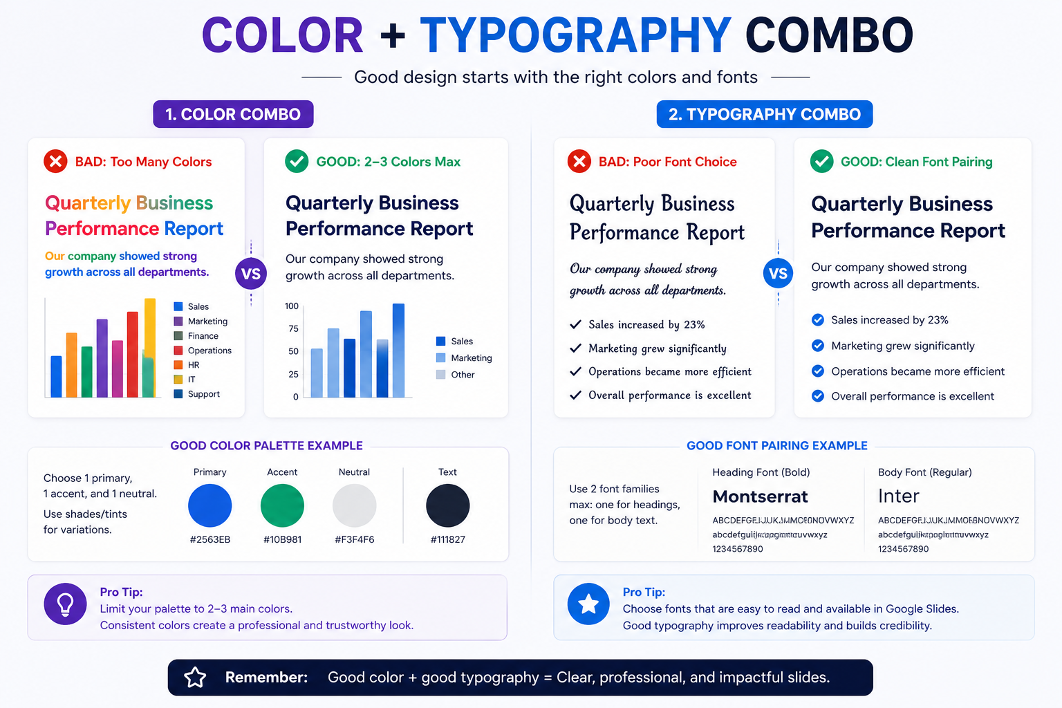
Limit your palette to two or three colours across the entire deck: one primary colour, one accent colour, and one neutral for body text. Everything else should be a tint or shade of those base colours. Tools like Coolors.co and Adobe Color let you build and test palettes in minutes.
The single most important colour rule is contrast. Your text must be clearly readable against the background at any screen size. Dark text on a light background or light text on a dark background both work well. Avoid placing similar tones next to each other, and always test your slides on the actual display or projector you will be using before presenting.
5. Choose Your Fonts with Intention
Typography sets the tone of your presentation before your audience reads a single word. A clean, modern font family signals professionalism. An overly decorative font signals something less flattering.
Stick to a maximum of two font families: one for headings and one for body text. Popular, reliable choices for Google Slides include Lato, Nunito, Open Sans, Montserrat, and Raleway. These are legible at scale, widely compatible across devices, and available directly in Google Slides without installation.
Headings should be noticeably larger than body text, ideally 32 to 44pt for titles and 20 to 28pt for supporting copy. A clear size difference creates visual hierarchy and guides the eye naturally through the slide content.
6. Establish a Clear Visual Hierarchy on Every Slide
Every slide has one most important piece of information. Your design job is to make sure that priority is obvious at a glance.
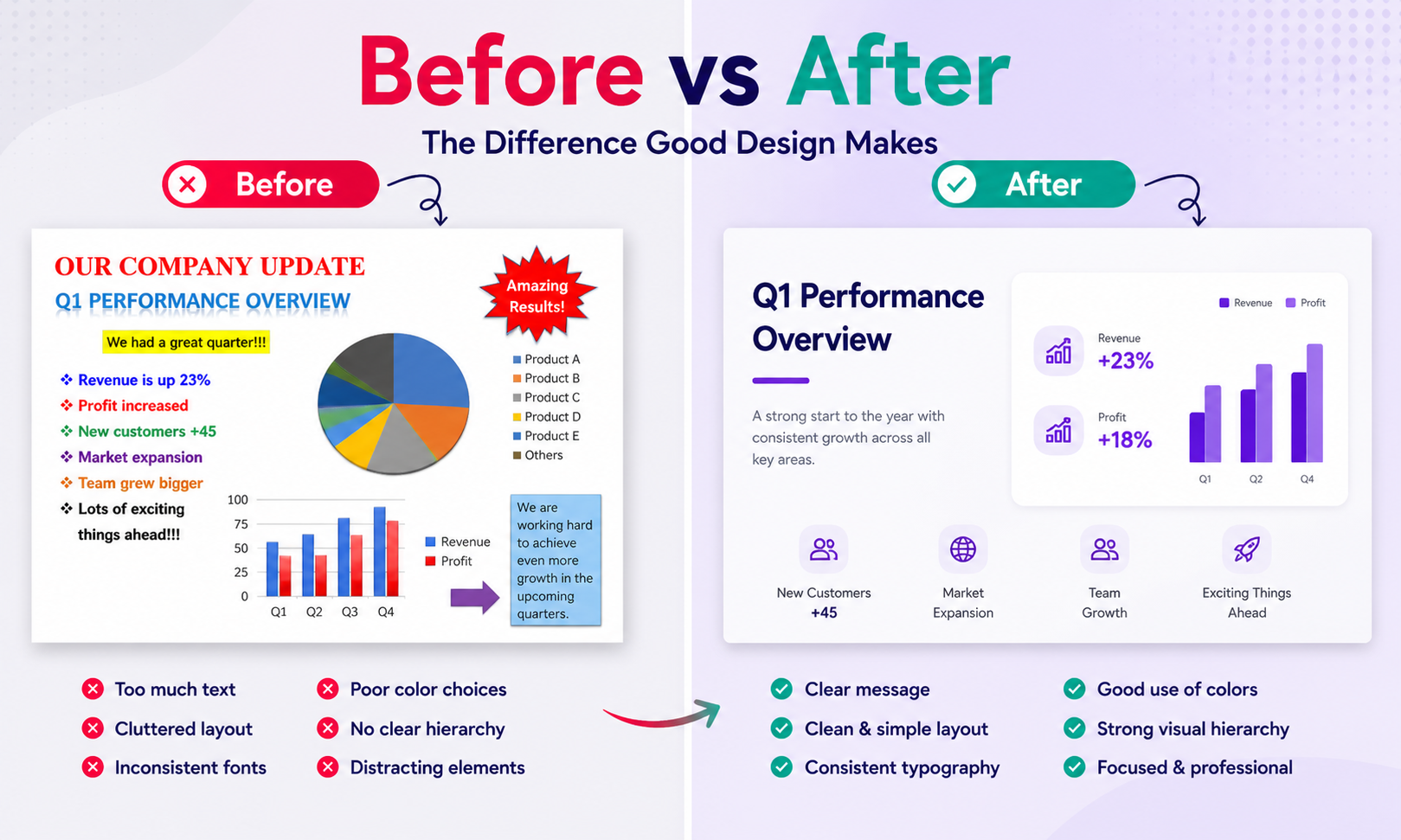
The headline should be the largest, boldest element. Supporting points should be smaller and less prominent. Supplementary detail sits at the smallest scale. When all elements on a slide are the same size and weight, nothing stands out. The audience has to read everything to figure out what matters. When hierarchy is clear, the eye does the work for them.
This principle applies to colour, size, weight, and positioning. Use all four to communicate what is important and what is supporting.
7. Give Every Slide Room to Breathe
White space, the empty areas around and between your slide elements, is one of the most underused tools in presentation design. It is not wasted space. It creates clarity, focus, and a sense of visual calm that makes content easier to absorb.
Crowded slides feel overwhelming. They push information at the audience rather than inviting them to engage with it. If a slide feels cluttered, the solution is almost always to remove something rather than rearrange it. When in doubt, split one busy slide into two clean ones. Both will look better, and your audience will follow along more easily.
8. Keep One Idea Per Slide
This is closely connected to white space and visual hierarchy, but it deserves its own entry because it is so consistently ignored.
When you try to cover three points on a single slide, none of them land with full force. Each idea competes with the others for attention. Give every key point its own slide, and suddenly both the content and the design become cleaner. You will have more slides, but each one will be more memorable. Presentations built around this principle tend to feel far more aesthetically pleasing because the content itself has space to exist.
9. Use Alignment Tools and Grids
Misaligned elements are one of the most common reasons a slide feels unprofessional even when the colours and fonts are good. The human eye notices asymmetry immediately, even when viewers cannot articulate what feels off.
Use Google Slides’ built-in alignment tools under Arrange > Align and Distribute to snap elements into position. Enable guides via View > Guides > Add Guides for a consistent invisible grid across every slide. Zoom out and view your slides as thumbnails periodically. This bird’s-eye view reveals spacing inconsistencies, alignment issues, and slides that feel visually heavier or lighter than the rest of the deck.
10. Reduce Your Text Ruthlessly
Slides are not documents. They are visual supports for a spoken presentation or high-level summaries in a shared report. Either way, long paragraphs of body text do not belong on them.
Aim for five or fewer bullet points per slide and six or fewer words per line. If your audience is reading your slides while you are presenting, you have lost them. Strip text back to the essential message and trust your voice to carry the nuance and detail. If there is context the audience needs in writing, put it in a separate handout or speaker notes.
11. Use High-Quality, Relevant Images
A single well-chosen image can communicate something that three bullet points cannot. Images make slides more engaging, more memorable, and more aesthetically pleasing when used thoughtfully.
Two rules matter here. First, use high-resolution images only. Blurry, pixelated, or stretched photos undermine the visual quality of your entire presentation immediately. Second, keep images relevant to the specific point on the slide. A beautiful image that is only loosely connected to your content is still a distraction.
Free sources including Unsplash, Pexels, and Pixabay offer professional-grade photography at no cost. You can also search for images directly within Google Slides via Insert > Image > Search the web without opening a separate tab.
12. Mask Images into Shapes
Rectangular images dropped onto slides look like placeholders. Masking images into shapes, circles, hexagons, or custom outlines, adds a finished, intentional quality that elevates even a simple layout.
To apply a shape mask in Google Slides, select your image, click the dropdown arrow next to the crop icon in the toolbar, and choose Shapes. This technique works especially well for team photos, product images, and any slide where the visual needs to feel designed rather than simply inserted.
13. Create Aesthetically Pleasing Backgrounds
Your background is the canvas for every other element on the slide. A plain white background is safe, but it can also feel flat and uninspired.
Consider a soft gradient, a muted texture, or a full-width image at reduced opacity. Dark backgrounds work well when you pair them with light, high-contrast text and keep the design minimal. If you use a photo as a background, apply a semi-transparent colour overlay to ensure your text remains readable across the entire slide. You can control image opacity in Google Slides via Format Options > Adjustments > Transparency.
The goal is a background that sets the visual mood without competing with the content on top of it.
14. Turn Data into Visual Formats
A table full of numbers is one of the quickest ways to lose your audience’s attention. Whenever you have data to communicate, ask whether it can become a chart, a graph, or an infographic instead.
Google Slides has built-in charting tools under Insert > Chart that let you create bar charts, pie charts, and line graphs linked to Google Sheets data. For more complex information, such as a process flow, a comparison breakdown, a timeline, or a funnel, a pre-designed infographic slide communicates the structure far more clearly than raw data.
SlidesDepot’s library of single infographic slides is built for exactly this purpose. Instead of building a diagram from scratch, you can drop in a pre-designed layout for timelines, SWOT analyses, roadmaps, org charts, or Venn diagrams, then replace the placeholder content with your own.
15. Be Selective with Animations and Transitions
Transitions and animations can add polish to a presentation or they can make it feel like a product demo from fifteen years ago. The deciding factor is restraint.
Use smooth, subtle transitions: a simple fade or a clean slide-in between sections is appropriate. Spinning text, bouncing elements, and rapid-fire animations distract from your message rather than supporting it. Animations work well when they reveal a chart progressively, walk through a step-by-step process, or draw attention to a specific data point. Use them with purpose, not by default.
If you find yourself applying a different animation to every element on every slide, pull back significantly.
16. Build a Strong Title Slide
Your title slide is the first thing your audience sees. It sets the visual tone for the entire presentation and tells them what to expect before you have said a word.
Invest real time here. Use a bold typographic treatment, a strong colour block, or a compelling full-width image. Keep the text minimal: the presentation title, your name, and the date is usually sufficient. A strong title slide creates confidence and anticipation. A weak one signals that the rest of the deck may not be worth paying attention to.
17. Add Section Divider Slides
For presentations longer than ten slides, section dividers are a simple way to add structure and visual rhythm. A divider slide is typically a full-colour or full-image slide with a single large line of text indicating the next section.
This gives the audience a moment to reset between topics, makes the overall deck feel more deliberately organised, and adds a layer of visual interest without requiring complex design work. Most well-crafted professional templates include section divider layouts as standard.
18. Run a Final Consistency Check
Before you present or share your deck, do one final pass through every slide looking specifically for inconsistencies: font sizes that do not match across similar slides, text boxes sitting slightly off their alignment guides, colours that are almost but not quite the same shade, or spacing that varies between slides for no clear reason.
These details are easy to miss when you are building one slide at a time. They become obvious the moment you view the whole deck as a series of thumbnails. A five-minute consistency check at the end of your process is one of the most cost-effective things you can do for the overall visual quality of your presentation.
Quick-Reference Design Checklist
| Design Area | The Rule |
| Colour palette | 2 to 3 colours max; always verify contrast |
| Typography | Max 2 font families; clear heading vs. body size difference |
| Text density | One idea per slide; 5 bullets or fewer |
| Images | High-resolution only; relevant to the specific slide point |
| White space | Use generously; split cluttered slides rather than compressing |
| Animations | Subtle and purposeful; never decorative by default |
| Slide Master | Configure first; review for consistency last |
How to Make Google Slides Look Good: The Honest Summary
Good presentation design is not about decoration. It is about clarity. Clear hierarchy, consistent typography, a focused colour palette, and generous white space will do more for the visual quality of your Google Slides than any animation or fancy layout trick.
If you want to skip the setup and start from a polished foundation, a professionally designed template does most of the work for you. At SlidesDepot, the full library of designer-crafted Google Slides and PowerPoint templates is available with a free plan or a paid subscription from $6.99/month. From full presentation decks to individual infographic slides, every template is built to look aesthetically pleasing out of the box and is updated weekly with fresh designs. Presentation design, simplified.


How to Convert PowerPoint to Google Slides Without Losing Formatting
Switching from Microsoft PowerPoint to Google Slides does not have to mean losing hours of design work. Whether you are collaborating with a team, presenting from a browser, or simply moving away from paid software, knowing how to convert PowerPoint to Google Slides while keeping your formatting intact is a skill every professional needs. This…
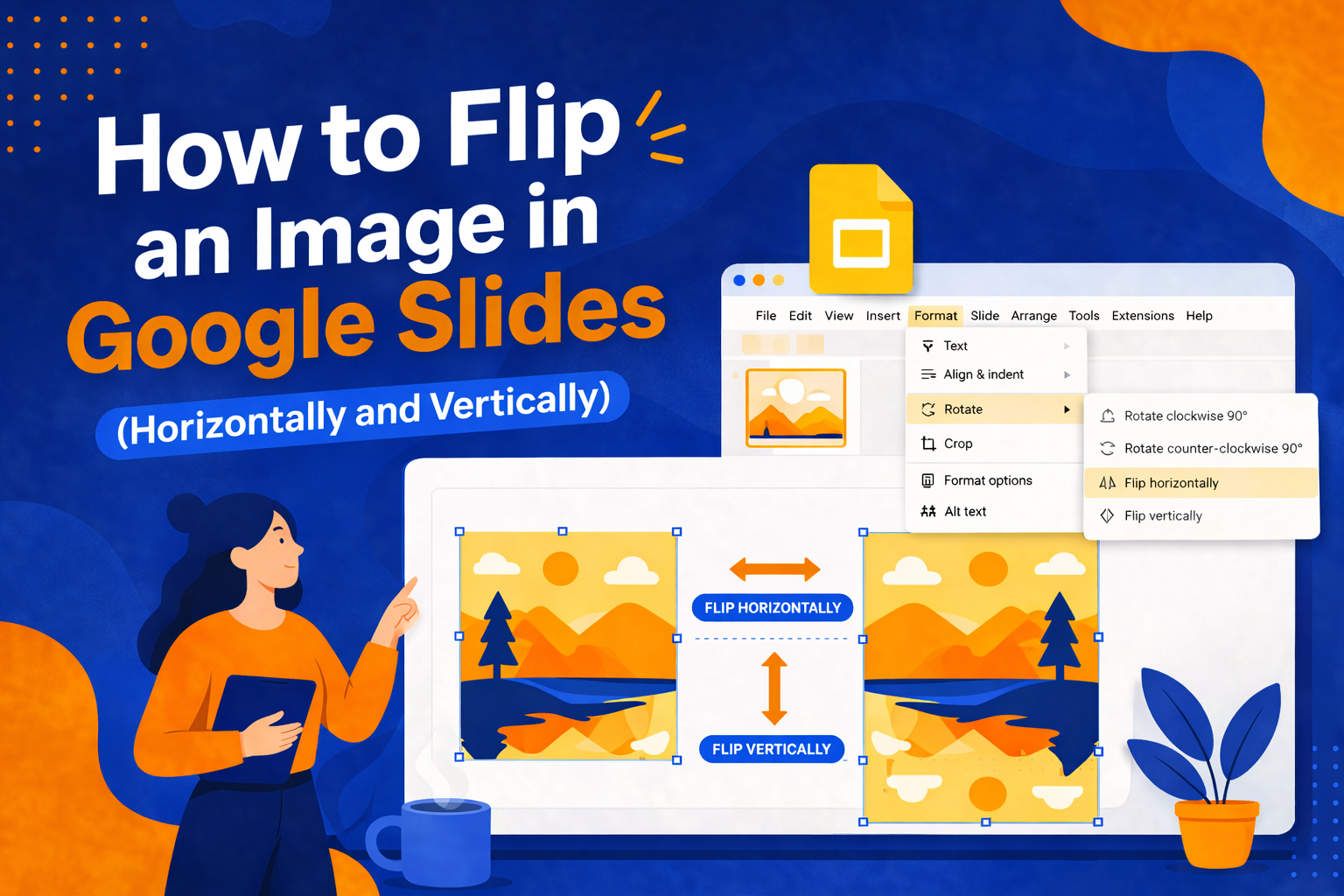
How to Flip an Image in Google Slides (Horizontally and Vertically)
Have you ever added an image to your Google Slides presentation, only to realize it’s facing the wrong direction or that the layout would look so much better if the image were mirrored? It’s a small problem, but it can throw off the entire visual balance of your slide. The good news: Google Slides makes…

How to Structure a Persuasive Speech People Actually Remember
A persuasive speech lives or dies in the first thirty seconds. You can have the strongest argument in the room, but if your opening doesn’t earn attention, the rest of your points are wasted breath. Most speakers spend weeks polishing their words and almost no time thinking about how those words are supported visually, which…