What Is a Multimedia Presentation and Why Does It Matter in 2026?
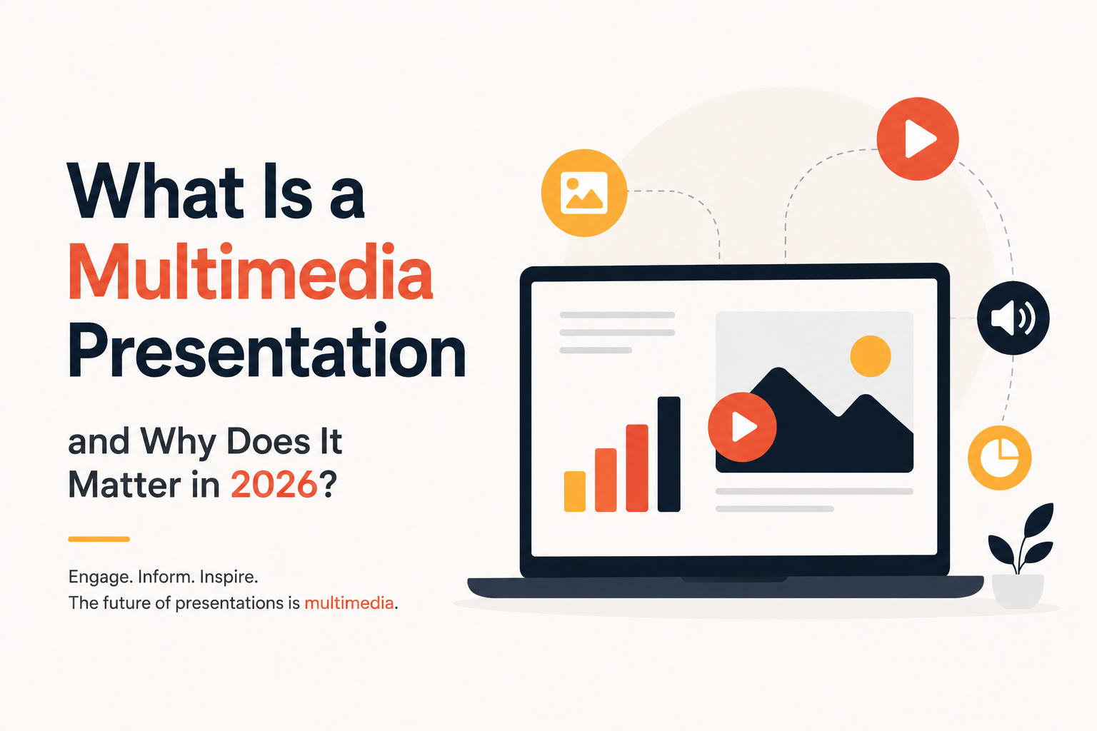
Picture two slide decks. One is plain text, slide after slide, in the same gray bullet format you’ve seen a hundred times. The other has a short product clip, a clean chart, and a quick voice note from a happy customer. The second one sticks with you days later, and the first one doesn’t. That difference is the basic idea behind blending text, images, audio, and video into one slide story. If you’ve searched “what is a multimedia presentation” before a big pitch, you’re not alone, and the answer matters more now that audiences expect more than rows of bullet points.
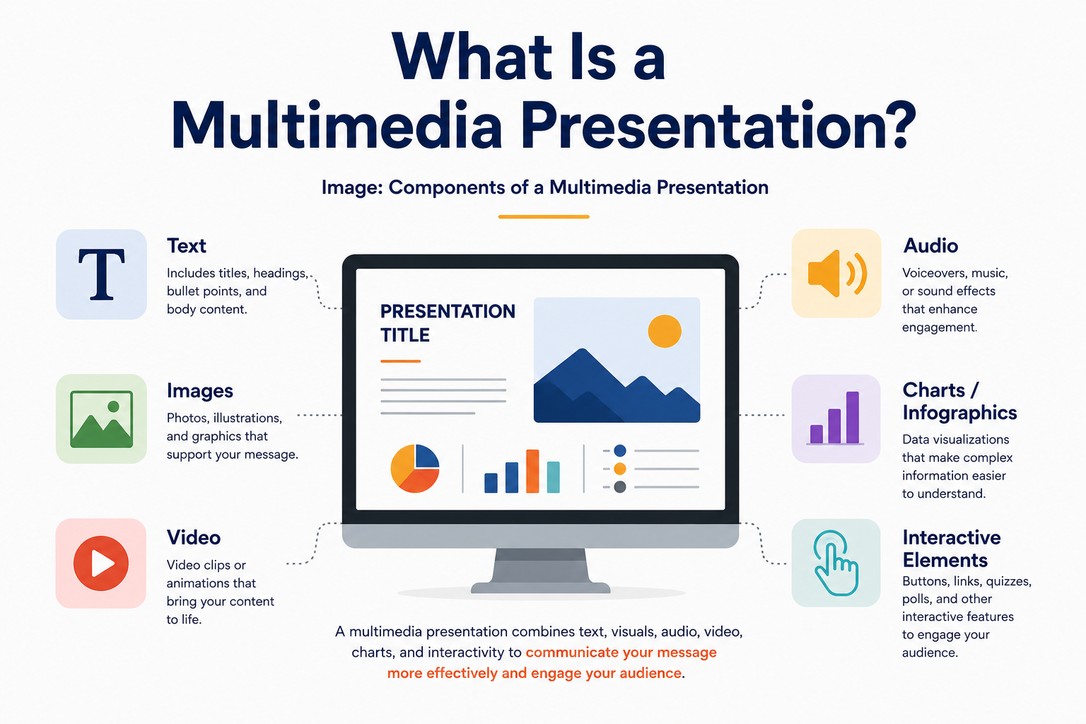
What Is a Multimedia Presentation, Exactly?
A multimedia presentation is any slide deck that goes beyond plain text and brings in at least one other media type: image, audio, video, or something interactive. Some people call this a multimedia slide deck, others say multimedia slideshow. The meaning is the same. A slide with a heading and three bullets isn’t multimedia. The same slide with a short chart and a quick audio explainer is, because it’s now delivering the message through more than one channel at once.
Why a Multimedia Presentation Matters in 2026
Most meetings and pitches now happen at least partly on a screen, whether that’s a hybrid boardroom or a fully remote call. That means the slide itself carries more of the work a speaker’s tone and body language used to handle in person. People are also used to fast, layered content from every app they open before they ever open your deck, so a flat text slide feels dated the moment it appears. A short clip or a moving chart isn’t decoration anymore. It’s part of how you hold audience engagement long enough to actually make your point.
A Few Real Examples
An investor pitch might open with a short product demo instead of a paragraph describing what the product does. A sales deck might swap a static price table for a slide a prospect can click through tier by tier. A classroom lesson might pair a diagram with a short animation showing a process in motion, like rainfall forming in the water cycle. A training deck might add a recorded walkthrough next to the steps, so someone can follow along at their own pace instead of guessing what a static screenshot means. None of this is decoration for its own sake. Each piece is doing a job text alone can’t do as well.
Multimedia Features in PowerPoint and Google Slides
You don’t need extra software to build a multimedia deck. Both major platforms have built-in tools for this, and knowing what they offer makes it easier to plan a slide instead of bolting media onto it after the fact.
In PowerPoint, a few features do most of the heavy lifting. Cameo lets you place your live webcam feed directly onto a slide, so your face sits next to the data instead of in a separate video tile, which is especially useful for remote pitches and recorded training. Morph creates a smooth animated transition between two versions of the same slide, which works well for showing a process unfold, a map zooming into a region, or a number changing over time. Designer scans whatever you’ve dropped onto a slide, an image or a stat, and suggests cleaner layout options automatically. PowerPoint also supports direct video and audio embedding from a file or online source, screen recording from within the app, and narrated, timed slideshows you can export as a standalone video.
In Google Slides, the toolkit is lighter but covers the same core needs. You can embed a video straight from YouTube or Google Drive without leaving the slide, and insert audio clips for voiceover or sound cues. Charts inserted from Google Sheets stay linked to the source data, so updating the spreadsheet updates the slide automatically, which is handy for live reporting decks. The Explore panel offers quick layout suggestions based on your content, and the Q&A feature lets a live audience submit questions during a presentation, turning a one-way slide into something interactive. Speaker notes also support voice typing, useful for drafting talking points quickly.
Neither platform requires you to be a video editor or a designer to use these tools well. The harder part is usually deciding which slide actually needs a video clip or a linked chart, and which one is better left as a clean, simple statement.
Templates Do Most of the Multimedia Work For You
Building a multimedia slide deck from a blank page takes time most people don’t have before a deadline, and laying out a video frame, a chart zone, and a caption box from scratch is its own design project before you’ve written a word of content. A template solves this by giving you that structure already in place: defined video zones, chart frames, icon sets, and spacing that’s already been worked out, so you’re dropping content in rather than designing layout and typography from nothing.
This matters even more for multimedia specifically, because mixing media types is where layouts break down the fastest. A video that’s slightly too wide, a chart that crowds out the caption underneath it, an icon row that doesn’t line up with the text beside it these are the small things that make a deck look unfinished, and a well-built template has already solved them. SlidesDepot’s full template library is organized by use case, so you can start from a layout that’s already built for the kind of content you’re adding rather than retrofitting a generic slide:
- If you’re building a data-heavy deck with charts, dashboards, or live metrics, the infographic templates collection has layouts with chart frames and icon sets already placed.
- If your story needs to show progress or a sequence of events, the timeline templates come with milestone markers and spacing built for that format.
- If you want something more visual and less corporate, the creative templates collection leans into bolder layouts that pair well with video and imagery.
- If you’re working specifically in Google Slides, the Google Slides templates collection is built and tested for that editor.
- If you’re working specifically in PowerPoint, the PowerPoint templates collection is built around PPT’s layout and animation system.
- If you just want to test a layout before committing to anything, the free templates are a low-stakes way to see how a multimedia layout feels before you build a full deck around it.
From there, you add your own clips, swap in your brand colors, and write the words. The structure does the work that would otherwise eat your afternoon.
Don’t Skip Accessibility
This part gets overlooked often, and it shouldn’t be. If a video plays without captions, anyone watching with the sound off (which is common on shared screens and in open offices) misses the message entirely. If an image carries the only explanation of a key point, anyone using a screen reader misses it too. A few small habits fix most of this: add captions to video clips, write a short alt description for charts and diagrams, and keep narration in plain language instead of dense jargon. It takes a few extra minutes and it means more of your audience actually gets the message you built the deck to deliver.
Mistakes to Avoid
The biggest mistake is treating multimedia as “more is better.” A slide with a background video, three icons, and a sound effect all firing at once isn’t impressive. It’s confusing, and people tune out the moment a slide asks them to process too much at once. Good presentation design treats each media type as a tool for one job on one slide, not a checklist for every slide. Other common issues: video that autoplays before the presenter is ready to talk over it, fonts and colors that don’t match between the template and whatever media got dropped in later, and clips so long the deck starts to feel like a film screening instead of a conversation.
PowerPoint or Google Slides?
Both platforms support video, audio, images, and basic animation, so the format usually isn’t the real problem. PowerPoint tends to offer deeper control over motion (Morph, Cameo, custom animation timing), while Google Slides leans into live collaboration and links that auto-update, like charts pulled from Sheets. What matters most for a multimedia deck is whether your template was actually built to work on both, since converting a deck between formats often breaks layouts or strips out animation. If you want to test a layout before committing, a free plan is worth trying first.
A Quick Checklist Before You Present
A few minutes of prep saves most of the common headaches:
- Keep individual video clips under 30 to 60 seconds so they support the point instead of becoming the point
- Test audio and video playback on the actual device and connection you’ll present from, not just your own laptop
- Add captions to any video and a short alt description to any chart or diagram
- Check the file size before emailing the deck, since large embedded videos can bounce or slow down a download
- Confirm the layout still looks right in both PowerPoint and Google Slides if you might need to switch between them
The Bottom Line
A multimedia presentation isn’t about adding every effect you can find. It’s about picking the right mix of text, image, video, and sound so people understand your point faster than words alone could manage, and making sure that mix actually reaches everyone in the room. Start from a template built for this kind of slide, and the structure does most of the work before you write a single line.

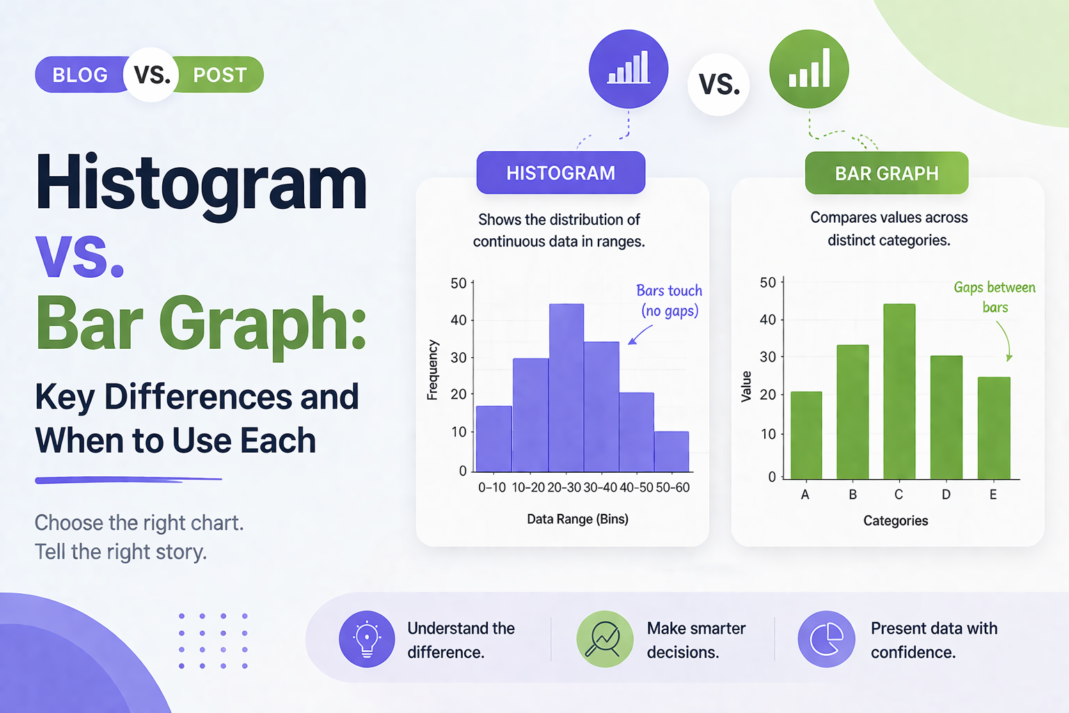
Histogram vs Bar Graph: Key Differences and When to Use Each
Histogram vs Bar Graph You have got data. You need a chart. You open PowerPoint or Google Slides and hover over the chart options. Then it hits you: should this be a histogram or a bar graph? They look almost identical, so it is easy to assume they are interchangeable. But they are not, and…
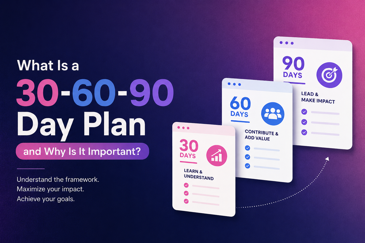
What Is a 30-60-90 Day Plan and Why Is It Important?
Starting something new, whether it is a job, a project, or a personal goal, often comes with a simple question: where do I even begin? A 30-60-90 day plan is one of the easiest ways to answer that question. It breaks down the first three months into three clear stages, so you always know what…
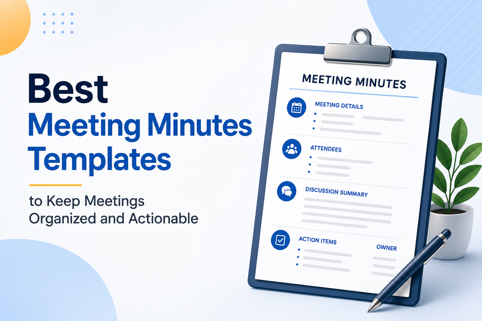
Best Meeting Minutes Templates to Keep Meetings Organized and Actionable
Most teams have sat through a meeting that felt productive in the moment, only to realize a week later that nobody can remember what was actually decided, or who was supposed to do what. The meeting itself wasn’t the problem. The way it was documented was. Good meeting minutes are what turn a conversation into…