Histogram vs Bar Graph: Key Differences and When to Use Each
You have got data. You need a chart. You open PowerPoint or Google Slides and hover over the chart options. Then it hits you: should this be a histogram or a bar graph? They look almost identical, so it is easy to assume they are interchangeable. But they are not, and picking the wrong one can undermine the story your data is trying to tell.
Whether you are a student charting survey results, a marketer reporting campaign performance, or a founder presenting growth metrics, the distinction matters. In this article, you will learn exactly what sets a histogram apart from a bar graph, see real examples of each, and know precisely when to use which.
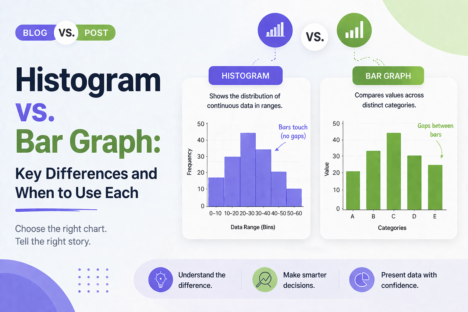
What Is a Histogram?
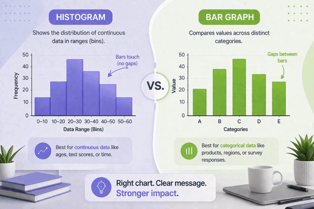
A histogram shows the distribution of a continuous numerical dataset. It groups data into ranges, called bins, and uses bars to show how many data points fall within each range.
The key feature of a histogram is that the bars always touch. There are no gaps between them. This reflects the fact that the data is continuous. The values flow from one range directly into the next with no breaks.
Histogram Example
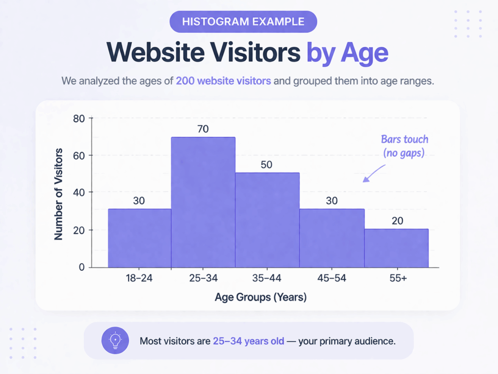
Imagine you are analyzing the ages of 200 website visitors. You group them into ranges: 18 to 24, 25 to 34, 35 to 44, 45 to 54, and 55 and above. A histogram displays these age groups on the x-axis and shows how many visitors fall into each bracket on the y-axis. This instantly tells you where the majority of your audience sits.
When to Use a Histogram
Use a histogram when your data is continuous and numerical. Common examples include:
- Test scores from 0 to 100
- Time taken to complete a task
- Heights or weights of survey participants
- Customer response times
If you want to understand how your data is spread out or clustered, a histogram is the right tool.
H2: What Is a Bar Graph?
A bar graph compares values across distinct, separate categories. The bars represent individual groups, not ranges, and there are visible gaps between them, reinforcing that each category stands on its own.
Bar graphs work with almost any kind of categorical data. They can be displayed vertically or horizontally and are highly readable at a glance.
Bar Graph Example
Say you are presenting quarterly sales figures for four products: Product A, Product B, Product C, and Product D. A bar graph places each product on the x-axis and the sales total on the y-axis. Side-by-side bars make it immediately obvious which product performed best.
When to Use a Bar Graph
Use a bar graph whenever your data consists of separate, named groups. Common examples include:
- Sales figures by product or region
- Survey responses such as Satisfied, Neutral, or Dissatisfied
- Website traffic by channel such as organic, paid, or direct
- Budget allocation by department
If you can name your data groups and want to compare them side by side, a bar graph is the right choice.
Histogram vs Bar Graph: Key Differences
1. Data Type
Histograms handle continuous numerical data such as measurements, scores, and times. Bar graphs handle discrete categorical data such as labels, names, and groups. This is the most fundamental difference between the two.
2. Bar Spacing
In a histogram, bars touch each other because the data is continuous. One range ends exactly where the next begins. In a bar graph, each bar is an independent category, so there is always a gap between bars. Presenting a histogram with gaps, or a bar graph without them, sends the wrong message about your data.
3. X-Axis Meaning
On a histogram, the x-axis shows numerical ranges or bins. On a bar graph, the x-axis shows category names or labels. This changes how you label your axes and how your audience reads the chart.
4. Order of Bars
In a histogram, bars follow a fixed numerical order. In a bar graph, you can reorder bars freely, for example sorting from highest to lowest for easier comparison.
5. The Question You Are Answering
Use a histogram to answer: How is my data distributed? Use a bar graph to answer: How do these categories compare? These are two different analytical questions, and choosing the right chart makes your answer much clearer.
Common Mistakes to Avoid
H3: Using a Bar Graph for Continuous Data
If you have age data for 500 respondents and plot each individual age as a separate bar, you will get a cluttered, unreadable chart. Group the ages into bins and use a histogram instead.
Adding Gaps to a Histogram
Some charting tools add spacing between all bars by default. When building a histogram in PowerPoint or Google Slides, remove the gap. It is a small formatting fix but critical for accuracy.
Labeling Axes Incorrectly
Histograms should label the x-axis with ranges such as “20 to 30” and the y-axis with frequency or count. Bar graphs should label the x-axis with category names and the y-axis with the value being measured.
Tips for Presenting Both Chart Types Effectively
For Histograms
- Remove all gaps between bars
- Use a consistent bin size throughout the chart
- Label bins clearly on the x-axis
- Add a title that describes what the data shows
For Bar Graphs
- Sort bars from highest to lowest when ranking matters
- Use horizontal bars when category names are long
- Limit to seven or eight bars for readability
- Include data labels or gridlines so values are easy to read
If you build slides with charts regularly, starting with a well-designed template saves time and keeps your visuals consistent. You can explore ready-to-use chart layouts at SlidesDepot’s presentation templates.
Free Templates to Get You Started
SlidesDepot offers free and premium PowerPoint and Google Slides templates built with clean chart layouts and presentation-ready designs. Whether you are working on a business dashboard, a research deck, or a marketing report, there is a template that fits.
Browse and download free presentation templates and find the right starting point for your next data slide.
Conclusion
Histogram vs bar graph, now you know exactly when to use each. Histograms show how continuous data is distributed. Bar graphs compare values across named categories. The right choice depends on your data type and the question you are trying to answer.
A well-chosen chart makes your data instantly understandable. A mismatched one creates confusion, even when the numbers are solid. Start with the right chart, build on a clean template, and your presentation will do the heavy lifting.
Browse free presentation templates at SlidesDepot and give your data the stage it deserves.
What is the main difference between a histogram and a bar graph?
A histogram shows the distribution of continuous numerical data grouped into ranges. A bar graph compares values across distinct, named categories. Histograms have no gaps between bars; bar graphs do.
Can I use a bar graph instead of a histogram?
Only if your data is categorical. For numerical data where you want to see distribution, such as test scores or response times, a histogram is the correct choice. Using a bar graph in that case misrepresents the data.
When should I use a histogram vs a bar graph in a student presentation?
Use a histogram when analyzing score distributions across a class. Use a bar graph when comparing enrollment numbers by subject. Continuous data calls for a histogram; categorical data calls for a bar graph.
How do I make a histogram in PowerPoint or Google Slides?
In PowerPoint, go to Insert, then Chart, then Histogram. In Google Slides, build it through a linked Google Sheet. Remove bar gaps and set a consistent bin size. A pre-designed data visualization template from SlidesDepot can make the process much faster.

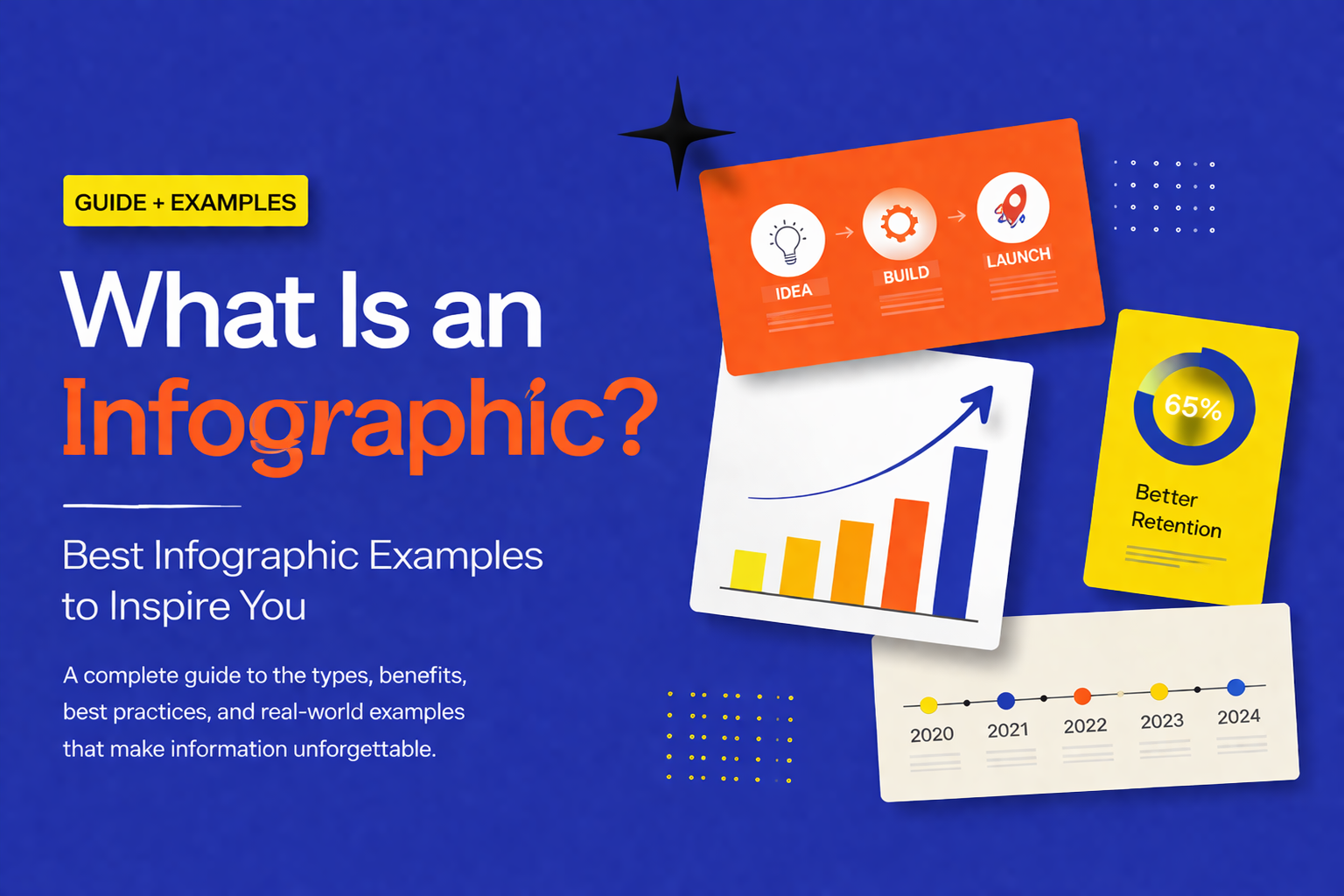
What Is an Infographic? Best Infographic Examples to Inspire You
You have a great idea, a strong dataset, or a complex process you need to explain — but the moment you put it on a slide, it becomes a wall of text that nobody wants to read. This is one of the most common frustrations for presenters, marketers, educators, and business professionals alike. The problem…