


96 Well Plate PowerPoint & Google Slides Templates
96 Well Plate Presentation Templates
The Idea Behind This Visual
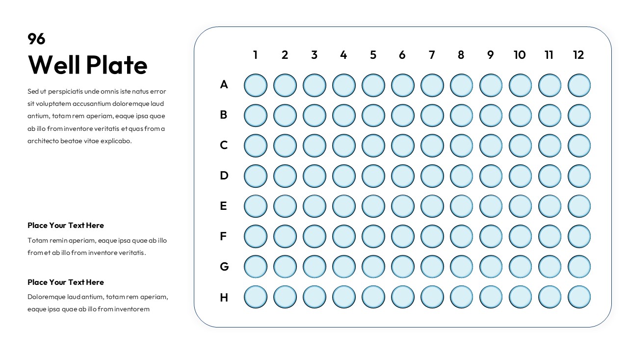
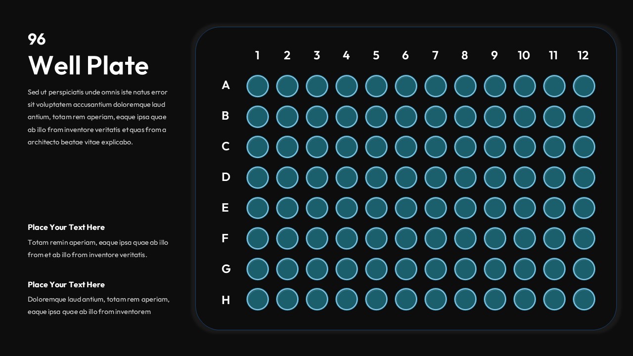
Data mapping in a laboratory environment requires a high degree of spatial accuracy to prevent errors during the transition from bench to presentation. Scientific visuals exist to provide a direct mental bridge between physical equipment and digital results. When researchers use a grid system, they solve the problem of cognitive load by mimicking the exact physical layout of their samples. Utilizing a 96 Well Plate visual allows a presenter to show exactly where a specific variable was placed. This visual framework ensures that the audience understands the relationship between coordinates and outcomes without needing to read a complex spreadsheet.
How This Slide Delivers It
This layout achieves clarity by providing a mathematically precise 12 by 8 grid that corresponds to standard microplate dimensions. The design utilizes alphanumeric labeling on the axes to mirror the physical markings found on actual lab hardware. Each circular zone in the 96 Well Plate diagram functions as a modular data point that you can color code to signify different experimental conditions. The separation of the main grid from the explanatory text on the left ensures that the data remains the primary focus while supporting details stay organized. This structural logic helps the viewer quickly scan for patterns or outliers within a large set of samples.
Adapting It for Your Context
You can adapt this slide by duplicating the circles to create heat maps or to show titration gradients across a single row. It is possible to add custom icons or small text labels over specific wells to highlight contaminated samples or significant discoveries. This flexibility allows you to turn a static diagram into a dynamic record of your experimental progress. Combining this with a data chart slide can provide a complete picture of your findings.
Key Visual Elements
- Alphanumeric grid labels: These provide the essential coordinates needed for accurate scientific referencing.
- Vector circular wells: Each circle acts as an independent editable unit to represent a unique biological or chemical sample.
- Divided layout: The left side provides a dedicated space for methodology while the right side focuses purely on the visual map.
- Light blue gradients: This subtle coloring helps differentiate the interactive areas from the static background elements.
Where This Works Best in Training
- Graduate student seminars where researchers must explain their plate loading methodology to faculty members.
- Laboratory safety workshops that demonstrate proper sample organization and the prevention of cross contamination.
- Standard Operating Procedure documentation for clinical lab technicians learning new high throughput workflows.
- Biotech sales training sessions that show how liquid handling robots interact with standard microplate layouts.
The Right Audience for This
Research scientists and laboratory managers use this tool to communicate the intricate details of their experimental setups. Medical educators and professors also find it helpful when teaching biology or chemistry students about assay development and screening processes. It is a necessary resource for anyone in the life sciences who needs to transform raw laboratory coordinates into a clear and professional presentation for their peers or stakeholders.
Login to download this file


