


Black Curved Line Chart Dashboard Analytics Template for PowerPoint & Google Slides
This template is part of a deck featuring multiple slides. To check out all slides.
See All
Product Description
Curved Line Chart Analytics Dashboard Presentation Template
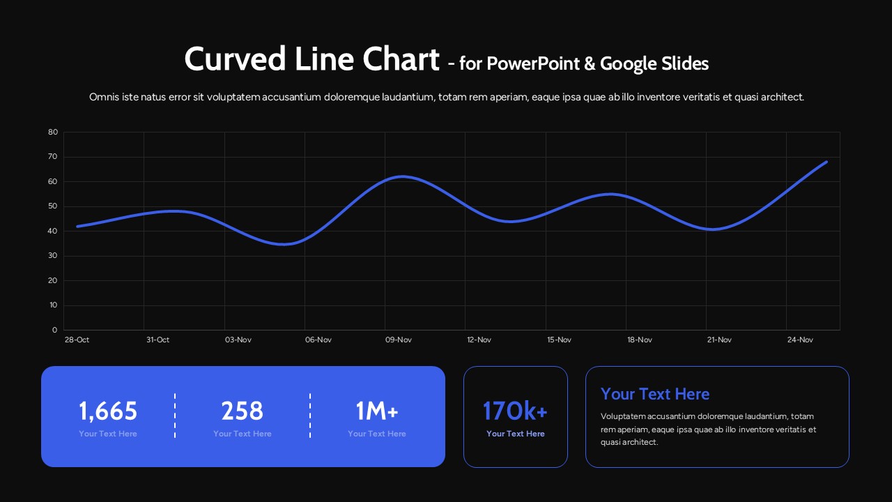
Present your performance metrics with clarity using this curved line chart dashboard analytics template designed for PowerPoint and Google Slides. The layout features a large, smooth curved line chart spanning the top section, supported by a clean grid background and clearly marked date intervals. The flowing data line highlights trends over time, making it ideal for showcasing growth, fluctuations, and performance insights in a visually engaging way. Beneath the chart, bold KPI cards display key figures such as totals, milestones, and percentage growth, creating a balanced dashboard structure that combines trend visualization with numerical summaries.
This curved line chart dashboard analytics template is built to help professionals transform raw data into compelling visual stories. The modern layout emphasizes readability with generous white space, rounded shapes, and strong typography for headings and statistics. Fully editable elements allow you to adjust chart values, modify dates, customize colors, and update KPI labels in seconds. Whether you’re presenting monthly reports, marketing analytics, financial performance, or project progress, this slide ensures your message remains structured, data-driven, and presentation-ready across both PowerPoint and Google Slides platforms.
Features of this template
• Large curved line chart with smooth data flow and timeline markers.
• Dedicated KPI cards for highlighting metrics, totals, and milestones.
• Clean grid background for improved readability and data alignment.
• Fully editable chart data, text placeholders, fonts, and colors.
• Compatible with PowerPoint and Google Slides without formatting issues.
Why use this template
• Showcase trends and key figures on a single, organized dashboard slide.
• Improve audience understanding with a clear visual hierarchy.
• Save time preparing analytics or performance reports.
• Deliver a modern, professional presentation with minimal effort.
Who is it for
Business analysts, marketing managers, financial planners, startup founders, and project managers who need to present performance data clearly and persuasively. It is also ideal for consultants preparing executive dashboards, sales teams reporting monthly results, and educators teaching data interpretation. Any professional looking to combine trend analysis and KPI reporting in one streamlined slide will benefit from this versatile dashboard design.
Login to download this file