


Free Data Bar Chart For PowerPoint & Google Slides Templates
Free Data Bar Chart Comparison Presentation Template
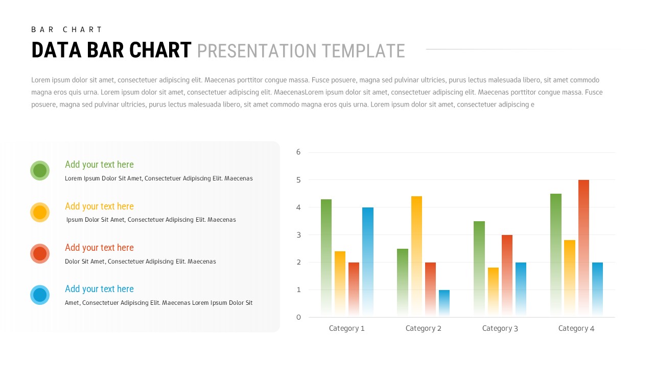
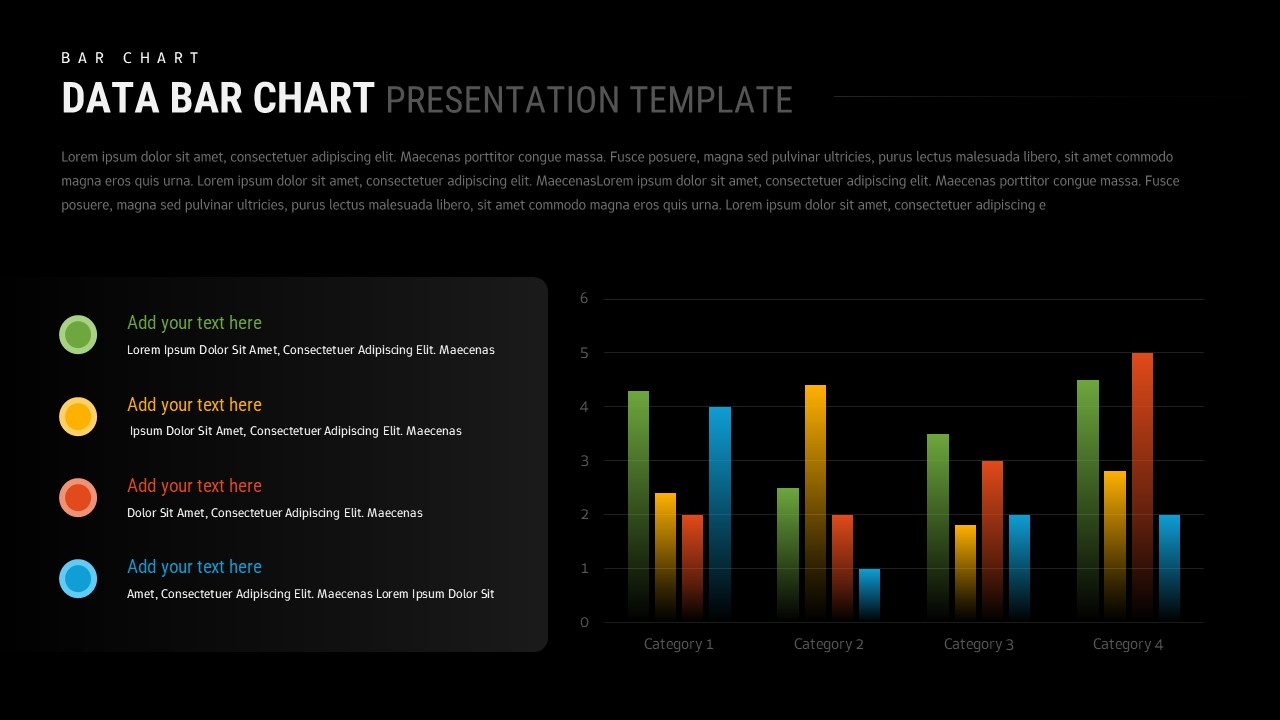
This Free Data Bar Chart Template for PowerPoint & Google Slides provides a clean, professional design featuring a grouped bar chart with four data series. The template includes a left sidebar legend with colored circular icons (green, yellow, orange, and blue) and customizable text sections. The main chart displays four categories with values ranging from 0-6, utilizing well-balanced white space and modern minimalist styling for maximum visual impact.
This Free Data Bar Chart Template for PowerPoint & Google Slides is ideal for business analysts, project managers, and executives who need to present comparative data across multiple categories. Perfect for quarterly reports, sales performance analysis, survey results, market research presentations, and financial dashboards. The template supports various data visualization scenarios including performance metrics, trend analysis, and multi-variable comparisons across different time periods or business segments.
Both light and dark theme versions ensure versatility across different presentation environments. All elements are fully editable, allowing you to customize colors, data values, category labels, and descriptive text to match your specific requirements. This template streamlines the process of creating professional data presentations that clearly communicate insights and drive informed decision-making.
Features of this Data Bar Chart Comparison template
• Grouped bar chart design with four customizable data series
• Light and dark theme versions for different presentation settings
• Color-coded legend system with expandable text sections
• Professional minimalist layout with optimal white space distribution
• Fully editable chart values, labels, and descriptive content
Why use this Data Bar Chart Comparison template
• Saves time creating professional data visualization presentations
• Ensures consistent, clean design across all your business reports
• Supports both PowerPoint and Google Slides platforms seamlessly
• Provides clear visual comparison of multiple data sets simultaneously
Who is it for
This template is perfect for business analysts, data scientists, project managers, marketing professionals, financial advisors, consultants, executives, and researchers who need to present comparative data, performance metrics, survey results, or market analysis in professional business presentations and reports.
Login to download this file


