


Modern Pricing Table Comparison Template for PowerPoint & Google Slides
Modern Pricing Table Pricing Comparison Presentation Template
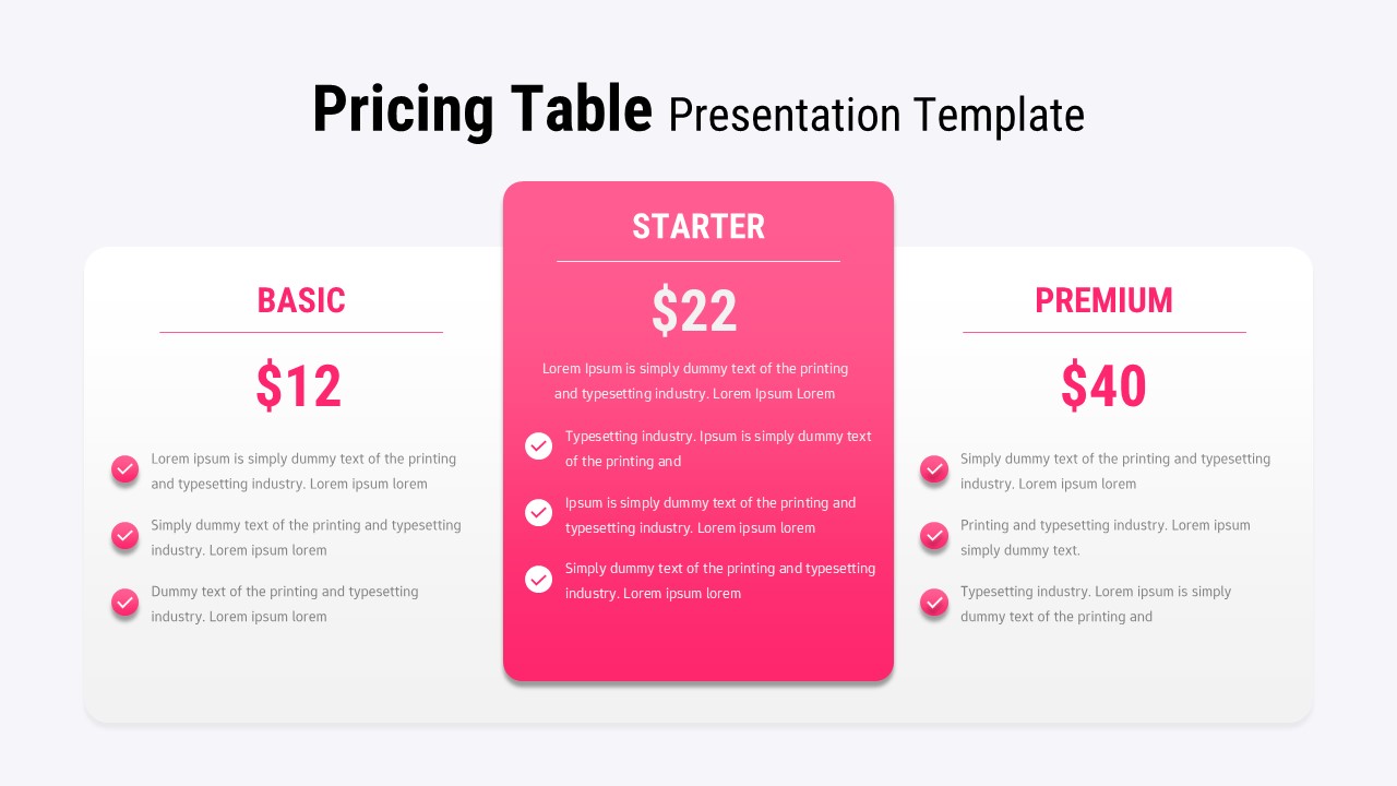
You already know what your pricing tiers are. You’ve thought through the positioning, sweated the numbers, argued internally about what goes in the middle plan versus what’s premium-only. Most pricing slides fail the same way. Everything looks equal. Equal weight, equal emphasis, equal visual boredom. And when everything feels equal, the audience stops helping you do your job – they stop being guided toward the option you actually want them to choose. This pricing table presentation template fixes that problem before you open it.
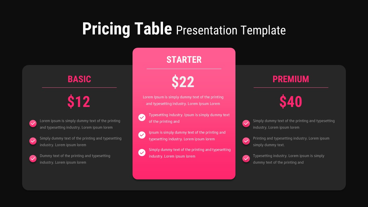
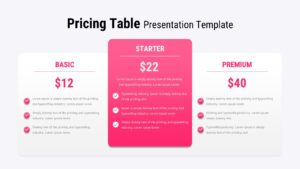
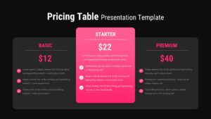
The layout is built around a simple truth: one plan should lead. The center tier sits elevated, gradient-washed in a pink-to-magenta that pulls the eye without screaming for attention. The flanking cards in the pricing table presentation – your Basic and Premium tiers are clean white, which does two things simultaneously: it gives them room to breathe, and it makes the featured plan look chosen, not just centered.
The typographic hierarchy does actual work here. Bold price markers. Clear section dividers. Checkmark icons that scan in under a second. Your audience should be able to glance at this slide and understand your offer before you’ve said a word — because the best pricing presentation is one that mostly explains itself.
Everything in this pricing table presentation is editable, which sounds obvious but matters more than templates usually admit. Plan names, feature lists, accent colors, pricing — all of it yields to your brand without a fight. If your company colors are midnight blue and slate, swap the gradient. If you have four tiers instead of three, the structure holds. The bones are sound.
It works in PowerPoint. It works in Google Slides. It works at midnight before a pitch when you have forty minutes and exactly zero patience for something that won’t cooperate.
Login to download this file
Related Templates

Pros And Cons List Slides & PPT Templates
Comparison


