


Octopus Concept Mapping Diagram Template for PowerPoint & Google Slides
Octopus Central Concept Mapping Diagram Presentation Template
Most concept maps look like they were designed by a committee that couldn’t agree on anything. The octopus diagram doesn’t have that problem.
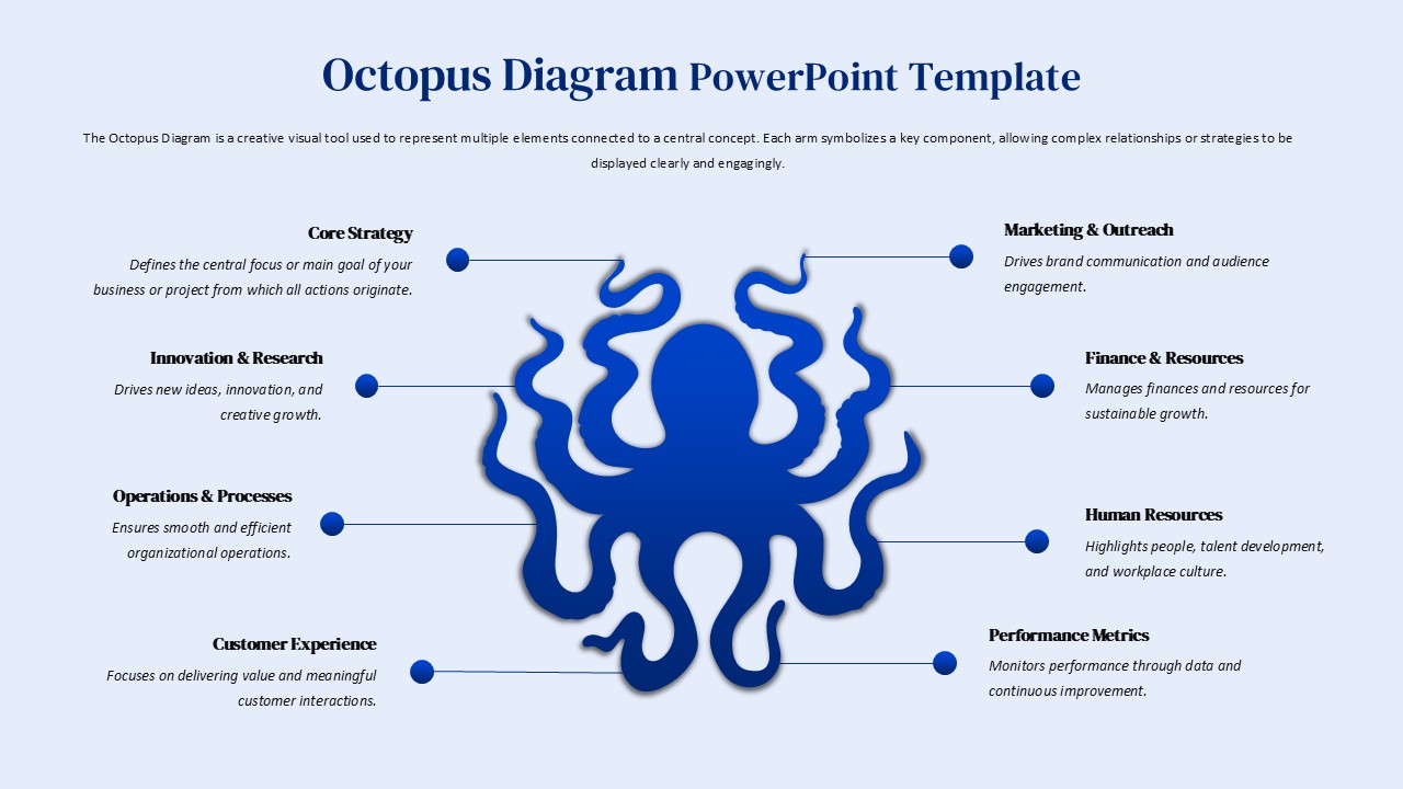
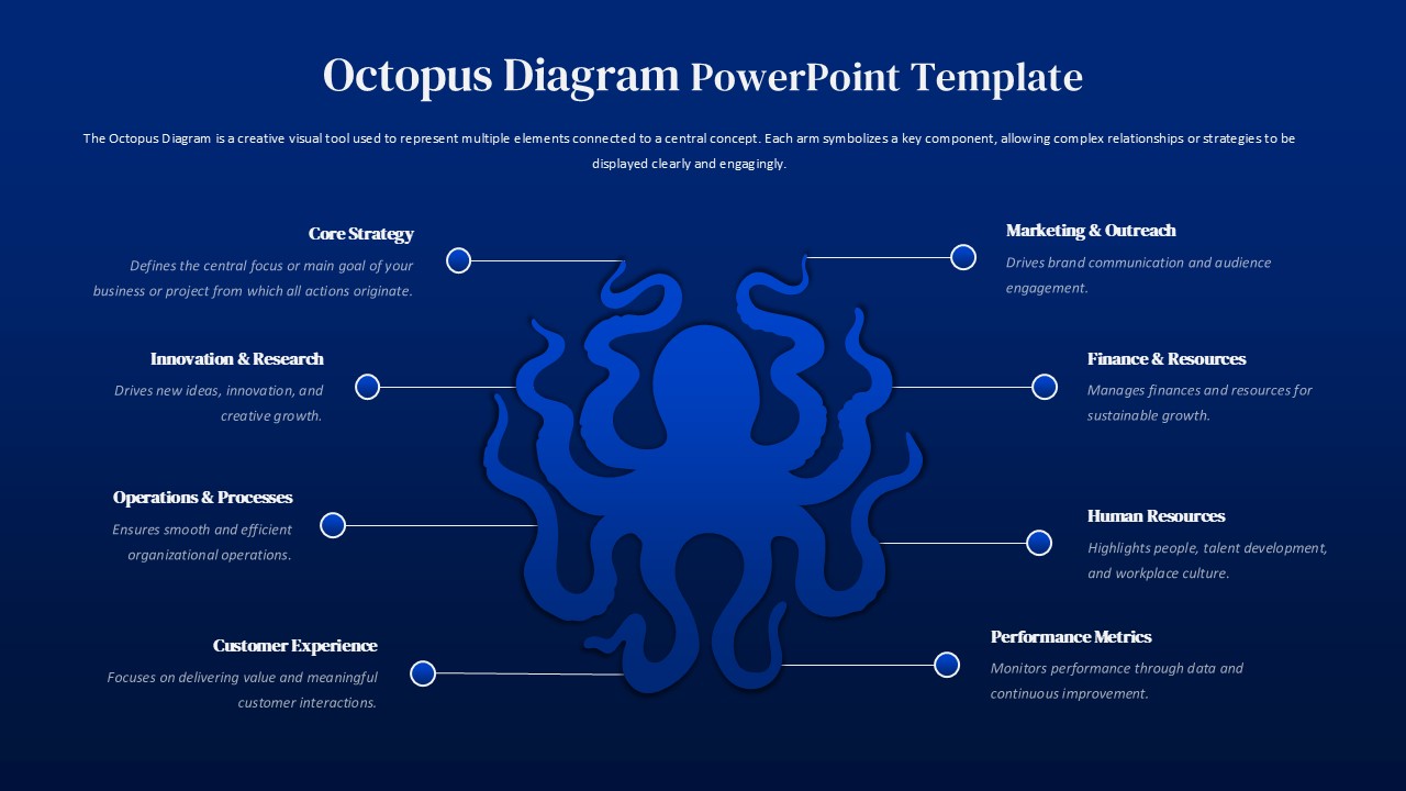
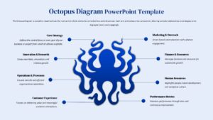
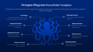
The central idea is obvious once you see it: one hub, eight arms, everything connected back to a single point. That’s not a metaphor being forced onto a business context; it’s actually how a lot of organizations work. Finance, HR, operations, marketing – they all report up to something central, and pretending otherwise in a slide deck never helps anyone. Here’s the catch, though. Most multi-arm templates look clinical. Boxes and arrows, connector lines that cross each other, labels crammed into corners. This one uses an octopus illustration as the anchor, which sounds gimmicky until you realize it’s the only thing keeping eight categories from turning into visual noise. The illustration earns its place.
Each arm of the octopus diagram gets its own labelled section such as core strategy, innovation, operations, marketing, finance, customer experience, HR, performance metrics. Eight categories, eight clear connectors, nothing overlapping. The horizontal layout means viewers can scan left to right without losing the thread. Audiences follow structure; they don’t follow chaos.
And it’s fully editable. Colors, text, section count – all of it can be swapped out without rebuilding anything from scratch. That matters more than it sounds. A template that forces you to reverse-engineer its layout to change one label isn’t a template; it’s a trap.
Who should use the Octopus Diagram?
Who actually uses something like this? Strategists presenting a framework to a leadership team. Consultants explaining how five workstreams connect to one client objective. Educators mapping out a system with multiple moving parts. The octopus diagram works across all of it because the underlying logic — one center, multiple branches, clear relationships – doesn’t change much by industry.
It runs on PowerPoint and Google Slides without formatting grief. The spacing holds, the typography stays consistent, the illustration doesn’t shift around between platforms. That’s not exciting. But it is the thing that saves you twenty minutes before a meeting.
Login to download this file


