


Dark KPI Performance Dashboard Infographic Template for PowerPoint & Google Slides
This template is part of a deck featuring multiple slides. To check out all slides.
See All
Product Description
Business KPI Metrics Dashboard Presentation Template
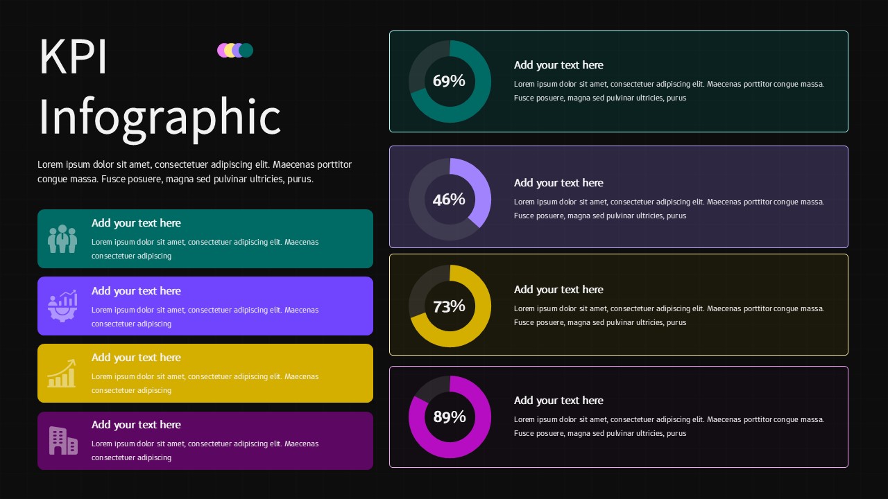
Present your performance metrics with clarity using this KPI Dashboard Infographic Template for PowerPoint & Google Slides. Designed to highlight measurable results, this KPI infographic slide features four circular progress charts displaying percentage values (69%, 46%, 73%, and 89%) alongside structured text blocks for detailed explanations. The balanced two-column layout separates visual data indicators from descriptive content, enabling audiences to quickly interpret results while understanding the context behind each KPI.
Each metric is color-coded in soft pastel tones, helping differentiate performance areas while maintaining a clean and professional aesthetic. The circular charts create immediate visual impact, making this KPI infographic ideal for showcasing growth rates, goal completion, productivity levels, or departmental benchmarks. Subtle background grids and rounded content cards enhance readability and alignment, ensuring your presentation remains structured and visually cohesive.
Fully editable in PowerPoint and Google Slides, this KPI infographic allows you to customize percentages, adjust colors, update icons, and modify text without disrupting the layout. Whether you’re reporting monthly targets, tracking strategic objectives, or summarizing quarterly achievements, this dashboard-style slide ensures your key performance indicators stand out with precision and authority.
Features of this KPI Dashboard Infographic template
• Four circular KPI progress charts with bold percentage indicators.
• Two-column dashboard layout for balanced data visualization and text.
• Soft pastel color blocks to distinguish performance categories.
• Fully editable text, icons, colors, and data values.
Why use this KPI Dashboard Infographic template
• Communicate KPI results clearly in executive meetings or reports.
• Transform complex metrics into digestible visual insights.
• Maintain a professional, modern look across business presentations.
• Save time with a structured dashboard-ready layout.
Who is it for
Business analysts, project managers, team leaders, marketing professionals, and executives who need to present KPI results clearly and persuasively. It is also ideal for consultants, startups, and corporate teams delivering performance reviews, quarterly updates, or strategic progress reports.
Login to download this file