


stacked-bar-graph-data-analysis-powerpoint-google-slides.
This template is part of a deck featuring multiple slides. To check out all slides.
See AllProduct Description
Stacked FreeBar Graph Data Visualization Presentation Template
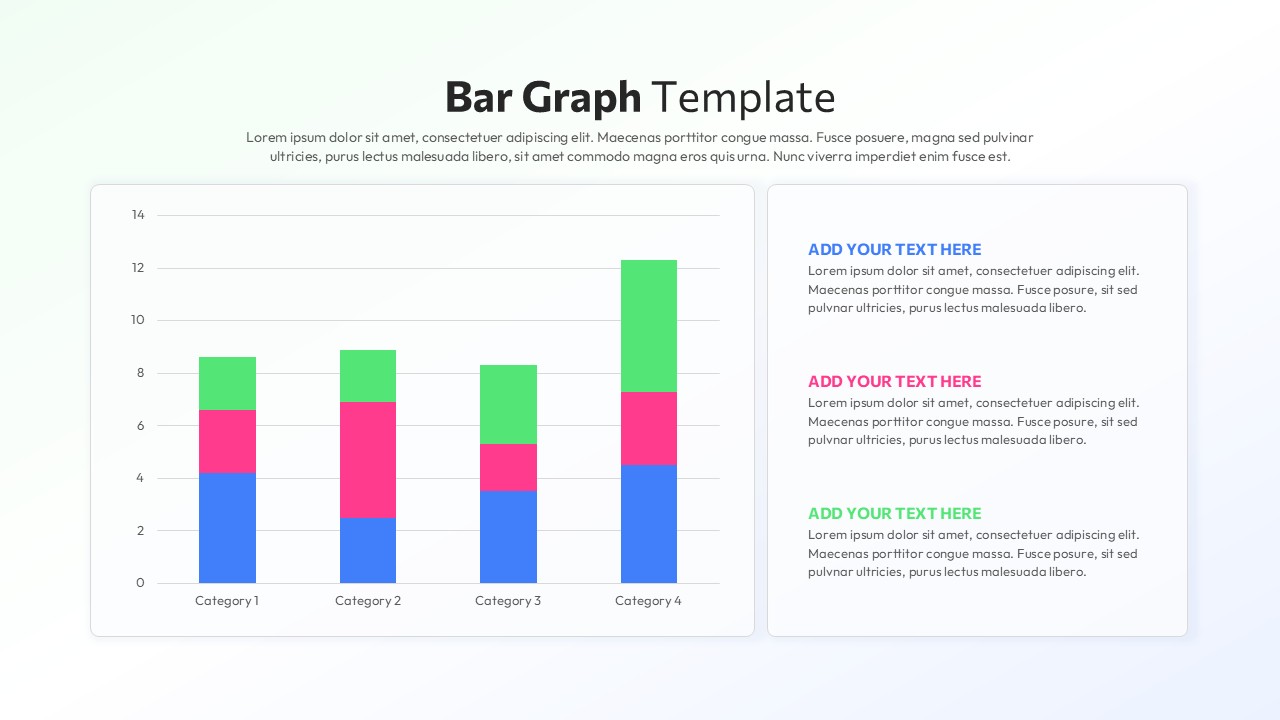
This stacked bar graph slide is designed to present comparative data clearly while highlighting part-to-whole relationships across multiple categories. The layout features a large vertical stacked bar chart on the left, paired with a structured text panel on the right, enabling presenters to combine quantitative insights with concise explanations. Each category is represented by multi-segment bars, making this stacked bar graph ideal for showing distribution, contribution, or performance breakdowns in a single visual. Clean gridlines, rounded chart containers, and balanced spacing ensure the data remains easy to read even in executive or classroom settings.
Built for flexibility, this Free stacked bar graph supports fast customization without compromising visual consistency. Colors, values, labels, and legends can be edited directly in PowerPoint or Google Slides, allowing users to adapt the slide to sales reports, operational metrics, or academic data. The right-side text blocks align visually with chart colors, reinforcing comprehension and guiding the audience through key takeaways. Whether used as a standalone slide or part of a larger report, the structure supports logical storytelling and data-driven discussions.
Beyond standard reporting, this Free stacked bar graph works well for trend comparisons, KPI summaries, resource allocation overviews, and performance reviews. The modern yet professional styling fits corporate, educational, and analytical presentations alike. With its balanced composition and editable design, this template helps transform raw numbers into clear insights while maintaining a polished, presentation-ready appearance for PowerPoint and Google Slides.
Features of this template
• Vertical stacked bar chart with clearly separated color segments for part-to-whole comparison.
• Dedicated text panel with aligned headings for contextual explanations or insights.
• Fully editable data values, colors, labels, and fonts in PowerPoint and Google Slides.
• Clean gridlines and spacious layout to improve readability on screens and projectors.
Why use this template
• Simplifies complex datasets into an easy-to-understand stacked bar graph.
• Saves time creating professional data visualizations from scratch.
• Enhances audience understanding through structured visual and textual balance.
• Suitable for reports, dashboards, and presentations across multiple industries.
Who is it for
Business analysts, managers, educators, consultants, and students who need to present comparative data clearly. It is especially useful for professionals preparing reports, performance reviews, dashboards, or analytical presentations that require a clean and reliable stacked bar graph format.
Login to download this file