


Four Column Waffle Charts KPI Data Visualization Template for PowerPoint & Google Slides

Four Column Waffle Chart Percentage Grid Presentation Template
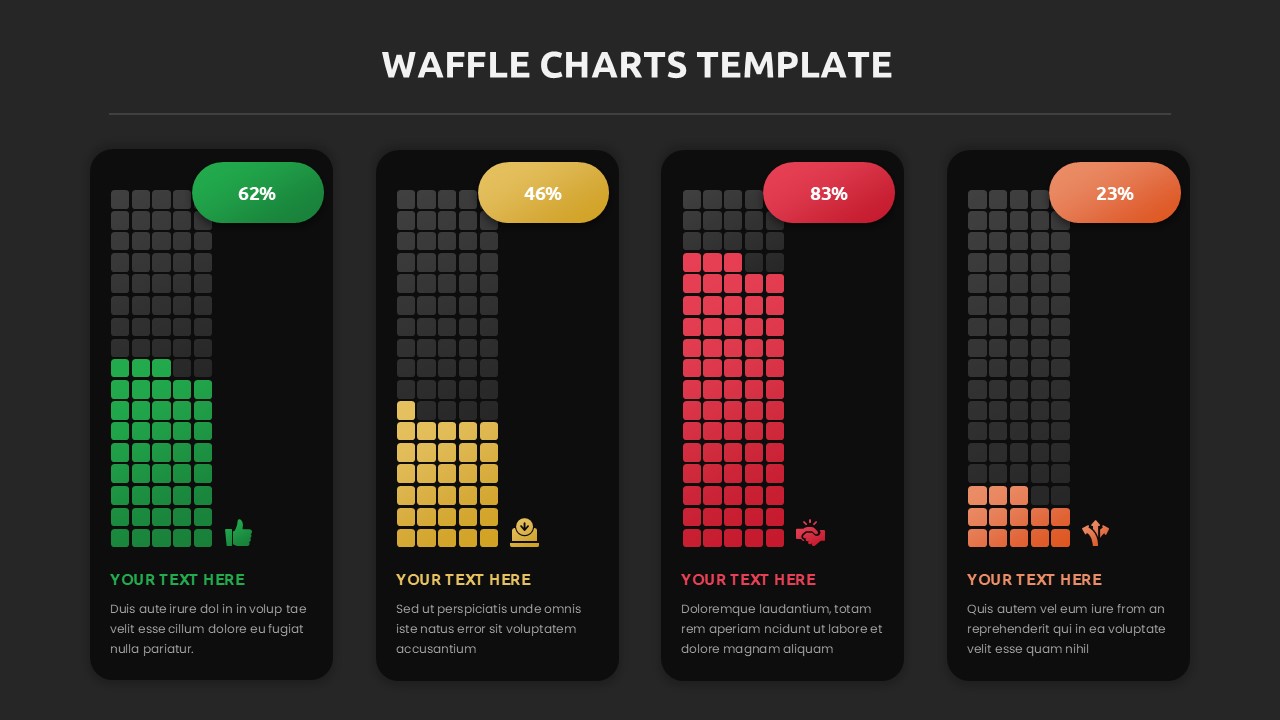
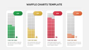
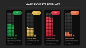
This Waffle Charts Template for PowerPoint & Google Slides provides a professional four-column layout featuring 10×10 grid visualizations with vibrant color coding. Each waffle chart displays percentage data through filled squares from bottom to top, complemented by rounded percentage badges, relevant icons, and placeholder text sections. The template includes both light and dark theme variations with consistent spacing and modern flat design aesthetics.
This Waffle Charts Template is ideal for business analysts, project managers, and executives presenting KPIs, survey results, completion rates, or comparative statistics. Perfect for quarterly reviews, performance dashboards, customer satisfaction reports, and project progress updates where multiple data points need clear visual representation. The template supports various business scenarios from marketing metrics to operational efficiency reporting.
All elements are fully customizable, allowing you to modify colors, percentages, icons, and text to match your specific data and brand requirements. The dual-theme design ensures flexibility for different presentation environments while maintaining professional clarity and visual impact throughout your data storytelling.
Features of this Waffle Charts template
• Four-column waffle chart layout with 10×10 grid visualization
• Light and dark theme variations for versatile presentation needs
• Customizable percentage badges with vibrant color coding
• Professional icons and placeholder text for easy content adaptation
• Modern flat design with rounded corners and consistent spacing
Why use this Waffle Charts template
• Simplifies complex data presentation through intuitive square grid format
• Enhances audience engagement with visually appealing percentage displays
• Saves design time with pre-formatted professional layouts
• Provides flexibility for various business metrics and reporting needs
Who is it for
This template is perfect for business analysts, data scientists, project managers, marketing professionals, executives, consultants, and team leaders who need to present statistical data, KPIs, survey results, completion rates, or performance metrics in board meetings, client presentations, quarterly reviews, and strategic planning sessions.
Login to download this file


