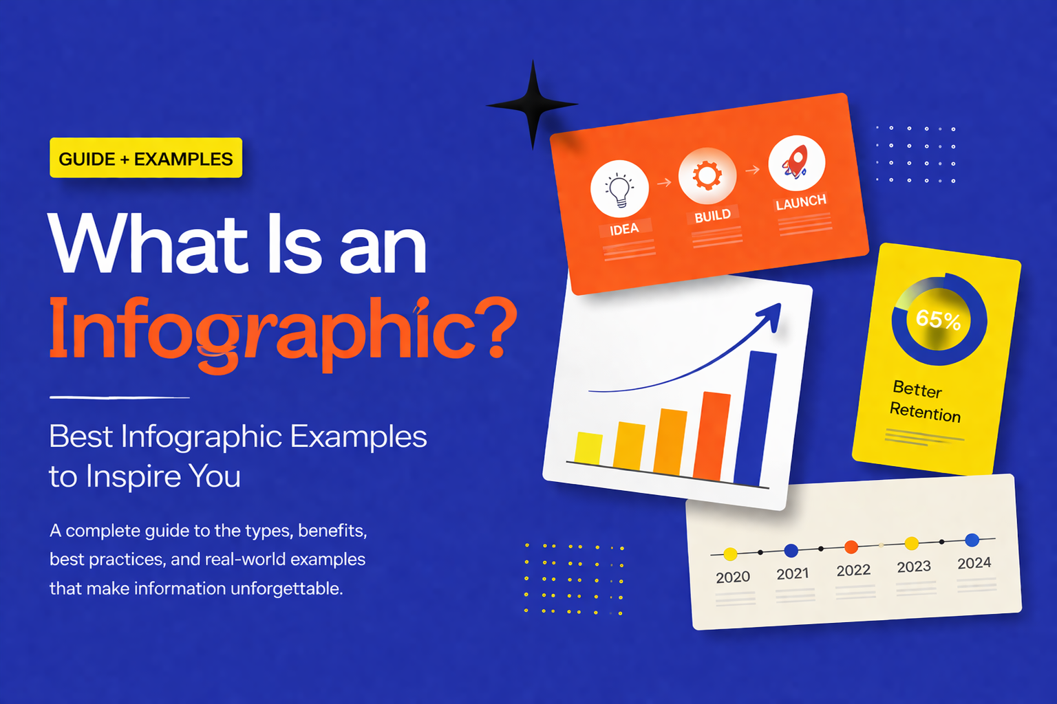
What Is an Infographic? Best Infographic Examples to Inspire You
You have a great idea, a strong dataset, or a complex process you need to explain but the moment you put it on a slide, it becomes a wall of text that nobody wants to read. This is one of the most common frustrations for presenters, marketers, educators, and business professionals alike.
The problem is not your content. It is the format.
That is exactly where an infographic comes in. Infographics have become one of the most widely used communication tools in business, education, and marketing and for good reason. They transform complex, dense information into visuals that people actually want to look at and can understand within seconds.
In this guide, you will learn what an infographic is, why it works so well, the different types you can use, and what makes one truly effective. By the end, you will also find a curated set of ready-to-use infographic templates to help you get started.
What Is an Infographic?
An infographic short for information graphic is a visual representation of information, data, or knowledge. It combines text, design elements, icons, charts, and imagery into a single cohesive visual that communicates a message quickly and clearly.
The key word here is visual. An infographic is not just a slide with some bullet points dressed up with color. It is a purposefully designed communication tool where every element layout, color, typography, iconography works together to guide the reader’s understanding.
Think of it this way: if a paragraph of text is a conversation, an infographic is a map. It shows you the full picture at once, lets you navigate to what matters most, and helps you remember where you have been.
Infographics are used across virtually every industry and profession:
- Business and marketing — to visualize campaign results, market data, and strategic plans
- Education — to explain complex concepts, timelines, and scientific processes
- Healthcare — to communicate medical procedures, statistics, and public health data
- Finance — to present investment data, budget breakdowns, and economic trends
- Technology — to map out systems, workflows, software processes, and architecture
Whether you are building a PowerPoint presentation, a Google Slides deck, a printed report, or a social media post, an infographic is one of the most versatile tools available to you.
Why Infographics Are So Effective
Understanding what an infographic is only gets you halfway there. To use them well, it helps to understand why they work so powerfully.
The Brain Is Wired for Visuals
Research consistently shows that the human brain processes visual information up to 60,000 times faster than text. When you look at a well-designed infographic, your brain does not need to decode sentences and translate them into meaning the visual does that translation for you, almost instantly.
This matters enormously in presentations, where you often have only a few seconds to capture attention before your audience mentally moves on.
Retention Is Dramatically Higher
Studies suggest that people retain approximately 65% of information when it is paired with a relevant visual, compared to just 10% when the information is presented as text alone. If you want your audience to walk away from your presentation actually remembering what you said, making your key points visual is one of the most evidence-backed strategies available.
Visuals Build Credibility
A well-designed infographic signals that the presenter has thought carefully about their audience. It communicates effort, clarity of thinking, and professionalism. Whether you are presenting to a board of directors, a classroom of students, or a potential investor, that perception matters.
They Make Sharing Easier
Infographics are inherently shareable. In marketing, an infographic distills complex information into something a reader can absorb in seconds and pass along to others. This is why infographics consistently outperform text-only content in terms of reach and engagement across digital channels.
The Main Types of Infographics
One of the most important decisions you will make when creating an infographic is choosing the right format. Different types of information call for different visual approaches. Here is a breakdown of the most common types and when to use each one.
Statistical Infographics
These are built around data. They use bold numbers, charts, icons, and callouts to make statistics feel immediate and impactful rather than abstract. Statistical infographics are the go-to format for research results, survey findings, performance reports, and annual reviews. Instead of presenting a table of numbers, you lead with the most significant figure and let the design give it weight.
Process Infographics
Process infographics break down a sequence of steps into a clear, easy-to-follow visual flow. They use numbered steps, arrows, icons, and short labels to walk the reader through how something works — from start to finish. They are invaluable for training materials, standard operating procedures, onboarding documentation, and any situation where your audience needs to understand a workflow.
Timeline Infographics
A timeline infographic visualizes events, milestones, or developments in chronological order. It answers the question: how did we get here? Timelines are used extensively in pitch decks to show company history, in project management to map out phases, and in education to put historical events in context. A well-designed timeline turns a dry list of dates into a compelling narrative of progress.
Comparison Infographics
When you need to put two or more options side by side, a comparison infographic makes the differences immediately visible. Using columns, icons, checkmarks, and color-coding, these visuals help your audience make decisions faster. They are commonly used in product comparisons, competitive analysis slides, pricing presentations, and strategy evaluations.
Hierarchical Infographics
These infographics show structure, relationships, and levels — making them ideal for organizational charts, decision trees, mind maps, and ranked lists. A hierarchical infographic answers questions like: who reports to whom? How do these ideas connect? What is the order of priority? They are particularly useful in organizational design, product architecture, and academic presentations.
Geographic Infographics
Geographic infographics combine map visuals with data overlays — heat maps, pins, regional shading — to show where something is happening. They are especially effective for presenting market expansion data, regional sales performance, demographic distribution, and global campaign reach.
Metaphor-Driven Infographics
Some of the most memorable infographics use a visual metaphor to frame their information — a tree representing growth and branching decisions, an umbrella representing protection and risk coverage, a funnel representing pipeline stages, a bottleneck representing a constraint in a workflow. These formats make abstract concepts immediately tangible and emotionally resonant. They are particularly powerful in leadership communications, strategy presentations, and creative pitches.
List Infographics
A list infographic is exactly what it sounds like — a well-designed visual list, where each point is paired with an icon, number, or visual accent. Do not underestimate the format. A thoughtfully designed list infographic is far more engaging than a bulleted slide and can be a powerful way to present tips, features, benefits, or recommendations.
What Makes a Great Infographic?
Not all infographics are created equal. A poorly designed one can actually make your message harder to understand. Here is what separates a truly effective infographic from a cluttered, confusing one.
One clear message. Every infographic should communicate one central idea. If you are trying to pack in five different insights, consider breaking them into multiple slides rather than forcing everything into one visual.
Strong visual hierarchy. Your audience’s eye needs to know where to go first. Size, color contrast, and placement all signal importance. The most critical information should dominate the visual — not compete with everything else for attention.
Minimal text. An infographic is not a paragraph with pictures. Labels should be short. Callouts should be punchy. If you need a full sentence to explain an element, the design is doing too little of the work.
Consistent design language. Stick to two or three colors, one or two font families, and a unified icon style. Inconsistency in design erodes trust in the content. A well-designed template solves this problem before you even begin.
Purposeful icons and imagery. Every icon or illustration should earn its place. Use visuals that reinforce meaning — not clip art added to fill space.
Adequate whitespace. Whitespace is not wasted space. It gives your content room to breathe, makes the layout easier to scan, and prevents the visual from feeling overwhelming.
How to Make an Infographic in PowerPoint or Google Slides
You do not need professional design skills to produce a great infographic. What you do need is a clear message and a solid starting point.
- Start with your message. Before opening any tool, write down the single key takeaway you want your audience to leave with. Everything in your infographic should support that one idea.
- Choose the right type. Use the breakdown above to match your content to the format that communicates it most naturally.
- Start from a template. Starting from a blank slide is the slowest and least reliable path to a polished result. A professionally designed template gives you a proven layout, a consistent color palette, and a typographic structure you can trust.
- Customize with your content. Swap in your data, replace placeholder text, update icons to match your topic, and adjust colors to fit your brand.
- Simplify. Read through the finished infographic and remove anything that does not directly support the core message. Less is almost always more.
- Test at actual size. View the slide at the resolution your audience will see it — on screen, on a projector, or in print. If anything feels cramped or hard to read, fix it before you present.
Both PowerPoint and Google Slides are fully capable of producing professional-quality infographics, especially when combined with a well-built template.
Infographic Templates You Might Like
Here are ten well-designed, fully editable infographic templates worth exploring. Each one covers a different visual style and use case — pick the one that fits your content and make it your own.
- Digital Transformation Roadmap Template SlideChef —
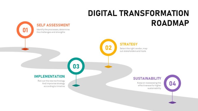
A clean, structured roadmap layout built for presenting phased strategies, technology adoption plans, or multi-year transformation journeys. Ideal for business leaders, consultants, and IT professionals who need to communicate a complex plan in a single, credible slide. Fully editable in PowerPoint and Google Slides.
- Sun Ray Diagram Template SlideChef —
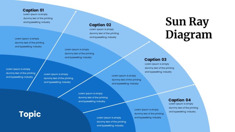
A visually distinctive radial diagram that positions your central concept at the core with connected ideas branching outward like rays of light. Great for brainstorming sessions, market analysis presentations, or any topic where you need to show how a central theme connects to multiple related ideas. It immediately makes a slide feel more thoughtful than a standard bullet-point layout.
- Umbrella Infographics Template SlideBazaar —
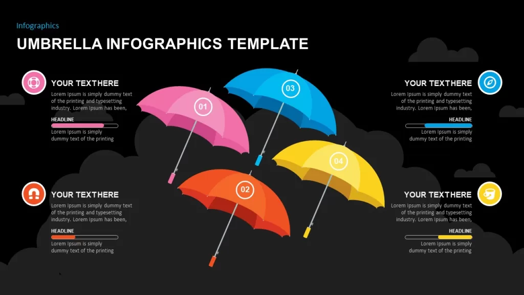
Four vibrant, color-coded umbrellas — each representing a different category, step, or concept — make this template instantly eye-catching. It works well for breaking down business strategies, marketing plans, or educational topics into clearly separated, visually distinct sections. A smart choice when differentiation between ideas is as important as the ideas themselves.
- Tree Infographics Template SlideBazaar —
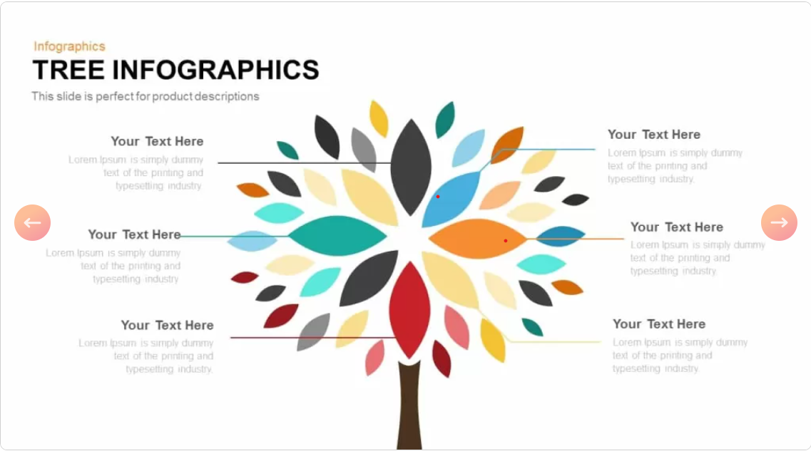
A striking tree-and-root design featuring colorful hexagon markers, each displaying a key metric or percentage. Particularly effective for presenting survey results, performance benchmarks, or segmented data in a way that feels alive and meaningful rather than flat and numerical. The organic metaphor adds a sense of growth to your data story.
- Business Tree Diagram Template SlideBazaar —
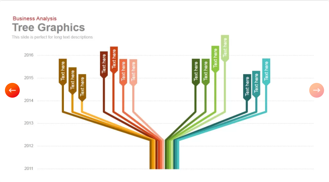
Built for strategic storytelling, this template uses a central trunk branching into vivid, color-coded limbs — each representing a category, decision, or business direction — with a timeline backdrop running across the years. A strong choice for mapping how a business, product, or strategy has evolved and branched over time.
- Bottleneck Diagram Template SlidesDepot —
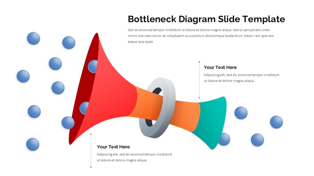
One of the most practical templates in this list. The funnel-shaped visual shows multiple inputs narrowing through a single constraint point, with labeled callouts for root causes like limited resources, inefficient processes, or unclear priorities. A compelling way to present workflow challenges, capacity issues, or process improvement opportunities — the kind of slide that sparks real conversation.
- Pencil With Stages Template SlidesDepot —
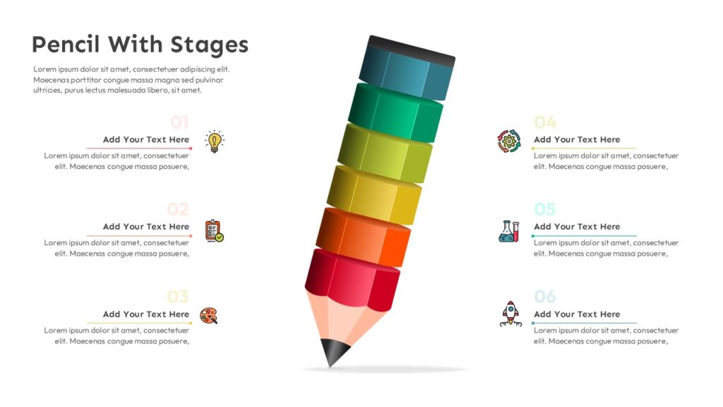
A creative take on the classic process infographic. It uses a vibrant 3D pencil illustration as the visual centrepiece, with six color-coded stages running along the body of the pencil from teal through to deep red. The pencil metaphor resonates naturally with creativity, planning, and development — making it a strong choice for project rollouts, training materials, and product development workflows.
- Eisenhower Decision Matrix Template SlidesDepot —
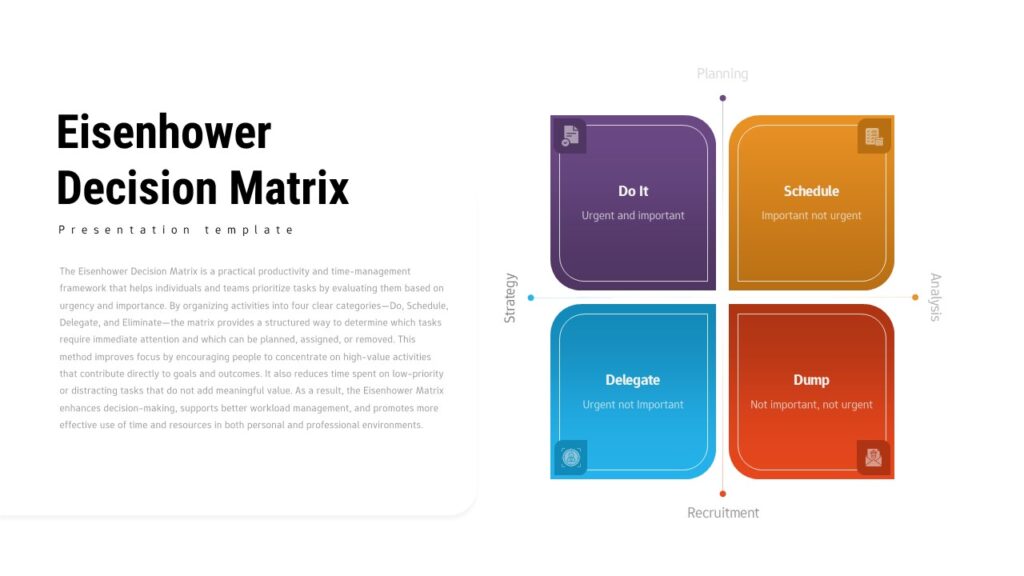
A beautifully rendered version of one of the most trusted prioritization frameworks in business. The four-quadrant layout sorts tasks by urgency and importance — Do, Schedule, Delegate, Eliminate — and is available in both light and dark themes. A polished, immediately credible slide for leadership, productivity, and project management presentations.
- Payroll Management Process Template SlideKit —
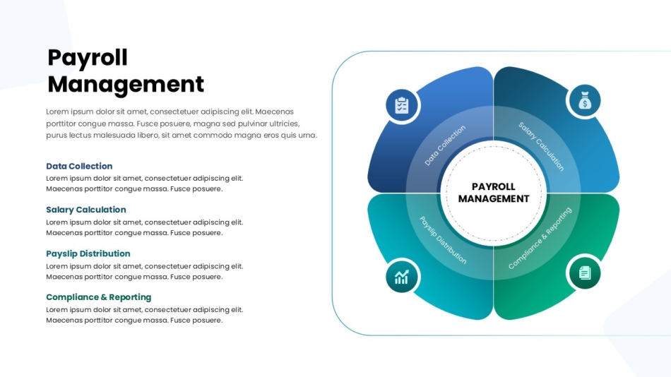
A clean, modern process infographic that breaks down payroll operations into four clearly defined stages — Data Collection, Salary Calculation, Payslip Distribution, and Compliance & Reporting — using a segmented circular diagram with intuitive icons. An excellent example of how a structured visual can make a compliance-heavy topic feel clear and approachable for any audience.
- Creative Multi-Timeline Roadmap Slide SlideKit —
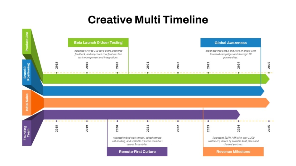
This template shines when you need to show that multiple streams of work were advancing at the same time. Color-coded horizontal ribbons — one per initiative or business function — run across a shared time axis with milestone callouts and annotations. The result is a rich, narrative-driven slide that communicates both the what and the when of your growth story. A strong choice for investor decks, company overviews, and strategic retrospectives.
Conclusion
Infographics are not just a design trend, they are one of the most reliably effective ways to communicate complex information to any audience. When you choose the right format, keep your message focused, and build on a solid visual foundation, an infographic does not just make your slide look better. It makes your entire presentation work harder.
The best starting point is always a professionally designed template. It handles the design decisions so you can focus on the content that matters.
Browse SlidesDepot’s full library of free and premium infographic templates at slidesdepot and find the one that fits your next presentation.

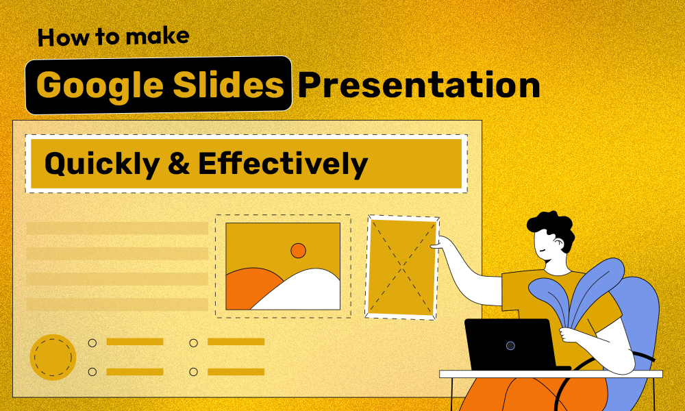
How to Make a Good Google Slides Presentation Quickly and Effectively
Smart Hacks to Make Your Google Slides Presentations Better Creating a presentation in Google Slides doesn’t have to be overwhelming or time-consuming. With the right approach, clear structure, and smart slide design, you can build a professional presentation that communicates your message clearly and keeps your audience engaged. This guide explains how to make a…
What Is the Main Purpose of Developing a Business Pitch? A Complete Guide for Founders
The Role of a Business Pitch in Winning Opportunities Many founders, professionals, and teams struggle with the same challenge: they have a strong idea, but their business pitch does not communicate it clearly. The slides feel disconnected. The story lacks focus. The audience walks away unsure about the value or the next step. Understanding what…

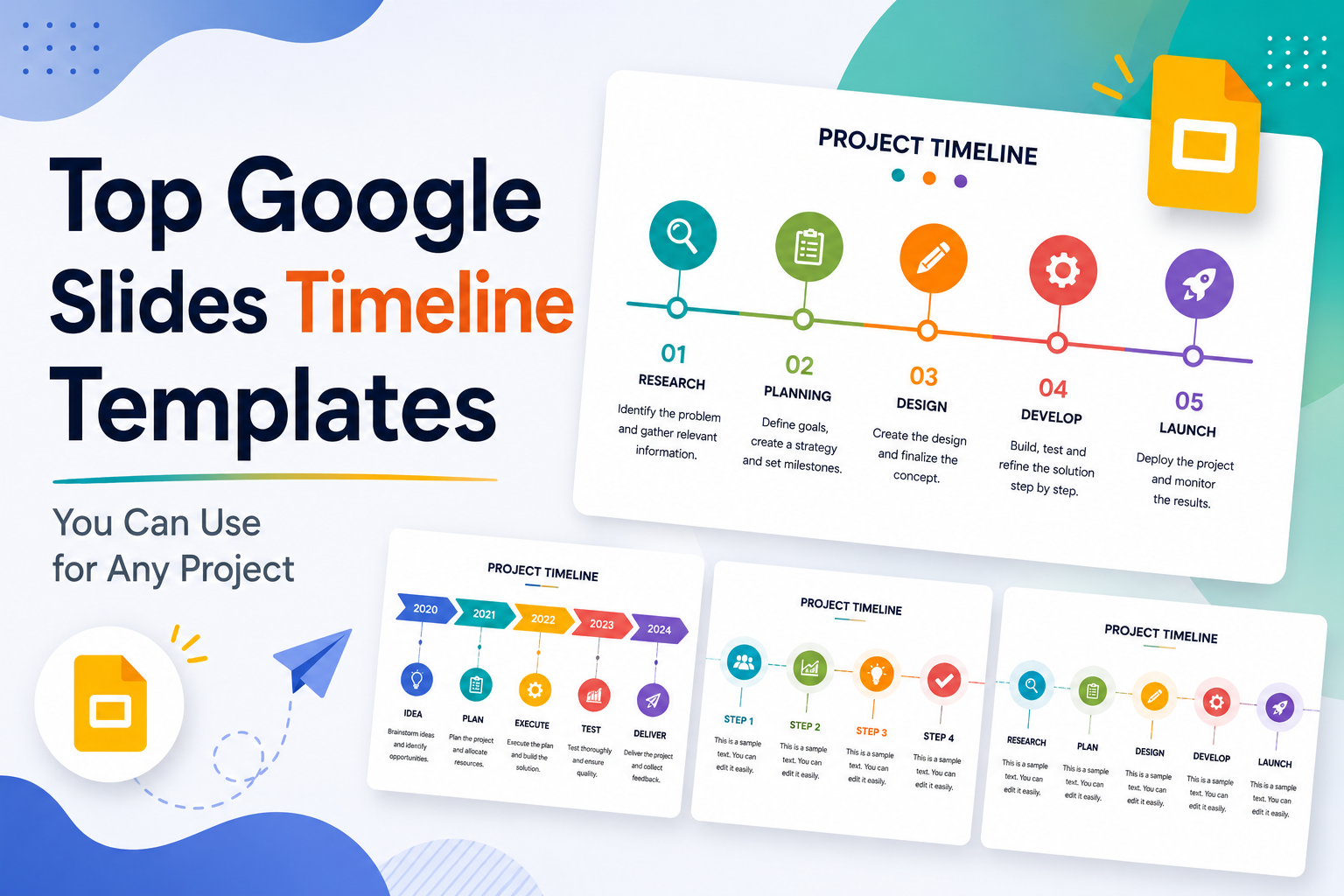
Top Google Slides Timeline Templates You Can Use for Any Project
Every project tells a story, and timelines are how you tell it visually. Whether you are pitching a product launch to stakeholders, walking students through a historical sequence, or mapping out a multi-phase marketing campaign, the right timeline slide can do more communicative work than three paragraphs of text ever could. The problem most people…