Understanding Different Types of Graphs: When to Use Each One
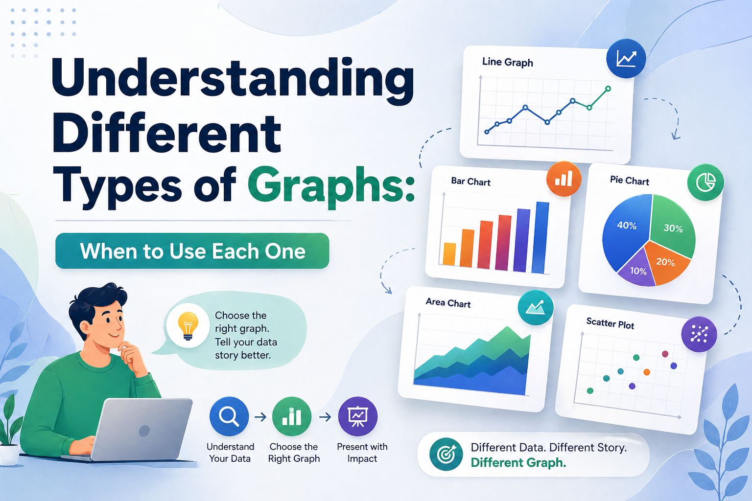
Data without the right visual is just noise. Whether you are a startup founder walking investors through growth projections or a project manager presenting a quarterly sprint review, the types of graphs you choose will determine whether your audience leans in or tunes out entirely.
This guide breaks down every major chart and graph type, explains the deeper graph meaning behind your data, and shows you how to pair the right visual with professional templates from SlidesDepot to build presentations that actually land.
What “Graph Meaning” Actually Tells You
Before you open any charting tool or slide deck, you need to answer one question: what is my data trying to say?
That answer, the core insight your visualization is designed to communicate, is what professionals mean by graph meaning. Is your data showing change over time? A comparison between groups? The makeup of a whole? Each of those stories belongs to a different chart type. Using the wrong visual does not just confuse your audience. It quietly distorts the message.
This matters more than most people realize. The human brain processes visuals roughly 60,000 times faster than plain text, but only when the visual matches the data’s underlying structure. A line graph that should be a bar chart forces your audience to do extra mental work, and most of the time they will tune out instead.
Key principle: Before choosing a chart type, finish this sentence: “I want to show how _.” The verb you use, whether that is grows, compares, breaks down, or correlates, points directly to the right graph format.
The Six Essential Types of Graphs
These are the chart and diagram varieties that cover the vast majority of professional use cases. Master these six and you will handle almost any dataset confidently.
1. Line Graph: The Trend Specialist
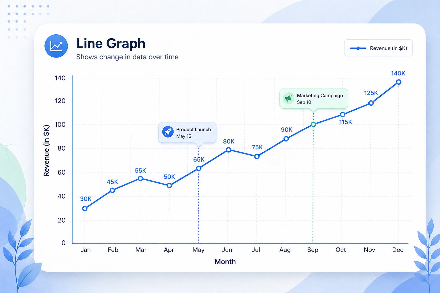
The line graph is the most widely used chart format in business, and the one with the clearest graph meaning. It shows how something changes continuously over time. Every data point connects into a single storyline, making it instantly readable whether you are tracking quarterly revenue, SEO traffic after an algorithm update, or user signups across a product launch window.
The X-axis should always represent time. The Y-axis represents your metric. When comparing multiple metrics simultaneously, a multi-series line graph, sometimes called a multi-line chart, keeps everything on one canvas without clutter. This is far cleaner than stacking multiple separate bar charts side by side.
Best for: Revenue growth, website traffic trends, stock performance, user engagement over time, and any metric tracked across a continuous period.
Pro tip: Add annotation markers at inflection points such as a product launch, a campaign start date, or a policy change. That context transforms a line graph from a data display into an actual narrative your audience can follow.
2. Bar Chart: The Comparison Workhorse
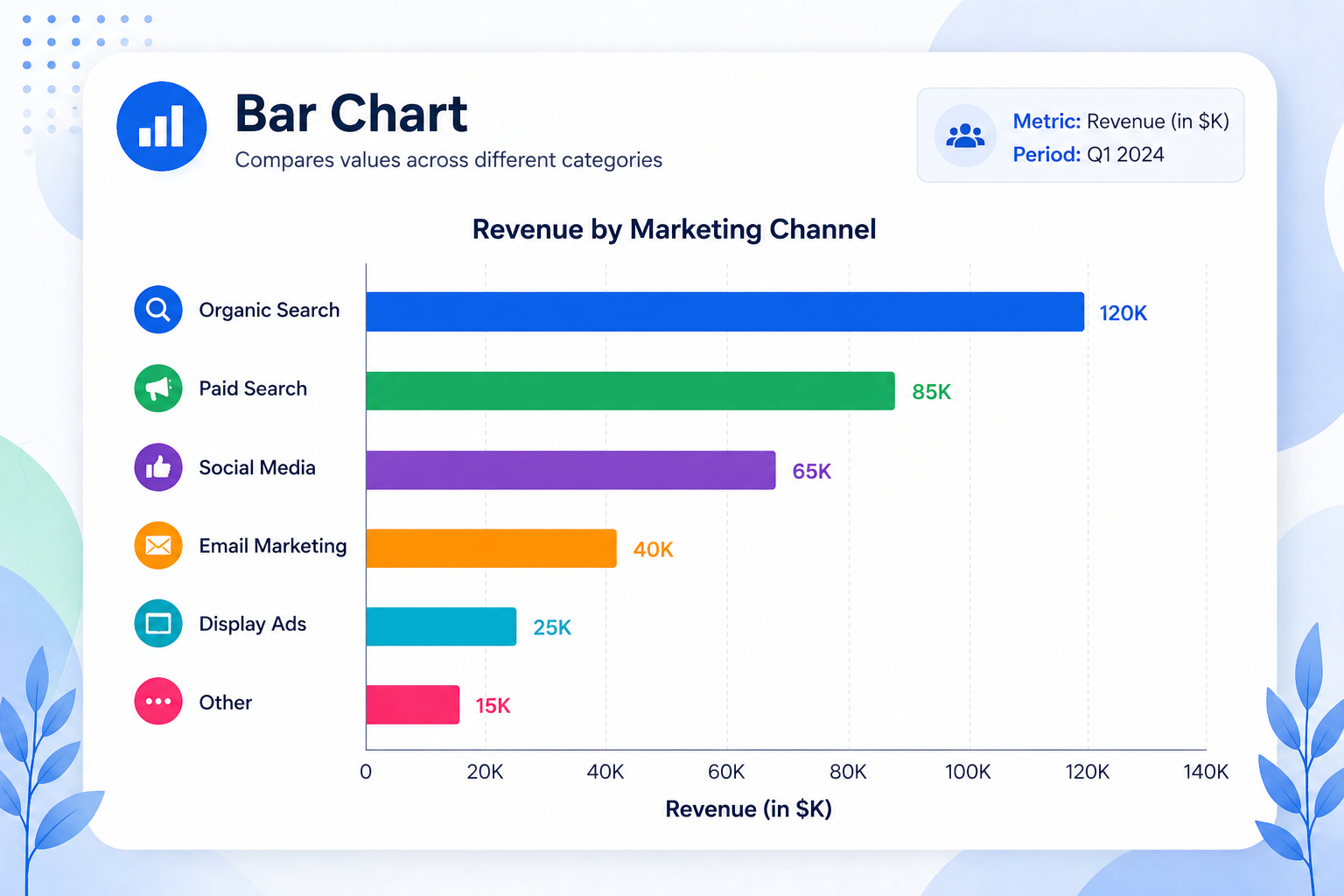
Where a line graph shows flow over time, a bar chart shows rank or difference at a fixed moment. It is the right diagram type when you need to compare discrete, separate categories such as marketing channel performance, regional sales figures, or survey responses across demographic groups.
Horizontal bar charts are especially effective for ranking, since the longer bar reads naturally as larger. Grouped bar charts let you compare subcategories side by side. Stacked bar charts show both total volume and the internal breakdown within each category, which is useful for budget or headcount data.
Best for: Organic vs. Paid vs. Social performance, revenue by region or product line, competitor comparisons, and survey results.
3. Pie Chart: Composition Only, Used Sparingly
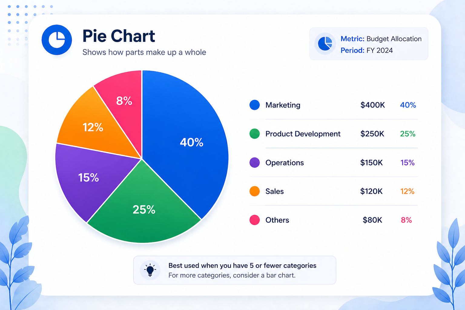
Pie charts are among the most misused graph varieties. They work well in exactly one scenario: showing how parts make up a whole, where all the parts add to 100% and there are five or fewer slices. Budget allocation, market share breakdowns, and demographic splits are natural fits.
Beyond five categories, the slices become too similar in size to read at a glance. In those cases, switch to a horizontal bar chart ranked by value. It communicates the same composition far more clearly.
Best for: Market share, budget allocation, and demographic breakdown with a maximum of five segments.
4. Scatter Plot: Revealing Hidden Relationships
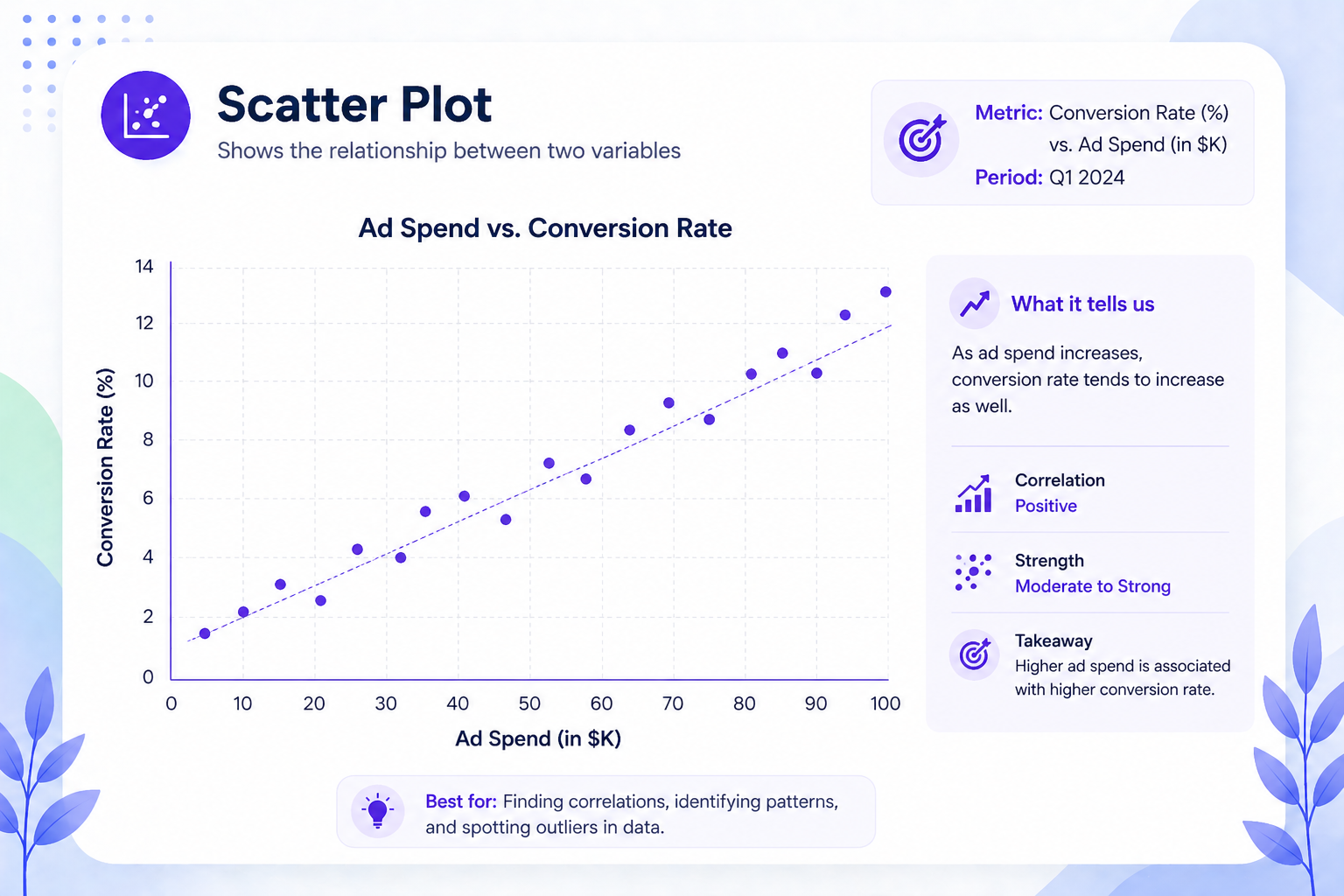
A scatter plot places individual data points on an X/Y axis to show whether two variables move together. It is one of the more advanced chart formats, primarily used in analytics, research, and science to surface correlations that would not be visible in any other visual format.
Does ad spend predict conversion rate? Does customer satisfaction score predict churn? Does price correlate with volume? Scatter plots answer these questions at a glance.
Best for: Correlation analysis, distribution mapping, research data, and performance benchmarking across many data points.
5. Area Chart: Adding Volume to a Trend
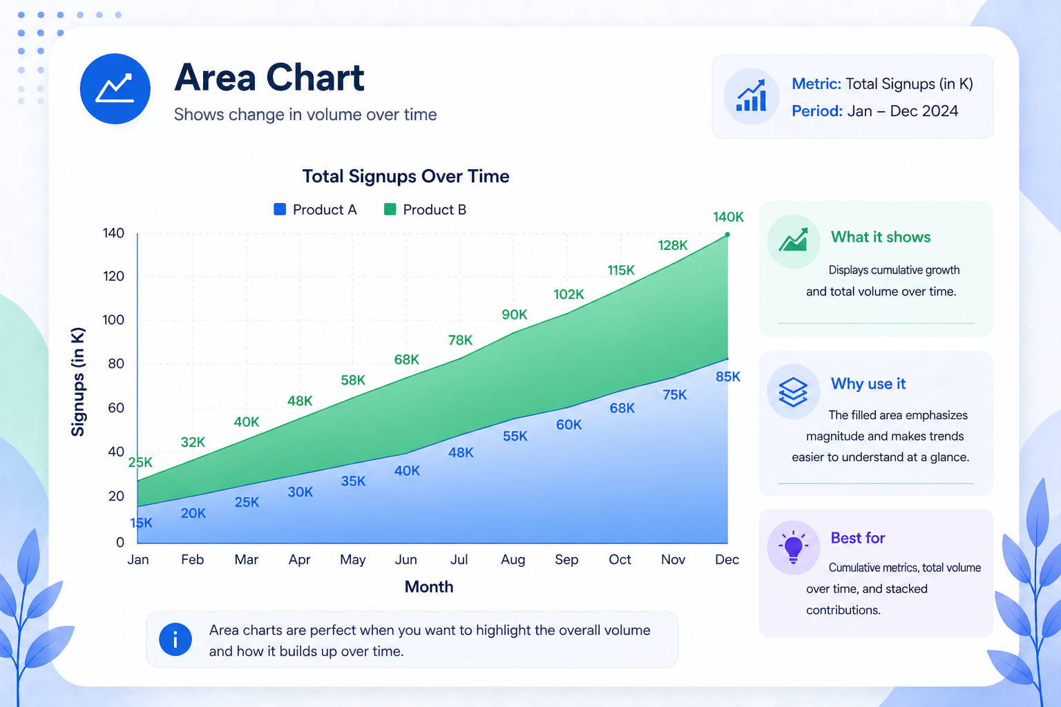
An area chart is a line graph with the space beneath the line filled in. The shading adds a sense of mass and volume, making it ideal for showing cumulative growth such as total signups over a year, expanding market coverage, or stacked revenue from multiple product lines. The visual weight of a filled area communicates scale in a way a bare line simply cannot.
Best for: Cumulative growth, total volume over time, and stacked contributions from multiple sources.
6. Timeline and Roadmap: Project Planning’s Backbone
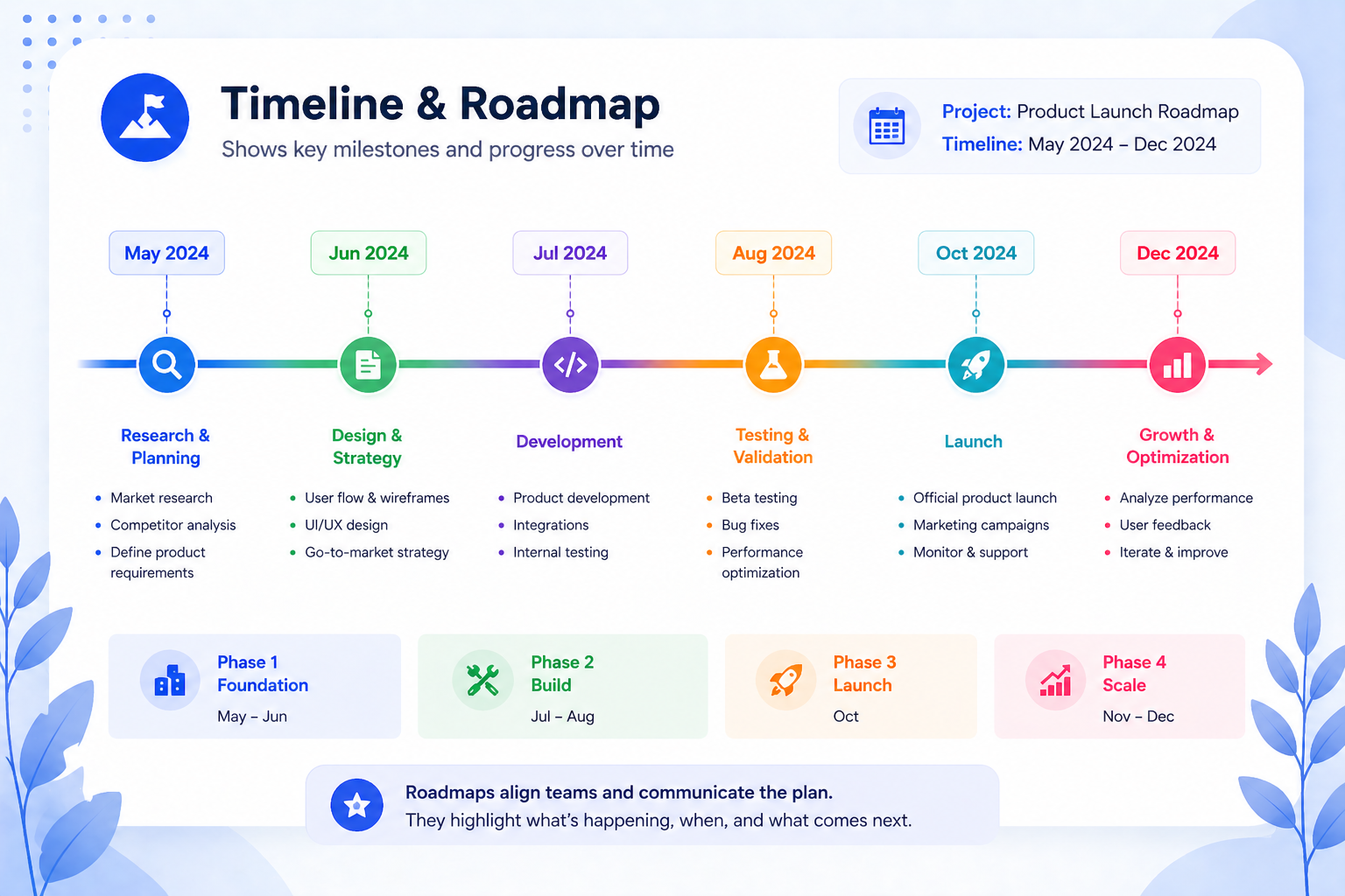
A timeline is a specialized hybrid visual that combines the chronological structure of a line graph with milestone markers, phase labels, and deliverable flags. It is the essential chart format for project management presentations, product roadmaps, and strategic planning decks.
Unlike a Gantt chart, which focuses on task duration and dependencies, a roadmap timeline emphasizes the sequence and story of a project. This makes it far more effective for executive and stakeholder audiences who need the big picture rather than the minute details.
Best for: Product launch roadmaps, 90-day onboarding plans, multi-year strategic initiatives, and sprint reviews.
Quick-Reference Decision Table
Use this as a shortcut. Match your data’s story to the right diagram or chart type before you start building.
What you want to show / Best graph type / Avoid
Change over time, single metric / Line graph / Pie chart Change over time, multiple metrics / Multi-line or area chart / Multiple bar charts Comparison between categories / Bar chart / Line graph Parts of a whole with five or fewer segments / Pie or donut chart / Bar chart Correlation between two variables / Scatter plot / Line graph Cumulative volume or stacked growth / Area chart / Pie chart Project phases and milestones / Timeline or roadmap / Bar chart
Common Graph Mistakes and How to Avoid Them
Using a line graph for categories. Line graphs imply continuity. Connecting “Organic,” “Paid,” and “Social” with a line suggests they exist on a spectrum, but they do not. Use a bar chart instead.
Pie charts with too many slices. Once you exceed five segments, the visual becomes unreadable. Collapse smaller categories into “Other” or switch to a horizontal bar chart ranked by size.
A truncated Y-axis. Starting your bar chart or line graph at a value other than zero exaggerates differences. It is technically accurate but visually misleading, and a classic way to make small changes look dramatic.
Too many data series on one chart. A line graph with eight series is unreadable. Limit to three or four lines and use color deliberately. If you need more, break the data into multiple focused charts.
No context or labels. A chart without a clear title, labeled axes, and a stated time period forces the audience to guess the graph meaning. Always put the key takeaway in the chart headline, not just in the body of the slide.
Choosing the Right Presentation Format for Your Graph
Selecting the correct chart type is only part of the process. How you present that chart matters just as much. A well-chosen graph placed inside a poorly structured slide can still lose your audience, because design and data need to work together.
This is where ready-made presentation templates become genuinely useful. Platforms like SlidesDepot offer pre-built slide layouts for common chart types including line graphs, bar charts, scatter plots, and timeline roadmaps. Because the structure is already in place, you spend less time adjusting spacing and alignment and more time focusing on the actual content and story your data is telling.
A few things worth considering when choosing any presentation template for data visualization:
Clarity of layout: The chart should be the first thing the eye lands on. Avoid templates that crowd a graph with too much surrounding text or decorative elements.
Axis and label space: Good templates leave enough room for clear axis labels, a descriptive chart title, and a data source note. These details are what separate a professional visualization from a rough draft.
Consistency across slides: If your presentation uses multiple chart types, consistent formatting across all of them, same font, same color palette, same grid style, makes the deck easier to follow and more credible to the audience.
Compatibility: Templates that work across both PowerPoint and Google Slides save time when collaborating with teams that use different tools.
The goal of any template is simply to remove the formatting burden so you can focus on the graph meaning itself, the insight you are trying to communicate and the decision you want your audience to make.


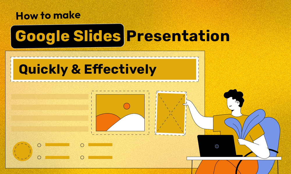
How to Make a Good Google Slides Presentation Quickly and Effectively
Smart Hacks to Make Your Google Slides Presentations Better Creating a presentation in Google Slides doesn’t have to be overwhelming or time-consuming. With the right approach, clear structure, and smart slide design, you can build a professional presentation that communicates your message clearly and keeps your audience engaged. This guide explains how to make a…
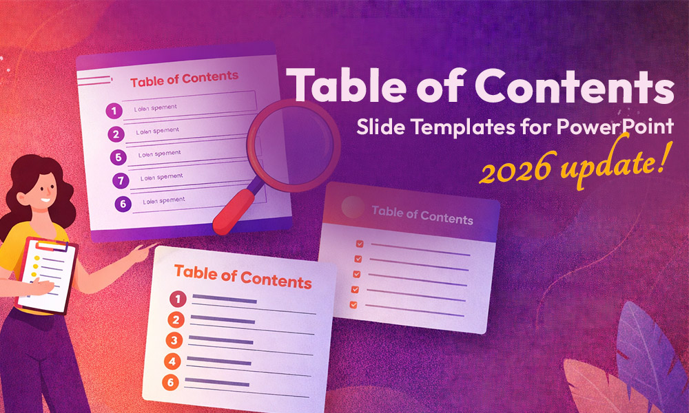
10 Best Table of Contents Slide Templates for PowerPoint in 2026
A strong table of contents slide does more than list your sections, it signals to your audience that your presentation is organised, intentional, and worth their attention. It sets the pace, reduces confusion, and gives every viewer a mental map before the first content slide even appears. Whether you are building an investor pitch deck, a…

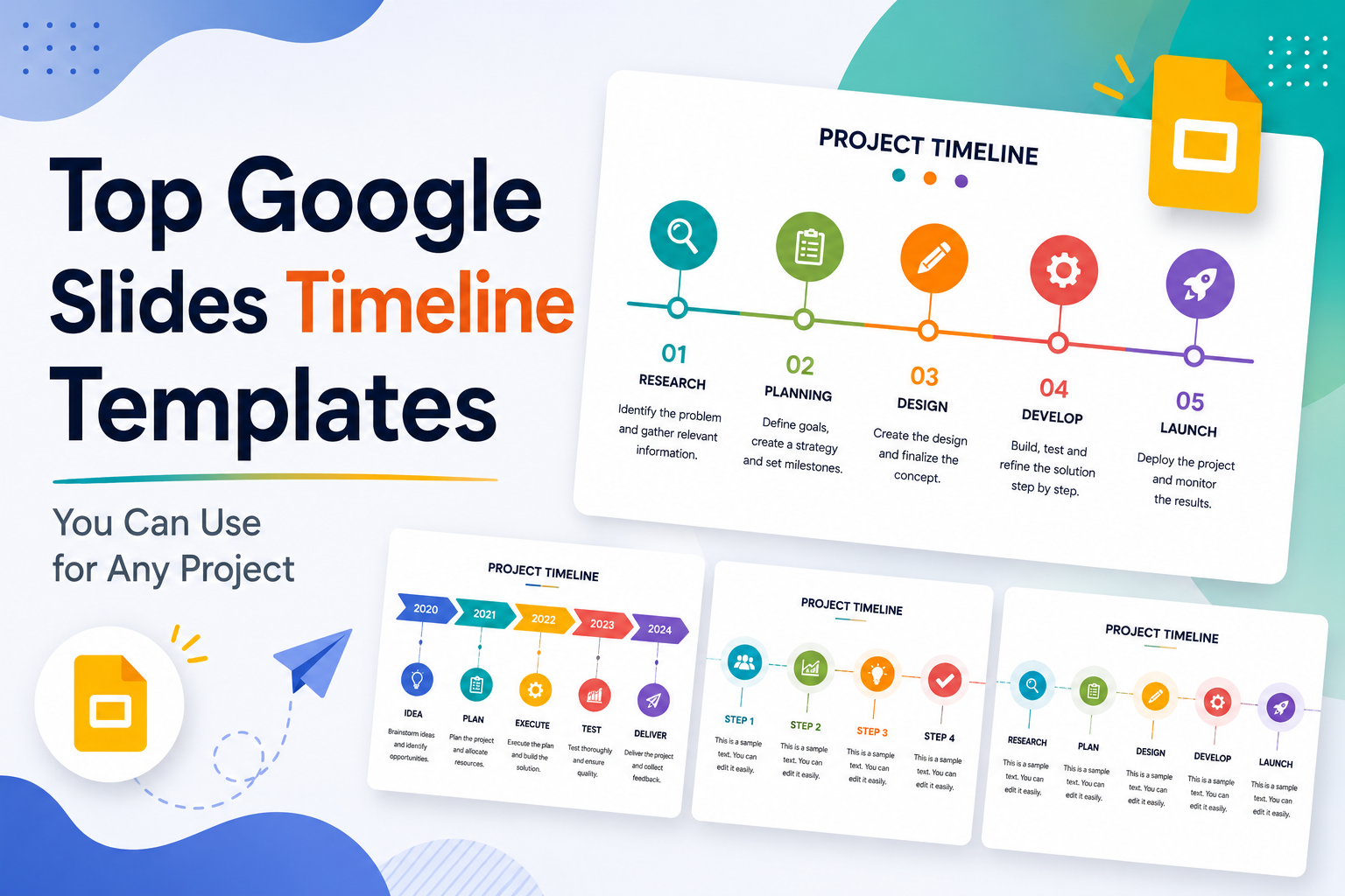
Top Google Slides Timeline Templates You Can Use for Any Project
Every project tells a story, and timelines are how you tell it visually. Whether you are pitching a product launch to stakeholders, walking students through a historical sequence, or mapping out a multi-phase marketing campaign, the right timeline slide can do more communicative work than three paragraphs of text ever could. The problem most people…