
Build a PowerPoint Bubble Chart in Minutes


A bubble chart in PowerPoint is one of the most effective ways to show three variables in a single visual without cluttering your slide. At SlidesDepot, we build a lot of data driven templates, and bubble charts consistently come up as a request from users who need to compare performance, market position, or scale across multiple factors at once. This guide walks through what a bubble chart is, when to use one, and exactly how to build one in PowerPoint.
What Is a Bubble Chart in PowerPoint
A bubble chart is a variation of a scatter chart that adds a third dimension through size. The X-axis and Y-axis plot two numeric values as usual, and the size of each bubble represents a third value. Some presenters also use color to add a fourth layer, such as grouping bubbles by category or region.
For example, you might plot customer acquisition cost on the X-axis, customer lifetime value on the Y-axis, and use bubble size to show total revenue per segment. In one view, your audience sees cost, value, and scale together instead of flipping between three separate charts.
When to Use a Bubble Chart in PowerPoint
Bubble charts work best when you need to compare multiple items across more than two dimensions. They are common in:
Portfolio reviews, where you compare products or business units by growth, profitability, and size Market analysis, where you plot competitors by price, market share, and customer satisfaction Risk assessments, where impact, likelihood, and cost all matter at once
If you only have two variables to compare, a standard scatter or column chart will usually communicate the point more clearly. Save the bubble chart for situations where the third variable genuinely changes how the audience should interpret the data.
How to Create a Bubble Chart in PowerPoint Step by Step
Step 1: Insert the Chart
Go to the Insert tab, select Chart, then choose XY (Scatter) from the chart list. Within that category, pick Bubble or 3-D Bubble. PowerPoint will drop in a placeholder chart along with a linked worksheet.
Step 2: Enter Your Data
Each row in the worksheet becomes one bubble on your slide. Set up your columns like this:
Column A holds your X-axis values Column B holds your Y-axis values Column C holds the value that controls bubble size
Replace the sample numbers with your own data, and the chart on your slide will update automatically as you type.
Step 3: Label Your Axes
Click on the chart, then use the Chart Elements button to add axis titles. Without labels, a bubble chart is nearly impossible to interpret correctly, so this step is not optional. Keep the axis scales proportional to each other where possible so differences between bubbles are easy to read at a glance.
Step 4: Adjust Bubble Size
Right click on any bubble and choose Format Data Series to control how bubble size scales across your dataset. If your smallest and largest values are far apart, adjust the scale so no single bubble overwhelms the rest of the chart.
Step 5: Add Color and a Legend
If you are using color to represent categories, keep your palette limited to three or four colors so the chart stays readable. Add a legend so viewers immediately know what each color represents, rather than making them guess.
Step 6: Label Key Bubbles Only
Avoid labeling every single bubble on the chart. Instead, add data labels to the bubbles that matter most, such as top performers or clear outliers. This keeps the visual clean and directs attention where it counts.
Design Tips for a Cleaner Bubble Chart in PowerPoint
A few small adjustments go a long way toward making your bubble chart easier to read on a projector or screen share.
Remove or soften gridlines so the bubbles remain the focal point of the slide Match your chart fonts to the rest of your presentation for a consistent look Add a short text callout near your most important bubble to explain why it matters Test your chart at actual presentation size, since small bubbles can disappear on a projector even if they look fine on your laptop screen
Common Mistakes to Avoid
The most frequent issue with bubble charts is unclear sizing. If viewers do not know what the bubble size represents, the chart loses most of its value. Always state directly, either on the slide or out loud, what each axis and the bubble size represent.
Overcrowding is another common problem. If you have more than a dozen or so data points, consider filtering down to the most relevant ones or breaking the data into two separate charts.
Finally, be careful about using a bubble chart just because it looks sophisticated. If a bar chart or table would communicate your point faster and more clearly, use that instead.
Save Time With Ready-Made Bubble Chart Templates
Building a bubble chart from scratch works well when you have unique data, but if you are short on time, SlidesDepot offers PowerPoint templates with pre-formatted bubble layouts, color palettes, and slide structures already in place. You can drop in your own numbers and skip the formatting work entirely.
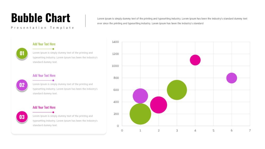
Bubble Chart Data Visualization Template A dual-column PowerPoint layout that pairs a colorful, editable bubble chart with numbered text sections for insights.
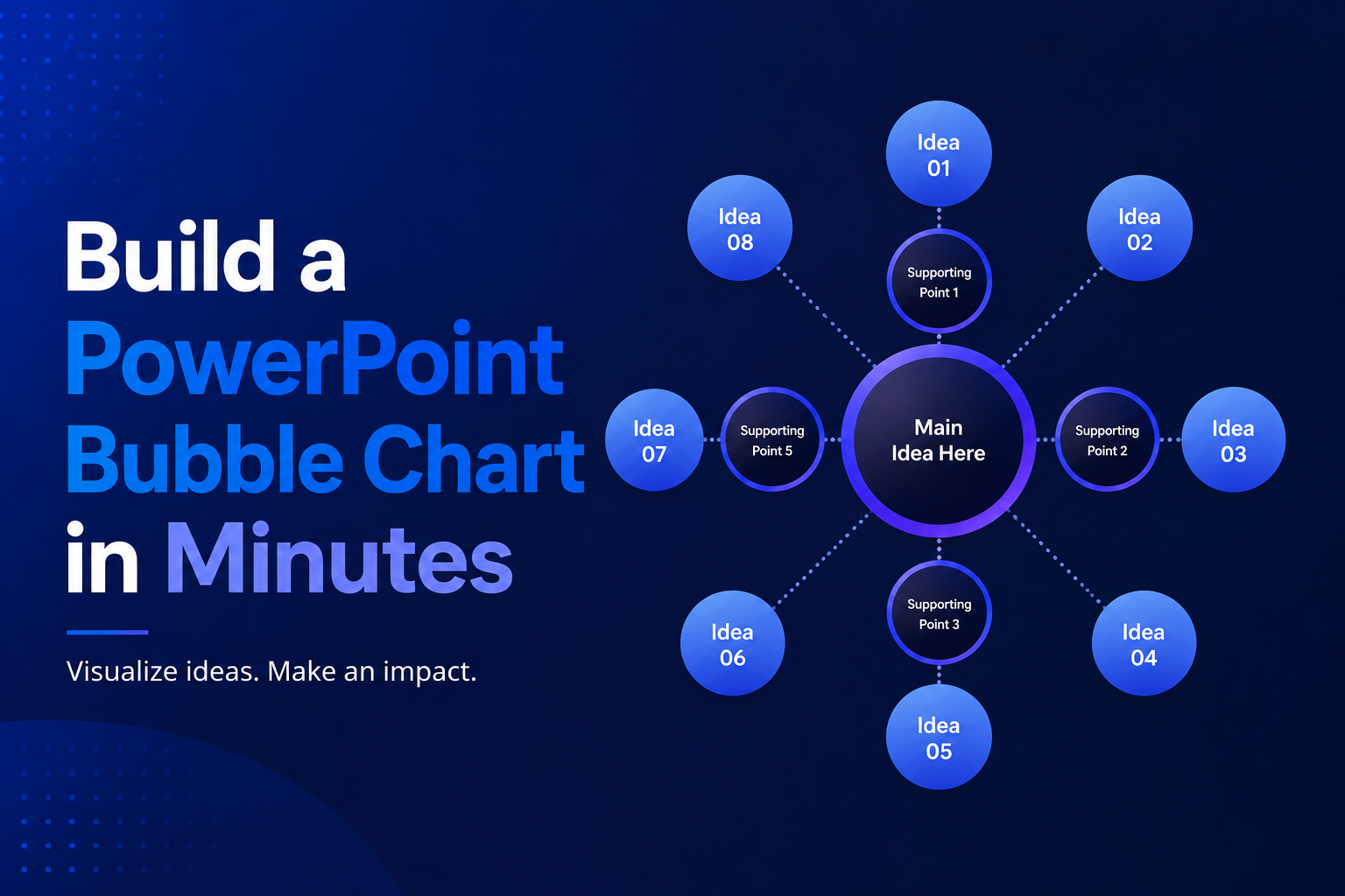
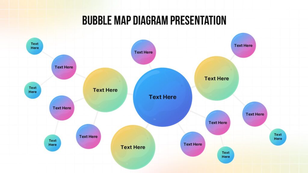
Colorful Bubble Map Diagram Template A central bubble connected to gradient-colored nodes, ideal for brainstorming, concept breakdowns, and idea mapping.
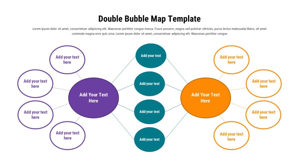
Double Bubble Comparison Map Template A side-by-side bubble layout built for comparing two ideas, products, or strategies while highlighting shared attributes.


How to Duplicate a PowerPoint File on Windows and Mac
How to Duplicate a PowerPoint File on Windows and Mac Anyone who works with slide decks eventually needs a backup copy, a second version for a client, or a fresh file to edit without touching the original. If you have been searching for how to make a copy of a PowerPoint file, the good news…

SlidesDepot vs Slidesgo: Which Template Library Fits Your Next Presentation?
If you’ve ever searched “free PowerPoint templates,” you know the real challenge isn’t finding a template. It is finding the right one without wasting time. Slidesgo and SlidesDepot both show up often in those searches, and both offer solid, editable templates for PowerPoint and Google Slides. They just approach templates in different ways. Slidesgo is…
What Is a Master Slide in PowerPoint? How to Edit It
If you have ever opened a PowerPoint file and wondered why every slide shares the same fonts, colors, and logo placement, the answer is the master slide. At SlidesDepot, we get asked about this feature almost every week, because it is one of the most misunderstood tools in PowerPoint, yet one of the most powerful….