What Is a Bar Graph Used For? 10 Bar Graph Examples Across Industries
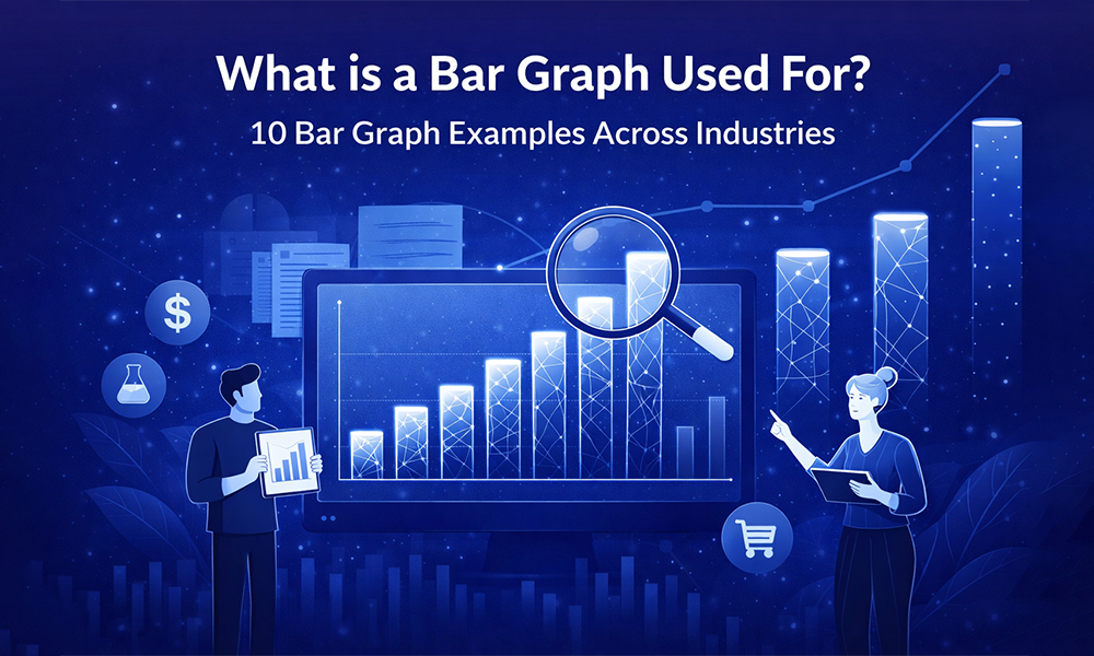
Every business runs on data, but data alone does not persuade anyone. When you are presenting to stakeholders, pitching a strategy, or reporting on quarterly performance, your audience needs to understand your numbers quickly and confidently. That is exactly why knowing what is a bar graph is one of the most practical skills you can develop as a professional communicator.
A bar graph translates raw numbers into a visual comparison your audience can absorb in seconds. The moment you replace a column of figures with a well-structured chart, you shift the conversation from “what does this mean?” to “what should we do about it?” Presenting that chart inside clean business presentation templates takes that clarity one step further by ensuring your design reinforces your message rather than competing with it.
This guide walks you through the fundamentals of bar graphs, shows you ten real-world examples across major industries, and explains the design principles that turn a basic chart into a genuinely persuasive visual.
What Is a Bar Graph and How Does It Work?
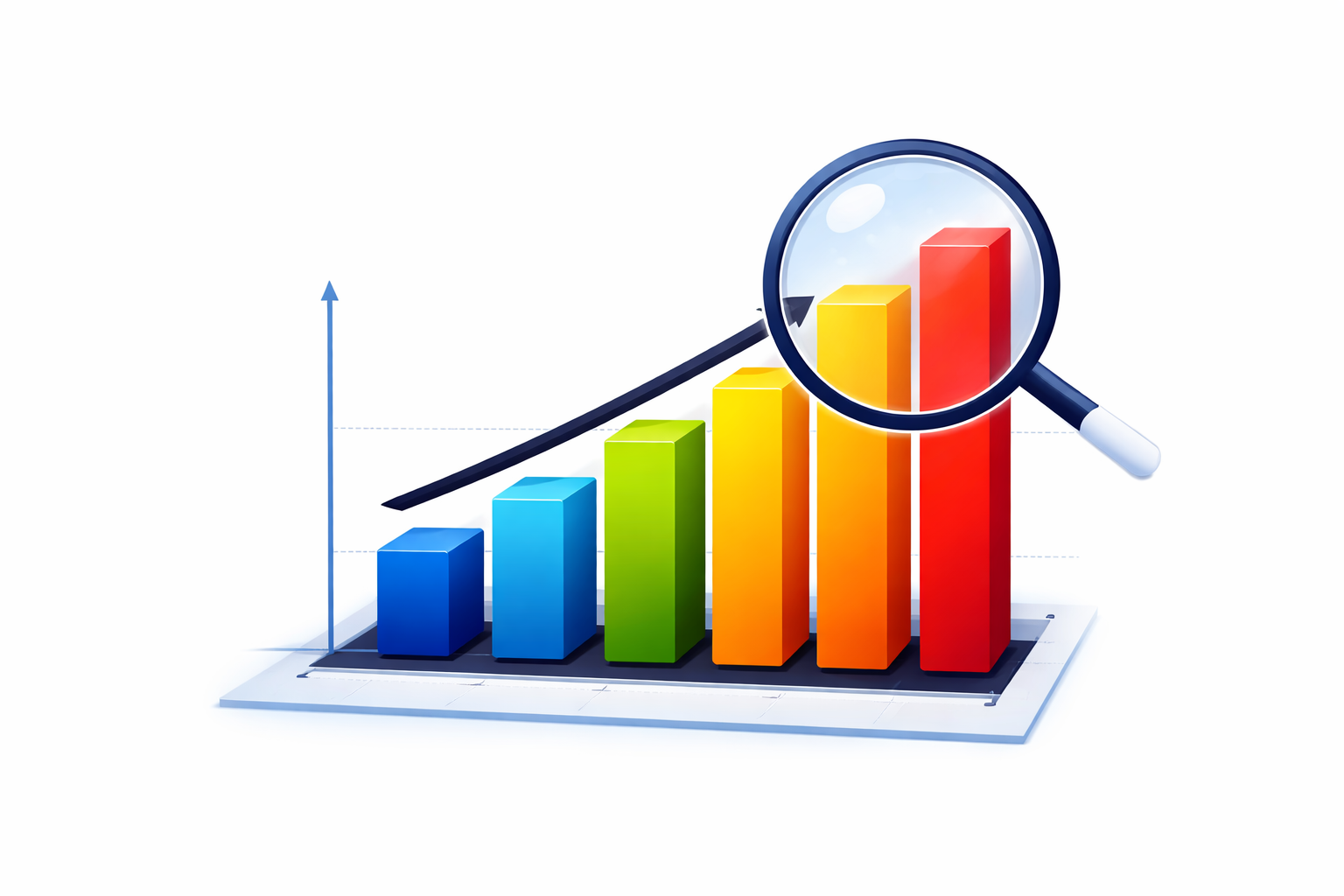
A bar graph is a chart that uses rectangular bars to represent data. The length or height of each bar corresponds directly to the value it represents, making it easy for your audience to compare quantities across categories without any additional explanation.
One axis of the chart displays the categories being compared, such as departments, time periods, regions, or product lines. The other axis represents a measurable value like revenue, percentages, headcount, or units sold. This straightforward structure is what makes the bar graph the default choice for any situation where your core question is: which of these is larger, smaller, or growing?
There are three formats you will use most often in professional settings. Vertical bar graphs are best for comparing a small number of categories or tracking change over short time periods. Horizontal bar graphs work better when your category names are long or when you have many items to display side by side. Stacked bar graphs combine a total value with its internal breakdown in a single view, giving you and your audience a two-in-one picture without adding a second chart to your slide.
One rule applies to all three formats without exception. Your value axis must always start at zero. Starting at any other number distorts the visual proportions of your bars and can mislead your audience about the actual size of differences in the data.
10 Bar Graph Examples Across Major Industries
The real strength of a bar graph is how naturally it fits into almost every professional context. The following ten examples show how different industries use this chart type to answer specific business questions clearly and efficiently.
In finance, teams use grouped bar charts to compare actual departmental spending against the approved budget. Each department gets a pair of bars, one for budgeted and one for actual, so overruns become visible immediately without requiring anyone to calculate the difference themselves.
In marketing, a vertical bar chart comparing lead volume across channels such as paid search, social media, and email tells you precisely where your investment is generating the strongest return. This kind of evidence makes budget conversations far more productive. Presenting this data inside strategy presentation templates gives it the professional framing senior stakeholders expect.
Human resources teams rely on horizontal bar graphs to share employee engagement survey results across departments. Horizontal orientation works particularly well here because department names tend to be long, and the layout accommodates them without forcing cramped or rotated text.
In sales, a stacked bar graph showing total monthly revenue alongside the contribution of each product line gives leadership a clear view of both overall performance and individual product momentum in a single visual. This format is a staple in annual planning sessions where product mix decisions are on the table.
Healthcare administrators use bar charts to compare how frequently specific diagnoses appear across different age groups. The visual supports resource allocation decisions, including how many specialist staff to hire and which wards need additional capacity.
Manufacturing quality managers plot defect rates across morning, afternoon, and night production shifts. A spike in one shift points immediately to a training issue, a supervision gap, or a machine calibration problem that would be invisible in a raw data table.
In education, school boards and district administrators use bar charts to compare standardized test scores across schools over multiple years. This makes it straightforward to evaluate whether specific programs and initiatives are producing measurable improvements.
Logistics operations teams chart on-time delivery rates by carrier. A consistently short bar for one partner signals a performance issue that warrants a contract conversation before delays begin affecting customers.
Retail store managers use bar graphs to map customer foot traffic by hour throughout the day. This pattern guides part-time staffing decisions, ensuring coverage is strongest during peak periods without overstaffing during quieter hours.
Real estate analysts chart active listings against closed sales by neighborhood. A high listing count paired with low sales volume signals an oversupplied market, giving buyers negotiating power and helping sellers set realistic expectations on both price and timeline.
Choosing the Right Bar Graph Orientation
Selecting between vertical and horizontal bars is a functional decision that directly affects how easily your audience reads your chart. Getting this right is a small choice with a noticeable impact on how professional your slides feel.
Use vertical bars when you are working with five or fewer categories, when your labels are short, or when you are showing how a value changes across time intervals. The vertical format reads naturally as a ranking, drawing the eye upward to the tallest bar first.
Use horizontal bars when your category labels are long and descriptive, when you have six or more categories to display, or when the chart will be viewed on a screen from a distance. Rotating long labels beneath vertical bars creates visual clutter that forces your audience to work harder than they should. Applying this logic consistently across your deck with Google Slides templates that already account for label spacing will make every chart feel deliberate and easy to read.
Design Principles That Make Bar Graphs Work Harder for You
Knowing what is a bar graph is only the starting point. Knowing how to design one that actually moves an audience is what separates a functional chart from a persuasive one.
Color should always carry a specific purpose. Highlight the bar that holds your key message using a bold, high-contrast color and keep every other bar in a neutral tone like light grey. This approach, known as visual weight, guides your audience’s attention without requiring a text annotation. Using a different color for every bar adds visual noise without adding analytical value, so reserve color variation for situations where it represents a meaningful distinction in the data.
Consistency across your entire presentation builds credibility with your audience in ways they may not consciously notice. Your fonts, line weights, and label sizes should match every other slide in your deck. When you work from PowerPoint templates with a unified design system, that consistency is built in from the start rather than something you have to recreate manually for every chart.
Flat, two-dimensional designs are always the right choice for data charts. Three-dimensional effects, gradient fills, and decorative backgrounds make it genuinely difficult to identify where the top of a bar aligns with the gridline. They create visual ambiguity where you need precision. Keep your axis titles specific and your data labels large enough to read from a presentation screen. If your chart feels crowded, removing individual data labels and relying on the axis and gridlines instead will give you a cleaner, more authoritative result of the kind seen in professional sales proposal templates.
Take Your Data Visualization Further with SlidesDepot
Once you understand bar graphs and the principles behind effective chart design, the natural next step is applying that knowledge inside a presentation framework that matches the quality of your data. SlidesDepot offers a comprehensive library of professionally designed, fully editable templates in PowerPoint and Google Slides, ready to customize with your content, colors, and branding in minutes.
Every chart and dashboard in the SlidesDepot collection uses clean layouts, consistent color schemes, and properly structured axes by default. You do not need a design background to produce visuals that look polished and credible. Whether you are building training presentation templates for an internal program or assembling a detailed investor report, the design foundation is already in place so you can stay focused on your analysis.
SlidesDepot is built for professionals who want their data to make an impression without spending hours on formatting. The templates are a time-saving, quality-lifting solution that scales from individual presentations to consistent output across entire teams and departments.
Conclusion
Understanding what is a bar graph gives you a reliable foundation for communicating data clearly in any professional setting. From finance and healthcare to retail and logistics, this chart type answers comparison questions faster and more intuitively than any alternative format.
The gap between a basic chart and a genuinely persuasive one comes down to the design choices you make around it. Start your axis at zero, use color with intention, eliminate decorative clutter, and keep your styling consistent across every slide. Apply those principles to every chart you build and your data will do exactly what it is supposed to do: inform, persuade, and drive action.
Explore the full SlidesDepot template collection

PPT Meaning: Beginner Guide + Free PPT Templates from SlidesDepot
If you’ve ever been asked to create a PPT for school, college, or work, you might wonder what exactly PPT means. For beginners, this confusion is common, especially if you’re new to presentations or digital tools. Understanding the PPT meaning is the first step toward creating clear, organized, and professional presentations. This beginner-friendly guide explains what PPT is, how…

How to Add Audio to Google Slides (Step-by-Step Guide)
How to insert audio into google slides Want to make your presentation more engaging? Adding audio to your slides – whether it’s a voiceover narration, background music, or a sound effect – can turn a flat deck into a memorable experience. In this guide, the SlidesDepot team walks you through exactly how to add audio to Google Slides, step…
How to Convert Canva Presentations to Google Slides in Minutes (2026 Guide)
You spent hours building a beautiful presentation in Canva. The fonts are on point, the colors match your brand, and the layout looks exactly how you imagined it. Then someone asks for the file in Google Slides format, and suddenly the whole process feels far more complicated than it should be. This is a frustration…