
Uncategorized

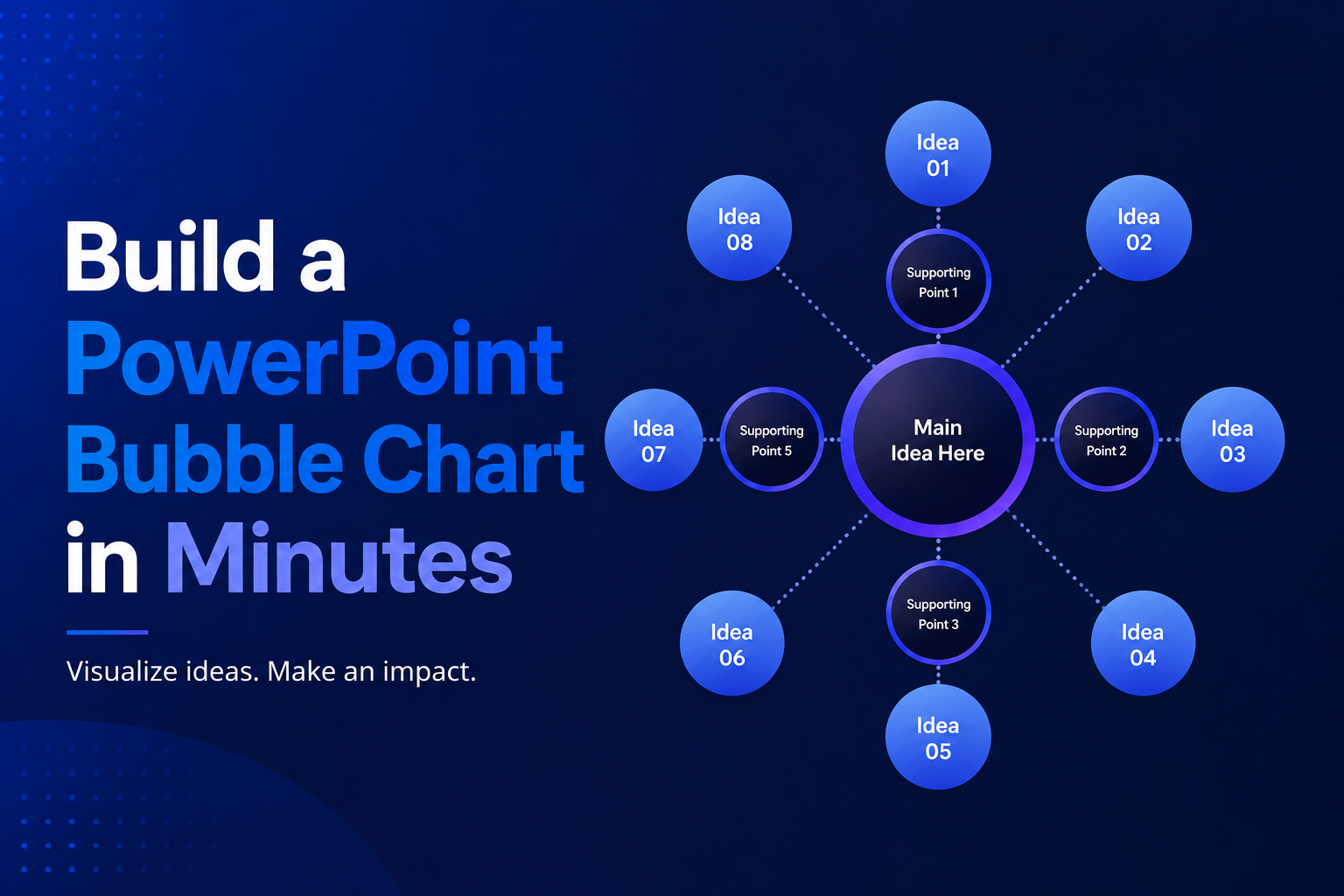
Build a PowerPoint Bubble Chart in Minutes
A bubble chart in PowerPoint is one of the most effective ways to show three variables in a single visual without cluttering your slide. At SlidesDepot, we build a lot of data driven templates, and bubble charts consistently come up as a request from users who need to compare performance, market position, or scale across…

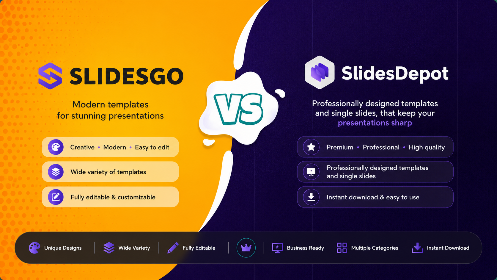
SlidesDepot vs Slidesgo: Which Template Library Fits Your Next Presentation?
If you’ve ever searched “free PowerPoint templates,” you know the real challenge isn’t finding a template. It is finding the right one without wasting time. Slidesgo and SlidesDepot both show up often in those searches, and both offer solid, editable templates for PowerPoint and Google Slides. They just approach templates in different ways. Slidesgo is…
How to Duplicate a PowerPoint File on Windows and Mac
How to Duplicate a PowerPoint File on Windows and Mac Anyone who works with slide decks eventually needs a backup copy, a second version for a client, or a fresh file to edit without touching the original. If you have been searching for how to make a copy of a PowerPoint file, the good news…