


P&L Dashboard PowerPoint & Google Slides Templates
P&L Dashboard Template Financial Overview Slide
What You Get
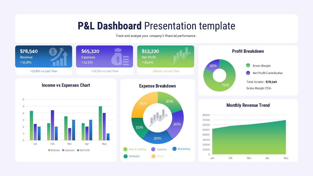
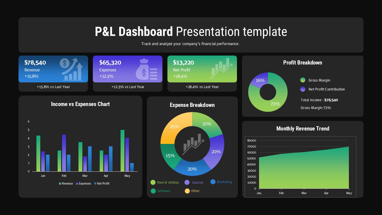
Open the file and you immediately see the title box at the top. This is where you put your ‘P&L Dashboard Presentation Template’ title. Below it sits a subtitle for your purpose. Then there are three coloured KPI rectangles. One for revenue, one for expenses, and one for net profit.
Each rectangle shows a large value and a percentage change. There are four data visualizations in the main body. You have a bar chart to compare income versus expenses. A donut chart shows the profit breakdown. A pie chart displays the expense breakdown by category. Finally, an area chart plots the monthly revenue trend. Everything is organized on a clean light grey background.
How to Edit It
Editing is very straightforward. First, you just type over the title and subtitle. Change them to fit your business name and reporting period. Then you click into the data tables powering the charts. Update the numbers with your own P&L data for the last few months.
Each text label in the KPI boxes is editable. You can also swap out the existing icons for different ones if you need a different visual focus. The charts will automatically redraw based on the data you enter. You can also click the shapes and recolour them to match your own brand palette using the colour picker.
When to Pull It Out
Pull this one out for your quarterly financial review. It’s perfect for quickly showing the board or leadership team where the company stands. This is ideal when you need to explain the latest quarter’s P&L figures. You might also use it during an annual planning meeting to review performance trends from the previous year. It saves you making multiple complex charts from scratch.
What’s Inside
KPI Rectangles: track key financial figures and period-over-period changes
Income vs Expenses Chart: compare major cash flows visually over time
Donut Chart: illustrate gross margin and net profit contribution percentages
Pie Chart: break down expenses into actionable categories like salaries or marketing
Why It Actually Works
- Keeps all critical financial views on one concise slide.
- Data visualizations remove the need to read dense tables of numbers.
- Pre-built structures mean you only update numbers not create layouts.
- Clear colour-coding makes comparisons fast and intuitive for the audience.
Who Reaches for This
Financial Analysts and CFOs reach for this when they are preparing their monthly or quarterly reports for stakeholders. A Marketing Director might use the expense breakdown section to justify their budget request. Small Business Owners and Startup Founders also grab this slide to track their financial performance without needing an internal finance team to build reports. Project Managers who are tracking their own project budgets find it useful for showing current P&L.
Login to download this file


