


Donut Chart PowerPoint & Google Slides Templates


Professional Donut Chart Template for Data-Driven Presentations
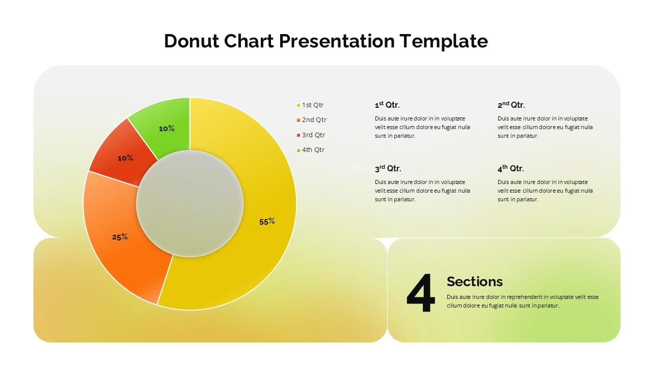
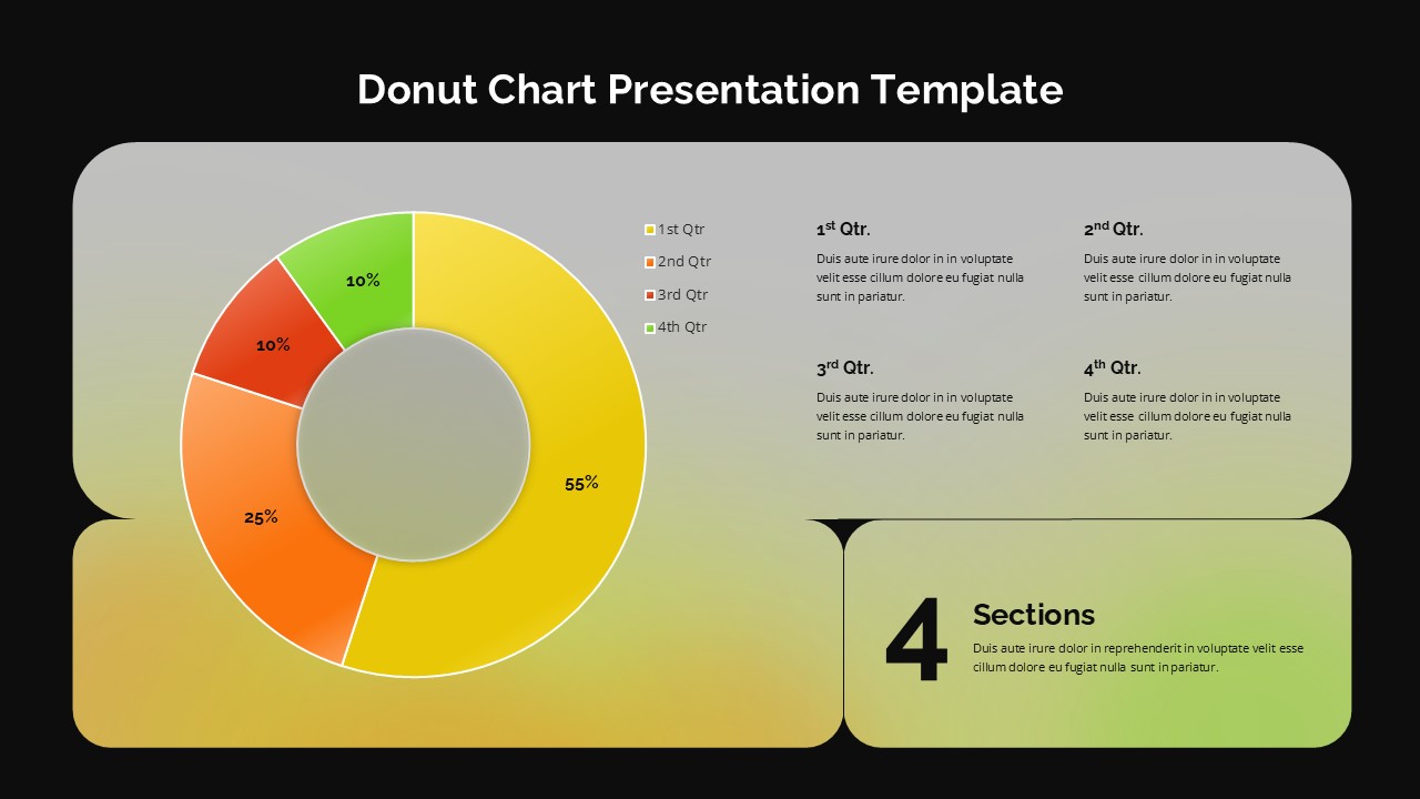
Presenting complex percentages doesn’t have to be overwhelming. This Donut Chart Template for PowerPoint and Google Slides offers a modern, high-impact alternative to traditional data visualizations. Designed for clarity and executive-level polish, this template allows you to transform raw quarterly results and financial metrics into a compelling visual narrative that your audience can grasp in seconds.
High-Impact Features for Professional Decks
4-Segment Radial Layout: Features a vibrant, color-coded donut chart pre-set for four distinct data points, perfect for quarterly performance or market share distributions.
Dual-Theme Versatility: Includes both Light and Dark mode variations, ensuring your data remains crisp and legible in any presentation environment—from bright conference rooms to high-contrast digital displays.
Structured Narrative Grid: Four dedicated text placeholders are arranged in an organized grid, allowing you to pair your percentage-based data with detailed qualitative explanations.
Fully Editable Vector Shapes: Every segment, color, and text box is a native vector element. You can easily adjust the percentages and match the palette to your corporate branding with just a few clicks.
Strategic Use Cases & Industry Applications
This percentage distribution infographic is a versatile asset for any professional who needs to justify data-driven decisions:
Financial Analysts: Break down annual budget allocations or expense distributions with precision.
Marketing Managers: Visualize channel-specific ROI or customer demographic segments.
Project Leads: Track KPI progress and task completion statuses across four distinct phases or departments.
Sales Directors: Present regional sales contributions or quarterly revenue growth targets.
Why Choose This Data Visualization Tool?
Beyond its clean, modern aesthetics, this circular data chart uses a “hub-and-spoke” information hierarchy. By placing the core data at the center and the supporting context to the right, you guide your audience’s eye through a logical story.
Login to download this file


