


Free Effective Horizontal Bar Graph PowerPoint & Google Slides Templates


Free Effective Horizontal Bar Graph
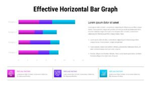
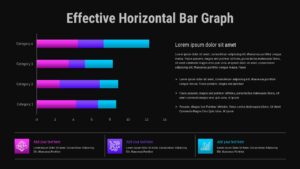
This Free Effective Horizontal Bar Graph provides a clean and structured layout for displaying long category names and complex comparisons without cluttering your digital workspace. It is designed specifically for business analysts and project managers who need to deliver clear status updates to stakeholders during a data-driven strategy session. The horizontal orientation allows for a natural left-to-right reading flow, ensuring that the viewer can quickly assess the relative length of different data segments across multiple variables. This layout helps you transform abstract numbers into a proportional narrative that highlights both strengths and gaps in performance at a single glance.
The file contains four distinct horizontal bars, each utilizing a high-contrast palette of magenta, blue, and cyan to represent segmented data components. By placing the graphic on the left and dedicated descriptive text on the right, the slide maintains a perfect visual balance between quantitative and qualitative information. Because this is a vector-based design for PowerPoint and Google Slides, you can easily adjust the segment lengths or swap the color scheme to align with your specific corporate identity. The addition of three icon-based text boxes at the bottom provides an organized space for highlighting final conclusions or supporting metrics.
This tool works best during quarterly sales reviews where different advertising channels need to be compared over a specific period. It is also an ideal fit for financial literacy seminars that require a visual breakdown of budget allocations across various departments. Project leads often reach for this format when tracking the progress of different work streams against a shared numerical scale. By utilizing this 16 by 9 aspect ratio presentation template, you save hours of manual alignment time while delivering a professional, comparative analysis to your audience. Using this professional bar chart simplifies complex findings into an easily digestible format for effective organizational decision-making.
Login to download this file


