
Types of Charts in Presentations: How to Choose the Right Chart
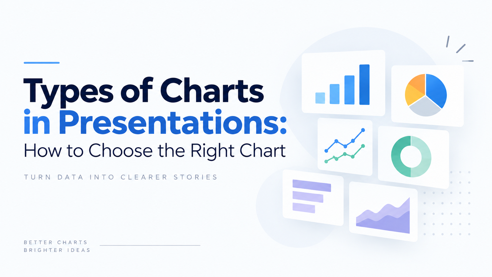


Picking the right chart type for presentations is one of those decisions that quietly determines whether a slide gets understood in five seconds or gets skipped entirely. At SlidesDepot, we build and study presentation templates every day, and the pattern is always the same: decks fail not because the data is weak, but because the wrong chart was asked to carry it. This guide walks through the main types of charts used in presentations, explains what each one is actually good at, and gives you a simple way to choose the right chart between them.
Why Chart Selection Matters More Than Chart Design
Most people jump straight to formatting: colors, fonts, gridlines. But formatting can’t fix a chart that was the wrong choice to begin with. A pie chart with ten slices, a line connecting categories that have no real sequence, a bar chart with a chopped-off axis, these are reasoning problems wearing a design costume.
Before opening any software, it helps to write down the point you want the slide to make, in one plain sentence. “Sales grew steadily in the Southeast while the Midwest stalled” points you toward a line or column chart. “Marketing spend broke down almost evenly across four channels” points you toward a composition chart. The sentence does most of the selection work before you ever touch a chart gallery.
Comparison Charts: Showing Which Is Bigger
Comparison charts answer “which one is bigger, and by how much.” They’re the workhorse of business presentations because so many business questions boil down to a ranking.
Bar and column charts are the safest default. Columns run vertically and suit short labels or time periods; bars run horizontally and handle long category names without forcing anyone to tilt their head. Length is one of the easiest things for the human eye to judge accurately, which is why this format rarely misleads.
Grouped bar charts let you compare two dimensions side by side, but they lose clarity past three or four series. Stacked bar charts show both a total and its internal makeup, though only the bottom segment sits on a shared baseline, so mid-stack comparisons are approximate at best.
Radar charts plot several variables around a central point and are useful for comparing profiles, like competitor capabilities or skill assessments, where the overall shape matters more than exact numbers.
Composition Charts: Showing Parts of a Whole
Composition charts answer “how does this break down.” The pie chart is the most familiar tool here, and also the most overused.
A pie or donut chart works fine with two or three segments where one clearly dominates. Past four or five slices, the eye can no longer judge the angles reliably, and the chart stops informing and starts decorating.
Treemaps solve that limitation by nesting rectangles sized to value, which handles dozens of categories at once, ideal for product portfolios or budget breakdowns.
Stacked area charts track composition as it shifts over time, combining a trend view with a part-to-whole view. Waterfall charts explain how a starting number becomes an ending number through a sequence of gains and losses, which is the standard format for finance teams bridging revenue or cost movements.
Funnel charts show conversion across sequential stages, most often in sales or marketing pipelines, where the drop-off between stages is the entire point of the visual.
Distribution Charts: Showing How Values Spread
Distribution charts answer “how spread out is this,” and they show up far less often in business decks than they should. An average can hide a lot of variance, and variance is frequently where the real story lives.
Histograms group continuous data into bins and reveal whether a distribution is even, skewed, or has two peaks. Box plots summarize a distribution’s median, quartiles, and outliers, and they’re compact enough to compare several groups on one slide.
Scatter plots place individual data points on two axes, exposing clusters, outliers, and correlation. Bubble charts add a third variable as marker size, useful for portfolio positioning, though bubble area is judged imprecisely and shouldn’t carry your main comparison.
Trend Charts: Showing Change Over Time
Trend charts answer “what happened over time,” and because time is continuous and ordered, connecting the points with a line makes sense here in a way it doesn’t for categories.
The line chart is the standard choice. It handles long time spans well and can carry four or five series before becoming cluttered. Area charts fill the space below the line to emphasize accumulated volume rather than pace of change.
Gantt charts map tasks against a timeline, showing duration, sequence, and overlap, and remain the most recognized format for project scheduling. For milestone-based timelines where duration matters less than order, a simpler timeline visual often communicates faster.
Relationship Charts: Showing How Things Connect
Relationship charts answer “how are these variables or entities connected,” and they require the clearest narration of any chart family because the audience can’t always decode the connection on their own.
Sankey diagrams show flow between stages, with the width of each band representing volume, suited to budget allocation or customer journey mapping. Heat maps use color intensity across a grid to surface patterns in large datasets, such as activity by day and hour or performance across regions.
How to Choose the Right Chart
A quick framework: identify how many variables you have and what type each one is. One category measured once needs a simple bar chart. Two continuous variables need a scatter plot. A category changing over time needs a line or area chart. A whole broken into parts needs a composition chart.
Then weigh precision against pattern. If the audience needs to act on exact numbers, use a labeled chart or a table. If they need to spot a trend or comparison at a glance, an unlabeled chart with a clean shape reads faster.
Finally, respect how accurately people perceive different encodings. Position and length are read most accurately, followed by angle, then area, then color. That ordering is exactly why bar charts consistently outperform pie charts for anything beyond a handful of segments.
Building Better Charts in Your Slides
A few formatting habits separate a readable chart from a default one. Start value axes at zero on bar charts, since length carries the comparison and a truncated axis exaggerates differences. Remove gridlines unless the audience needs to read exact values off the axis. Label series directly instead of relying on a legend when there are only two or three of them. Stick to one accent color for the point you’re making and mute everything else.
Starting from a professionally designed template also removes most of this work upfront. SlidesDepot’s data and chart template collections come with these formatting choices already built in, so you’re adjusting numbers rather than rebuilding structure from scratch.
Common Chart Selection Mistakes
The same errors show up across industries. Using a pie chart for more than four segments is the most frequent one; a sorted bar chart almost always communicates the same data more clearly. Plotting categorical data as a line chart is a close second, since a line implies a continuity between points that categories don’t actually have.
Truncated axes on bar charts distort comparisons because length is the thing being compared. Overloading a single chart with more than four or five series turns it into visual noise rather than a message. And missing context, an unlabeled axis, an undefined time period, an unstated source, makes even a well-chosen chart impossible for an audience to trust.
Final Thoughts: Choosing the Right Chart Type
Chart selection is a reasoning step, not a formatting step. Write the takeaway as a sentence, count your variables, and decide how much precision your audience actually needs, and the right chart among all the types of charts covered here usually becomes obvious before you open any software. Browse SlidesDepot’s data and chart template library to find pre-built layouts for every chart type covered here, ready to drop your numbers into.


How to Duplicate a PowerPoint File on Windows and Mac
How to Duplicate a PowerPoint File on Windows and Mac Anyone who works with slide decks eventually needs a backup copy, a second version for a client, or a fresh file to edit without touching the original. If you have been searching for how to make a copy of a PowerPoint file, the good news…
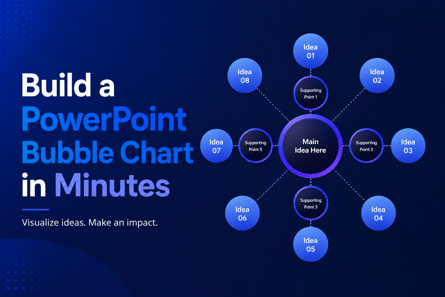
Build a PowerPoint Bubble Chart in Minutes
A bubble chart in PowerPoint is one of the most effective ways to show three variables in a single visual without cluttering your slide. At SlidesDepot, we build a lot of data driven templates, and bubble charts consistently come up as a request from users who need to compare performance, market position, or scale across…
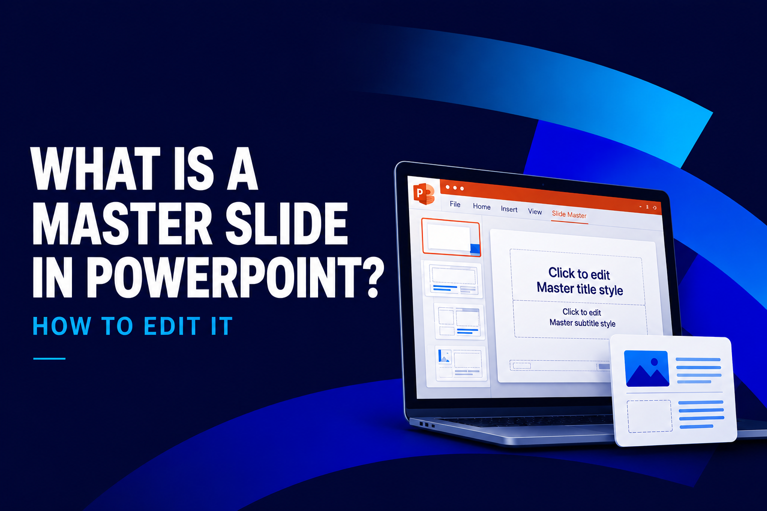
What Is a Master Slide in PowerPoint? How to Edit It
If you have ever opened a PowerPoint file and wondered why every slide shares the same fonts, colors, and logo placement, the answer is the master slide. At SlidesDepot, we get asked about this feature almost every week, because it is one of the most misunderstood tools in PowerPoint, yet one of the most powerful….