

Current vs Future State Process Comparison Presentation Template
Current State vs Future State Comparison Template for PowerPoint & Google Slides
There’s a specific kind of meeting where someone puts up a slide that’s supposed to explain a transformation – a new process, a restructuring, a digital overhaul – and instead of clarity, you get a wall of bullet points that nobody reads and a room full of people nodding without actually understanding what’s changing or why it matters. This Current vs Future State comparison template exists as a solution for that exact problem.
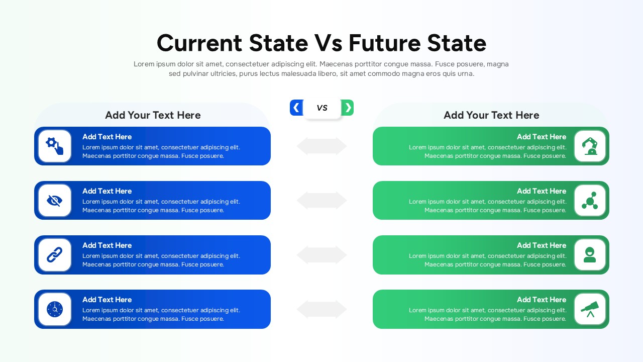
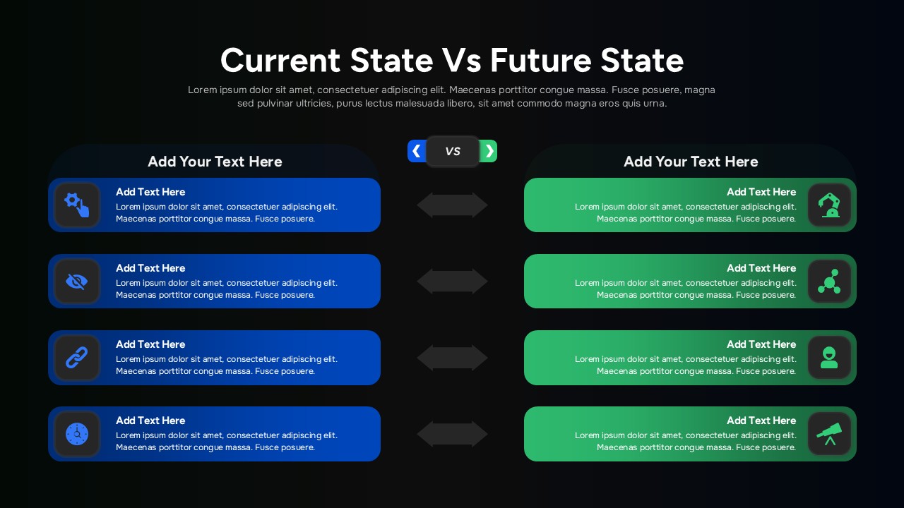
The layout is simple in the way that actually useful things tend to be: two columns, side by side. Blue on the left for where things stand now. Green on the right for where they’re going. A sequence of arrows running between them that doesn’t need a label to communicate “this is the direction of travel.” You read it in about three seconds, and then you’re already thinking about the content – which is exactly what should happen. Each row pairs an icon-anchored block on the current state side with a corresponding block on the future state side. So when you’re describing a slow approval process that’s about to become automated, or a siloed team structure that’s about to become integrated, the contrast lives in the layout itself. You’re not asking your audience to hold two things in their head at once. You’re showing them.
The design of the Current vs Future State is modern without being decorative about it. Rounded containers, subtle gradients, clean iconography – the kind of choices that make a slide feel considered without drawing attention to themselves. (There’s a version of “well-designed” that just means busy. This isn’t that.) The text areas are generous enough to handle real explanation, which matters if you’re presenting anything with actual complexity behind it.
Editability and Use cases of Current vs Future State template
And because it’s fully editable – shapes, icons, colors, row count – you can fit it to your context rather than fitting your content to a template. If your brand is not blue and green, it won’t be. If you need five comparison rows instead of three, you can have them.
This works well for transformation roadmaps, process redesign proposals, operational improvement cases, digital strategy presentations. It works well in leadership reviews and workshops and consulting deliverables. It works for anyone who has ever spent an hour trying to build this kind of slide from scratch and arrived at something that looked worse than what they started with – which, if you’ve done it, you know is a specific kind of frustrating.
Login to download this file


