


Bubble Chart Data Visualization Presentation Template for PowerPoint & Google Slides


Bubble Chart Analytics and Insights Presentation Template
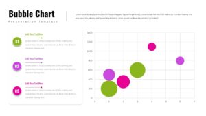
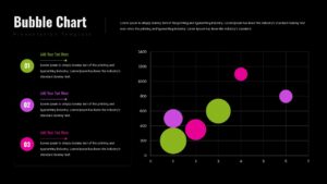
This Bubble Chart Presentation Template provides a clear and engaging way to visualize multidimensional data using bubble size, position, and color. The layout features a clean dual-column structure: descriptive numbered sections on the left and a large chart on the right, offering a balanced blend of narrative explanation and visual analytics. Each numbered block includes editable titles and text placeholders, allowing you to break down insights, summarize findings, or highlight comparisons with clarity.
The vibrant bubble chart uses varying colors and sizes to differentiate data points, making trends, correlations, and value clusters easy to spot at a glance. This presentation template is designed with a modern aesthetic—soft shadows, clean typography, and subtle gridlines—to maintain a professional look suitable for business reports, dashboards, marketing analyses, and project reviews.
Whether you’re presenting performance metrics, market segmentation, financial indicators, or research findings, this presentation template helps transform complex datasets into an accessible, visually appealing story. Its flexible structure supports customization for diverse industries and ensures your audience stays focused on the insights that matter most.
Features of this Bubble Chart template
• Large, easy-to-read bubble chart with customizable data points.
• Three editable numbered sections for explanations or key takeaways.
• Clean grid layout and modern typography for professional presentations.
• Fully editable colors, chart elements, shapes, and text.
• Optimized for PowerPoint and Google Slides with flexible formatting options.
Why use this Bubble Chart template
• Clearly presents multidimensional data in a visually compelling format.
• Helps audiences understand correlations, trends, and value distributions quickly.
• Saves time with a ready-made analytical layout ideal for reports and dashboards.
• Supports storytelling by combining narrative elements with data visualization.
Who is it for
Business analysts, marketing teams, data specialists, project managers, consultants, educators, and anyone presenting data-driven insights or performance metrics.
Login to download this file


