


9×3 Multi-Level Circular Diagram Template for PowerPoint & Google Slides
Multi-Level 9×3 Circular Process Diagram Presentation Template
Most diagrams lie. They look organized while hiding the fact that whoever made them couldn’t figure out how to show the relationship between the pieces. You end up with a flowchart that’s really just a list, or a circle that’s really just decoration.
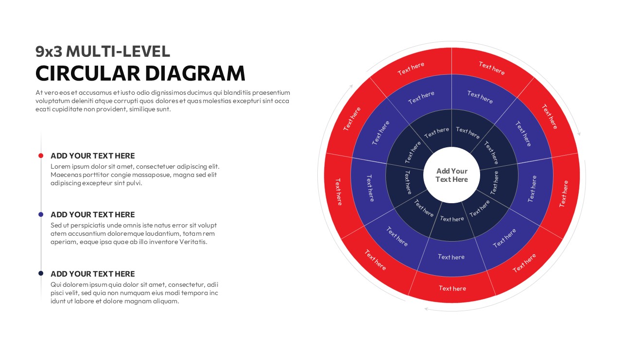
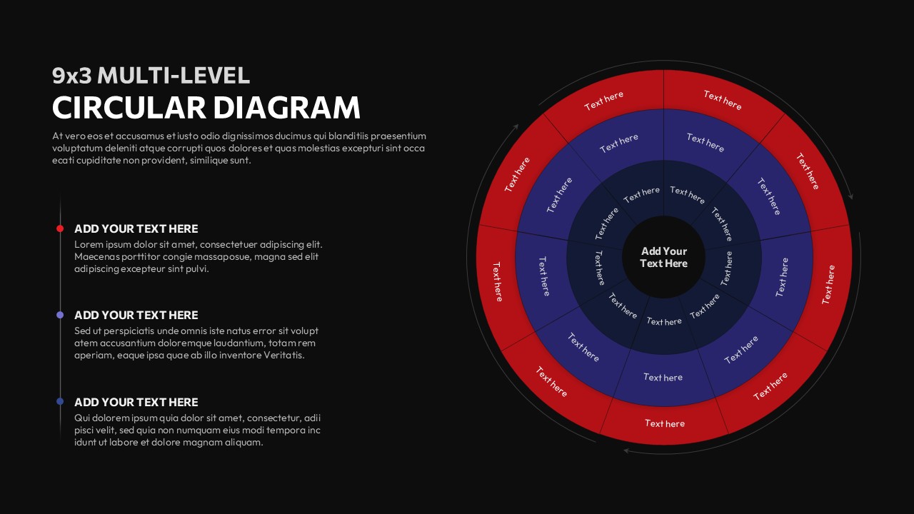
This Multi-Level Circular Diagram actually works and the reason is structural, not cosmetic. Three concentric rings, nine segments each, twenty-seven addressable areas total. That sounds like a lot until you’re the person standing in front of a room trying to explain a product ecosystem, or a strategic framework with nested dependencies, or a process that loops back on itself in ways a linear slide simply cannot capture. Then twenty-seven positions feel like exactly enough.
The centre holds your core concept whatever the whole thing is actually about. The rings expand outward in tiers of increasing detail (which is how complex ideas actually work, if you think about it not as lists, but as layers). The red and blue alternating segments aren’t just visual decoration. They’re doing real work: letting your audience track which tier they’re looking at without needing a legend, a footnote, or a moment of explanation from you.
The accompanying text blocks on the left give you room to let the diagram breathe. You can label a segment and expand on it without crowding the visual which, if you’ve ever tried to cram meaningful annotations onto a circular diagram, you know is the thing that usually breaks the whole layout.
Everything is editable. Shapes, colors, segment labels, text fields swap them into your brand palette, and it stops looking like a template and starts looking like something you designed yourself. (That’s the point. Nobody should be able to tell.)
Where Multi-Level Circular Diagram actually gets used:
Strategic frameworks where you need to show outer context wrapping inner priorities. Product ecosystems where features cluster around a core. Organizational maps. Multi-phase processes where the phases aren’t neatly sequential. Anything where the real structure is concentric – where importance radiates outward, or inward, depending on how you want to tell it.
It’s the kind of diagram that earns its place in a presentation. Not because it looks impressive, but because it makes something genuinely hard to explain – suddenly legible.
Login to download this file


