

Best Color Palettes for Corporate Training Slide Decks: A SlidesDepot Guide



Every industry trains differently, and its slides should look different too. A bank’s compliance refresher and a retail chain’s product launch training should not share the same colors. That is why choosing the best color palettes for corporate training slide decks starts with your industry, your audience, and your delivery format. At Slides Depot, we design training templates for HR teams, L&D managers, and internal trainers, and this guide shares 10 industry-specific palettes with hex codes, the color psychology behind them, and a simple system for applying them across an entire training program.
How Color Affects Learning in Corporate Training Slide Decks
Color is not just decoration in a training deck. It shapes how people feel, where they look, and how much they remember.
Blue supports focus and trust, which is why it dominates corporate and technical training.
Green feels calm and positive, making it useful for wellbeing, sustainability, and “correct practice” examples.
Orange and yellow create energy and draw attention, ideal for highlights, key takeaways, and interactive moments.
Red signals urgency and risk. It works for warnings, but overuse makes learners anxious or numb to it.
Neutrals such as greys, creams, and off-whites give the eye a place to rest during long sessions, which matters when a workshop runs for hours.
The goal is not to pick favorite colors. It is to match color meaning with learning goals.
Build a Training Color System, Not Just a Palette
A single palette works for one presentation. A training program needs a system. Before choosing colors, define four roles:
Base colors: background and body text. These should be quiet and highly readable.
Brand colors: headers, title bars, and logos. These connect training to company identity.
Module colors: one accent per course module or topic, used on section dividers and progress trackers.
Meaning colors: a fixed set for success, caution, and error. Keep them identical across every deck so learners never have to relearn them.
With these roles defined, any palette below can scale from one workshop to a full learning curriculum.
10 Best Color Palettes for Corporate Training Slide Decks by Industry
1. Technology and SaaS
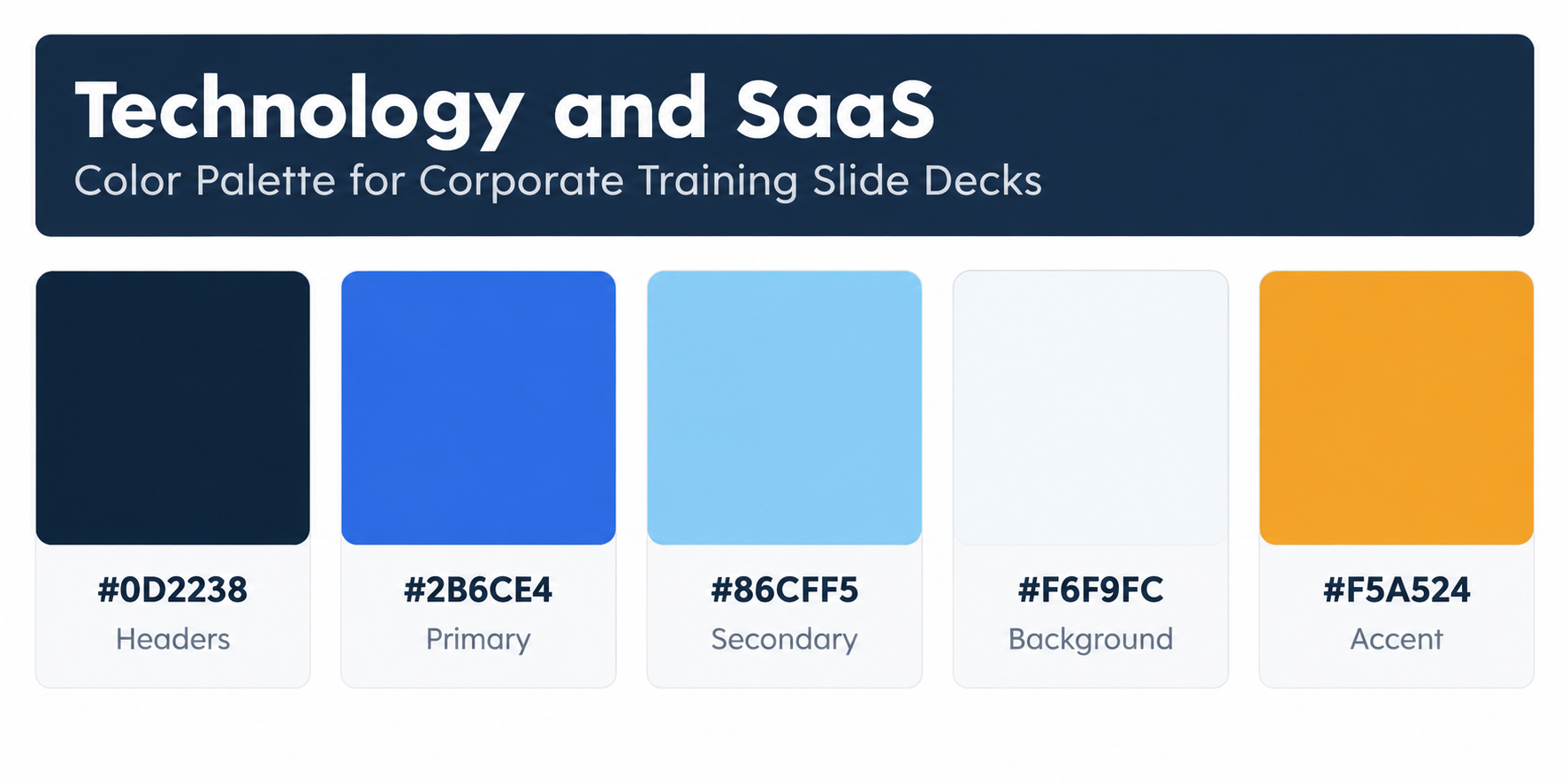
Tech teams expect clean, modern slides that feel like the products they use. A deep midnight base with bright blue and sky tones feels current, while a warm amber accent keeps product walkthroughs and feature training from feeling cold.
Color codes: #0D2238 (headers) · #2B6CE4 (primary) · #86CFF5 (secondary) · #F6F9FC (background) · #F5A524 (accent)
Great for: Product training, customer success enablement, engineering onboarding, software rollouts
2. Healthcare and Pharma
Healthcare training carries serious content, but learners are often fatigued clinicians or field reps. soft teals feel clinical yet caring, and a coral accent softens heavy topics like patient safety and protocols.
Color codes: #0E4D64 (headers) · #3AAFA9 (primary) · #DEF2F1 (background) · #FF7A59 (accent) · #1F2D33 (body text)
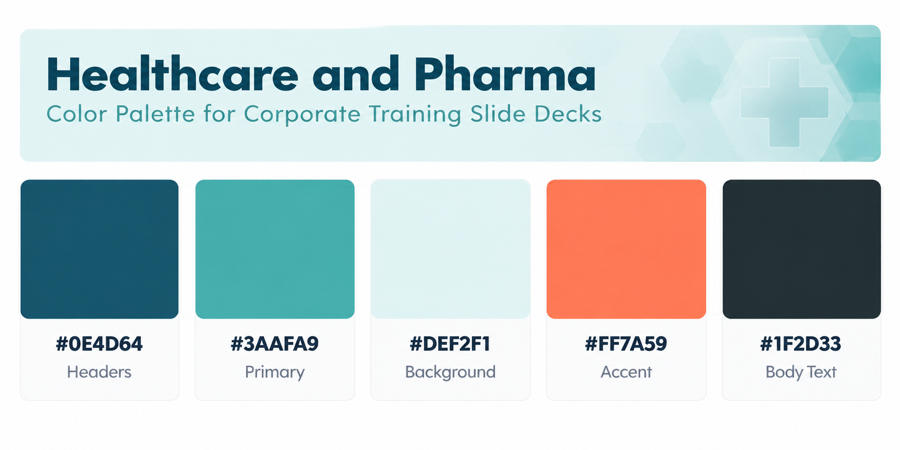
Great for: Clinical protocols, medical rep training, patient experience, HIPAA or data privacy modules
3. Banking and Financial Services
Financial institutions need decks that feel stable, precise, and trustworthy. Layered navy blues with a restrained gold accent communicate authority without looking dull, and the pale grey base keeps dense regulatory slides readable.
Color codes: #0A2342 (headers) · #2C5282 (primary) · #E9EDF3 (background) · #C4A35A (accent) · #1E1E24 (body text)
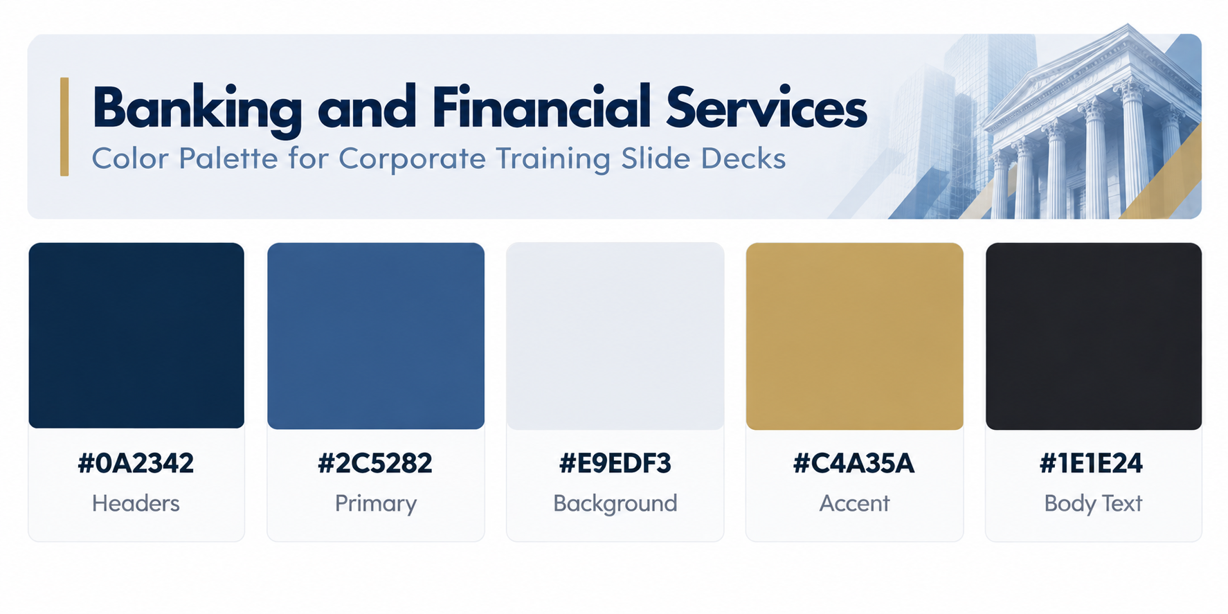
Great for: KYC and AML training, risk management, relationship manager programs, product suitability
4. Manufacturing and Engineering
Factory floors and engineering teams respond to bold, functional design. Charcoal and steel greys echo industrial environments, while safety orange and yellow highlight hazards and process steps clearly.
Color codes: #263238 (headers) · #546E7A (secondary) · #ECEFF1 (background) · #FF6F00 (primary accent) · #FFD54F (caution highlight)
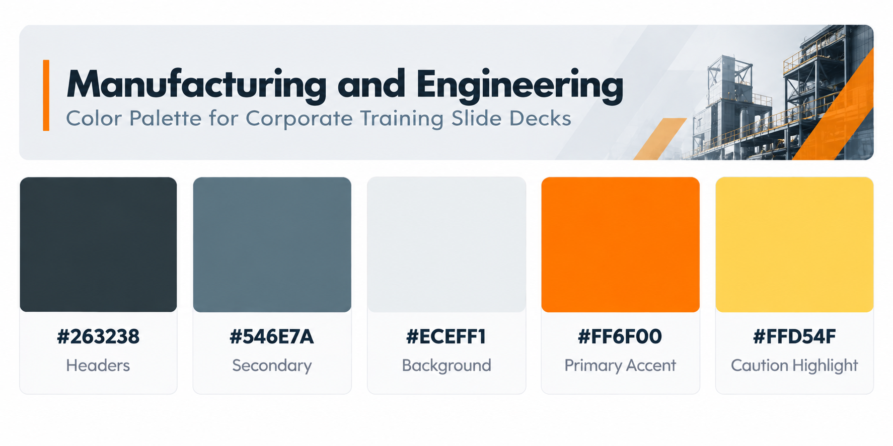
Great for: SOP training, lean and Six Sigma, machine operation, quality control
5. Retail and Consumer Brands
Retail training has to energize frontline staff who often learn on tablets or break room screens. A rich berry base with a lively pink and a teal pop feel brand forward and upbeat without losing clarity.
Color codes: #6A1B4D (headers) · #D6457A (primary) · #FFF4F1 (background) · #2EC4B6 (accent) · #2A2A2A (body text)
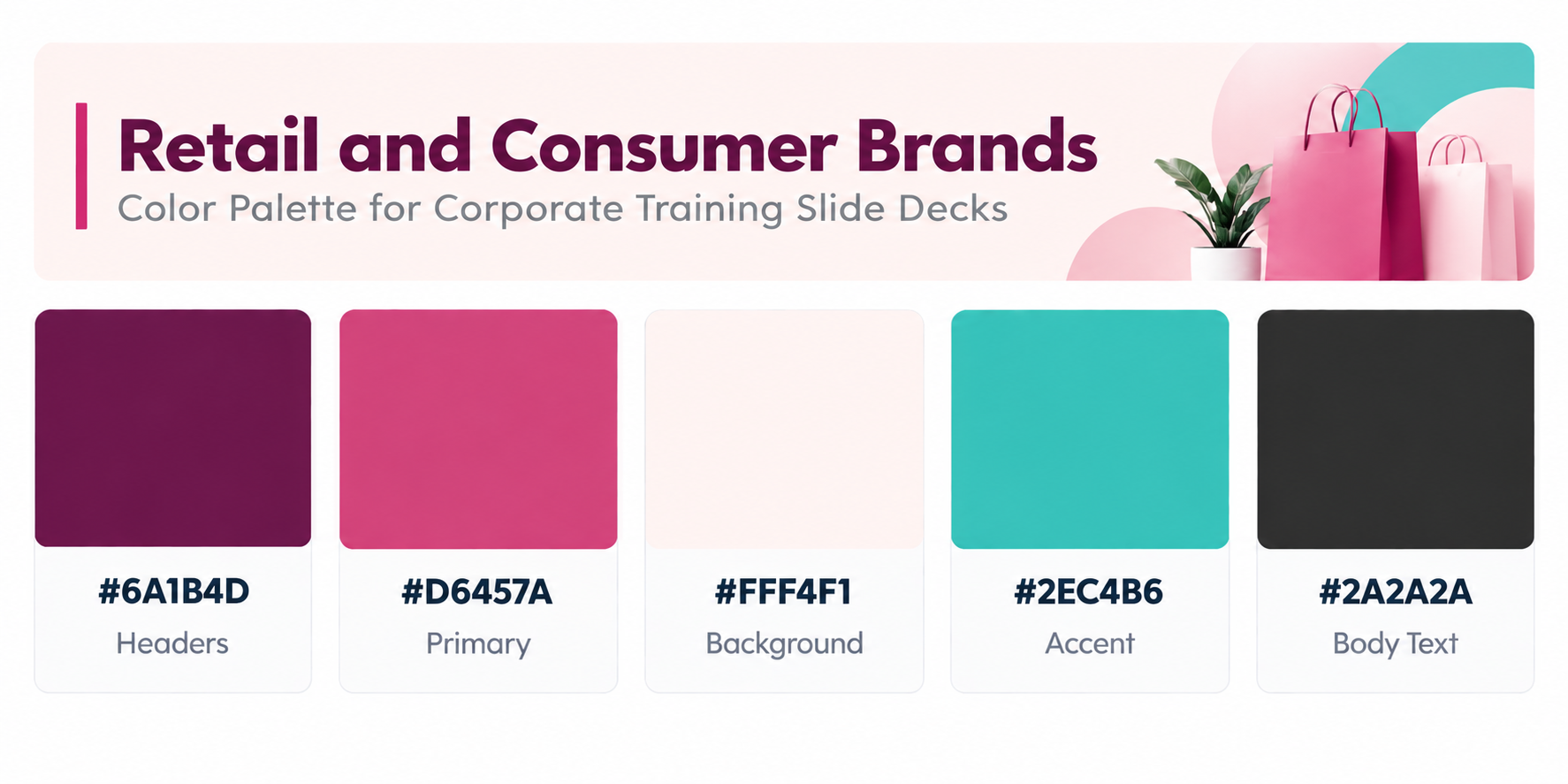
Great for: Store staff onboarding, visual merchandising, seasonal product launches, customer interaction training
6. Hospitality and Travel
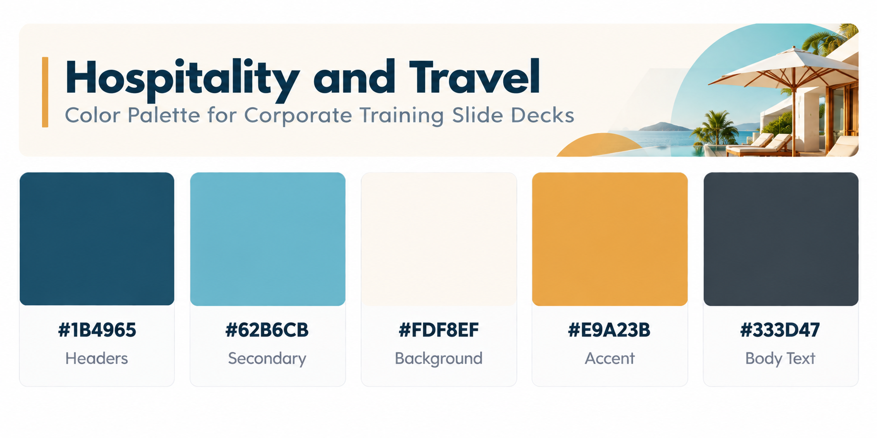
Hospitality training should feel warm and welcoming, just like the guest experience it teaches. Coastal blues paired with a cream base and a golden accent create a relaxed, service-focused tone.
Color codes: #1B4965 (headers) · #62B6CB (secondary) · #FDF8EF (background) · #E9A23B (accent) · #333D47 (body text)
Great for: Front desk training, guest service standards, food and beverage, travel agent programs
7. Energy and Sustainability
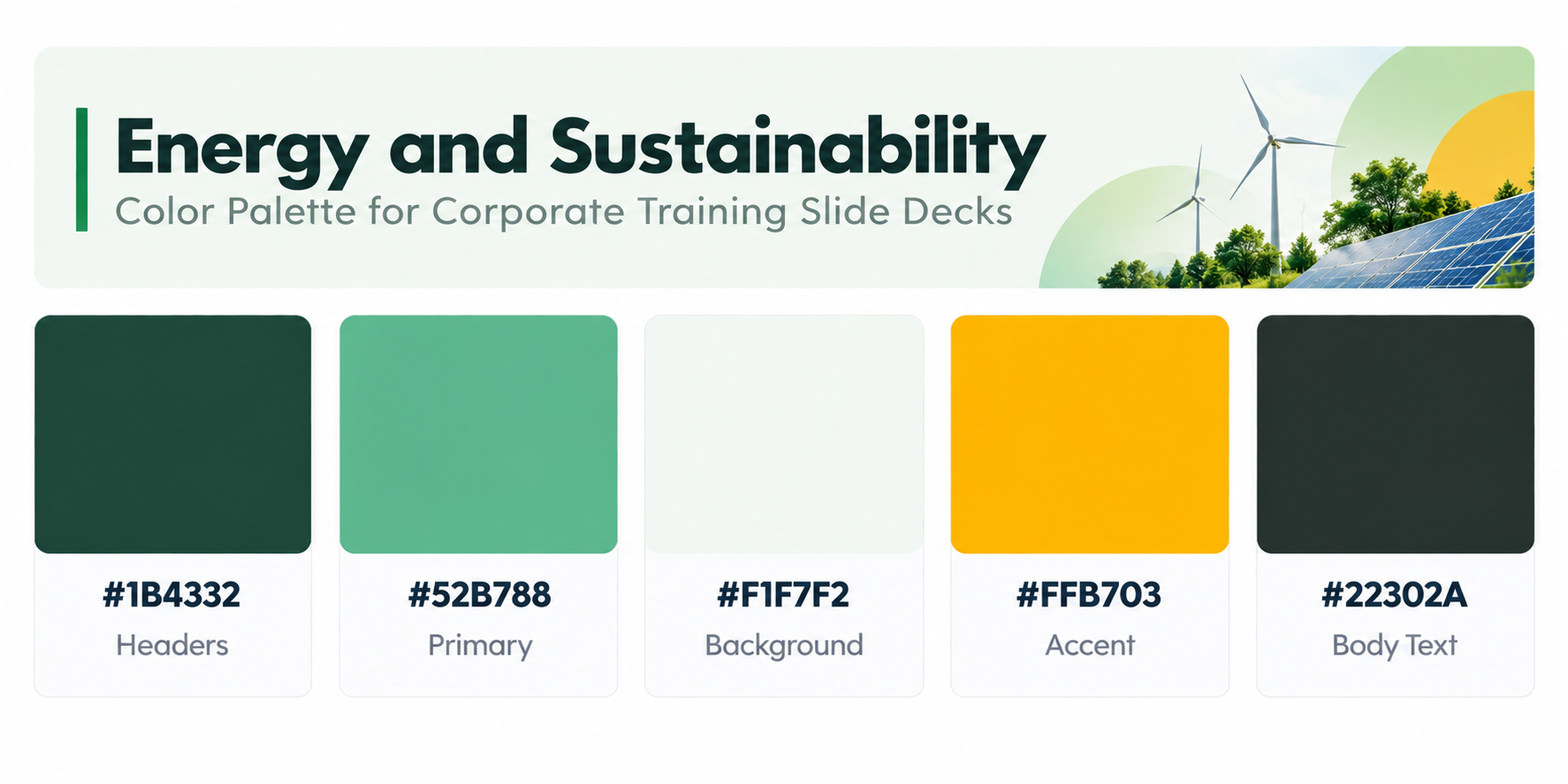
For ESG, energy, and sustainability training, green is the natural choice, but it needs contrast to avoid looking flat. Deep forest and fresh leaf greens pair with a sunny yellow accent that hints at renewable energy.
Color codes: #1B4332 (headers) · #52B788 (primary) · #F1F7F2 (background) · #FFB703 (accent) · #22302A (body text)
Great for: ESG awareness, environmental compliance, field safety, sustainability reporting training
8. Consulting and Professional Services
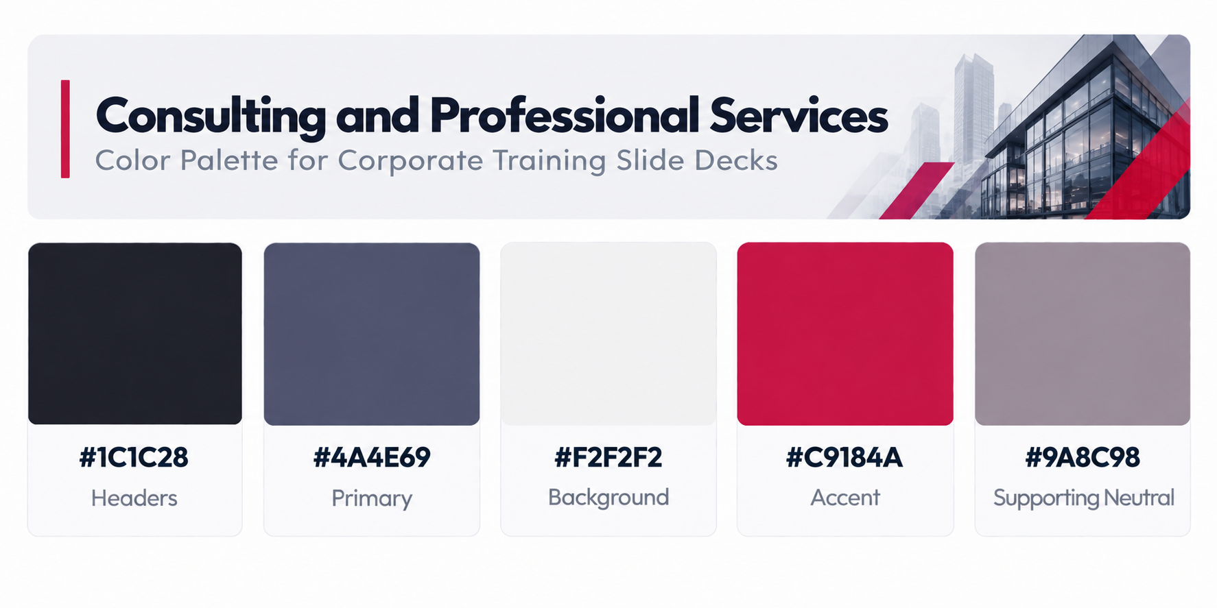
Consultants and advisory teams need decks that look boardroom ready. Near-black and muted slate purple feel sharp and intelligent, while a crimson accent gives frameworks and key recommendations real presence.
Color codes: #1C1C28 (headers) · #4A4E69 (primary) · #F2F2F2 (background) · #C9184A (accent) · #9A8C98 (supporting neutral)
Great for: Methodology training, client communication, proposal writing, analyst bootcamps
9. Public Sector and Nonprofit
Government and nonprofit training should feel approachable, credible, and inclusive. Steady blue-teal tones with a warm terracotta accent strike a balance between institutional and human.
Color codes: #203A4C (headers) · #3C7A89 (primary) · #F3F0E8 (background) · #D96C4F (accent) · #2B2B2B (body text)

Great for: Policy updates, volunteer onboarding, community outreach, grant compliance
10. Corporate Universities and Internal Academies
Large companies running internal academies need a palette that feels educational but still corporate. Indigo and periwinkle suggest knowledge and structure, and a golden accent works well for certifications and achievement slides.
Color codes: #2D3A8C (headers) · #6C7BD9 (secondary) · #F7F7FB (background) · #F2C14E (accent) · #23263A (body text)
Great for: Leadership academies, certification programs, learning pathways, graduate trainee programs
Light or Dark: Match the Palette to Your Delivery Format
The same palette can perform very differently depending on how the training is delivered.
In-person with a projector: Use light backgrounds. Projectors wash out dark themes and pale accents.
Virtual training on Teams or Zoom: Dark or mid-tone backgrounds reduce glare on laptop screens during long sessions.
Self-paced eLearning and LMS modules: Light backgrounds with strong accents work best, since learners often view slides on varied devices.
Printed handouts and PDFs: Always light backgrounds to save ink and keep text crisp.
Many trainers keep two versions of the same palette, one light and one dark, and switch based on the session.
Accessibility Checklist for Training Slide Colors
Training must work for every employee, so run through this quick checklist before rolling out a deck:
- Body text contrast of at least 4.5:1 against its background (WCAG AA).
- Large headings of at least 3:1 contrast.
- No meaning shown by color alone. Add icons, labels, or patterns.
- Red and green never used as the only pair to show right versus wrong.
- Charts limited to four or five distinguishable series colors.
- Slides previewed in grayscale to confirm hierarchy still makes sense.
How to Set Your Palette in PowerPoint and Google Slides
PowerPoint: Go to Design > Variants > Colors > Customize Colors. Enter your hex codes into the theme slots, name the theme, and save. For layouts and headers, use View > Slide Master so every trainer who edits the deck stays consistent. Our PowerPoint master slide guide explains this step by step.
Google Slides: Open Slide > Edit Theme, then click Colors in the toolbar. Choose each theme color and enter your hex values. Changes apply across all slides built on that theme.
Conclusion: Choose the Best Color Palettes for Corporate Training Slide Decks with SlidesDepot
The best color palettes for corporate training slide decks reflect your industry, respect your brand, and put learning first. Pick a palette that suits your sector, define clear roles for base, module, and meaning colors, and set everything once in your theme so every deck stays consistent.
Ready to put these palettes to work? Explore SlidesDepot’s editable corporate training, HR, and onboarding templates for PowerPoint and Google Slides, and turn your next training session into one your team actually remembers.


Build a PowerPoint Bubble Chart in Minutes
A bubble chart in PowerPoint is one of the most effective ways to show three variables in a single visual without cluttering your slide. At SlidesDepot, we build a lot of data driven templates, and bubble charts consistently come up as a request from users who need to compare performance, market position, or scale across…
What Is a Master Slide in PowerPoint? How to Edit It
If you have ever opened a PowerPoint file and wondered why every slide shares the same fonts, colors, and logo placement, the answer is the master slide. At SlidesDepot, we get asked about this feature almost every week, because it is one of the most misunderstood tools in PowerPoint, yet one of the most powerful….

Types of Charts in Presentations: How to Choose the Right Chart
Picking the right chart type for presentations is one of those decisions that quietly determines whether a slide gets understood in five seconds or gets skipped entirely. At SlidesDepot, we build and study presentation templates every day, and the pattern is always the same: decks fail not because the data is weak, but because the…