

Cute Background for Presentation: Trendy Templates You’ll Absolutely Love
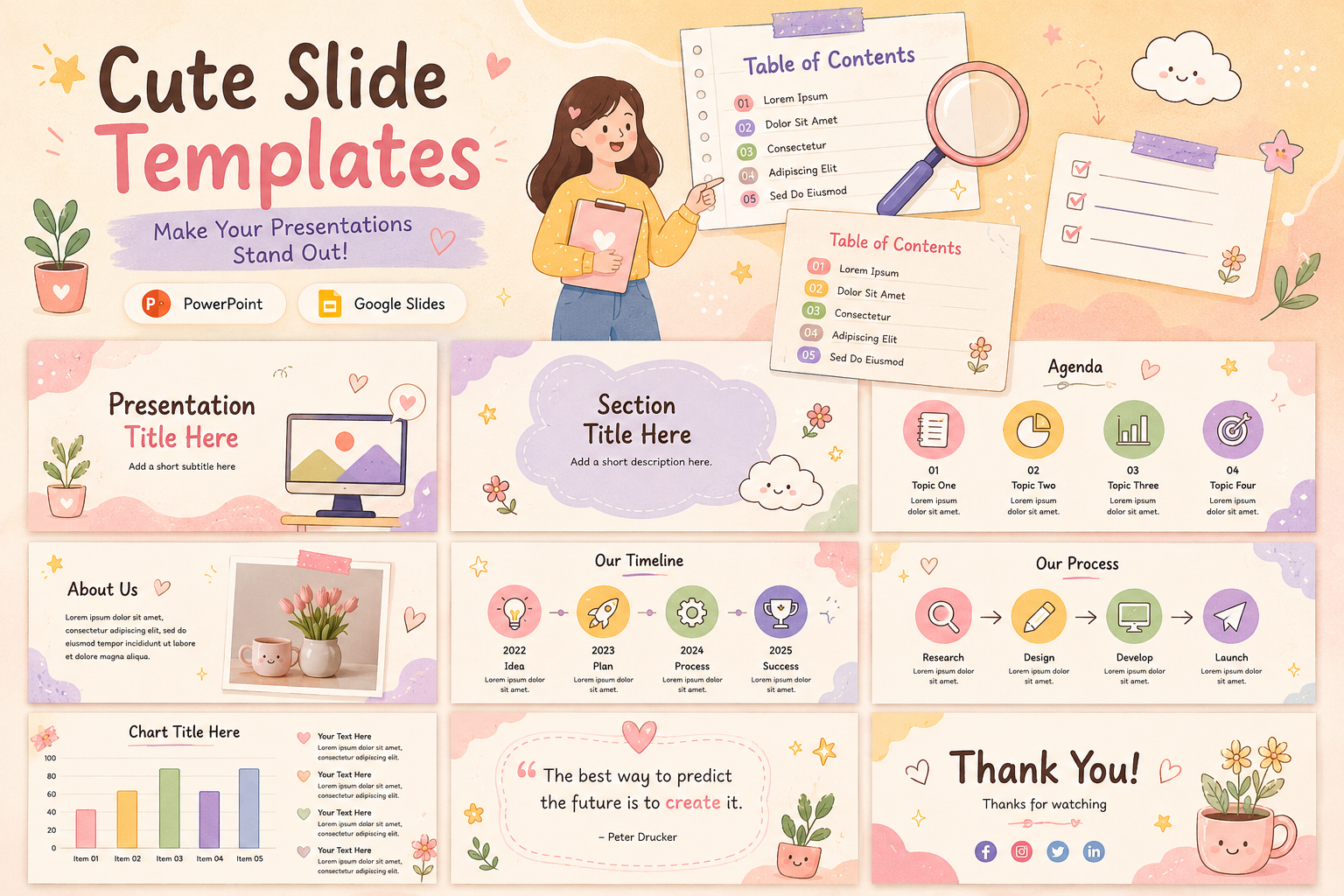


Choosing a cute PPT background sounds simple until you are actually doing it. There are hundreds of options, and most of them look fine in isolation but fall apart the moment you add text, charts, or images on top.
This guide is for anyone who wants to understand how presentation backgrounds actually work, what makes certain styles more effective than others, and how to match the right visual to the right context. We have also included examples from the SlidesDepot template library wherever a style is worth seeing in action.
Why the Background Matters More Than Most People Think
Most presenters spend the majority of their prep time on content, which makes sense. But the background is the first thing an audience sees. Before a single bullet point registers, the visual tone has already been set.
A background that clashes with your content, carries too much detail, or feels mismatched to your audience creates friction. The viewer’s brain has to work slightly harder to process what they are looking at, and that extra effort quietly pulls attention away from what you are saying.
Good background design is mostly invisible. When it is working well, nobody notices it. They just find the presentation easy to look at and easy to follow.
What Makes a Presentation Background Work
Before looking at specific styles, it helps to understand the principles that apply across all of them.
Contrast comes first. Text must be readable at a glance. If your background and your text color are too similar in brightness or hue, readability breaks down fast. This is the most common mistake with decorative backgrounds. A design that looks beautiful as a standalone image becomes a problem the moment a light-colored heading sits on top of a pale background.
Busy versus balanced. A background with a lot of detail, pattern, or color movement will compete with your content. Simpler backgrounds with a clear focal area or a consistent texture give content room to breathe. The more complex your slides, the simpler your background should be.
Consistency across the deck. A single standout background on a title slide is fine. But a full presentation needs visual continuity. Using different unrelated backgrounds on different slides breaks the visual rhythm and makes the deck feel unfinished.
Scale and rendering. A background that looks good on your laptop screen at full resolution may look very different on a projector in a conference room. High-contrast, clean designs tend to hold up better across display conditions than low-contrast or highly detailed ones.
Tone and audience match. A background carries a personality. Soft pastels, bold geometrics, hand-drawn florals, and minimal gradients each say something different before any content appears. Matching that signal to the context of your presentation is part of good communication.
A Look at the Most Useful Cute Background Styles
The word cute covers a wide range of visual territory. Below are the styles that come up most often and work most consistently. Whether you are searching for a cute PPT background for a school project or exploring customizable cute presentation templates for a professional pitch, these categories cover the full spectrum.
1.Abstract and Aesthetic Backgrounds
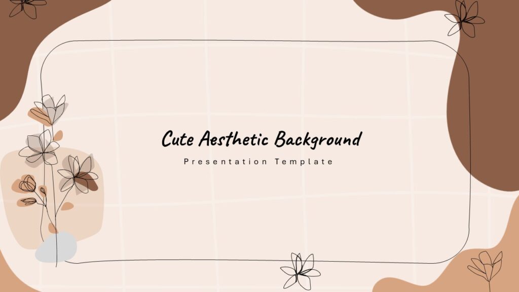
Abstract backgrounds use shape, color, and texture rather than recognizable imagery. Done well, they provide visual interest without distraction. Soft color gradients, layered geometric forms, and blurred organic shapes all fall into this category.
These work across a wide range of presentation types because they carry a general design sensibility rather than a specific subject association. A creative portfolio, a personal project, a class presentation, or a brand overview can all use an abstract background without it feeling out of place.
The SlidesDepot Cute Aesthetic Abstract Background template is built around this principle. It provides a design foundation that feels modern and considered without pulling focus from the content itself.
2.Floral and Botanical Backgrounds
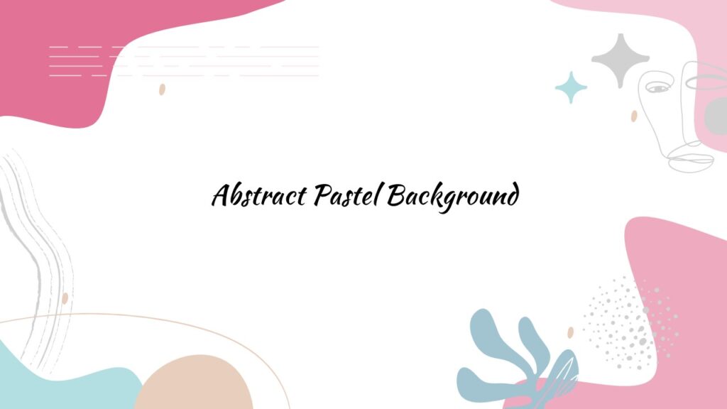
Botanical backgrounds have become one of the most popular categories in presentation design, and for good reason. When executed well, they bring warmth, creativity, and a handcrafted quality that generic templates simply cannot replicate.
The key distinction is between decorative florals and structural ones. A decorative floral fills the slide with pattern for its own sake. A structural floral uses botanical elements at the borders, corners, or as a framing device, leaving the central content area clear and readable.
Watercolor styles, flat botanical illustration, and loose hand-drawn linework are the three most common approaches. Each has its own feel. Watercolor reads as soft and artistic, flat illustration as clean and modern, and hand-drawn linework as personal and expressive.
SlidesDepot has two templates worth looking at here. The Cute Art Floral Background uses a bright, illustrated approach suited to creative and educational presentations. The Aesthetic Purple Floral Background takes a deeper, more sophisticated palette that works well for personal branding, lifestyle topics, or anything that benefits from a slightly more refined tone.
3.Pink Aesthetic Backgrounds
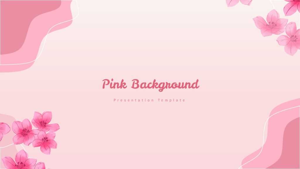
Pink as a presentation background gets used more broadly than people might expect. It appears in education, wellness, beauty and lifestyle, creative industries, and student projects across all levels.
The challenge is that pink covers a very wide spectrum. A warm blush behaves completely differently than a saturated magenta or a cool pastel lavender-pink. Getting the shade right matters.
For professional or semi-professional contexts, the most reliable approach is a desaturated, muted pink with strong contrast text. This reads as considered and intentional rather than casual. For student work or creative presentations, the full range of the pink spectrum is available.
The SlidesDepot Pink Aesthetic Background template sits in the polished middle ground. It is designed to work as a presentation background rather than as a decorative graphic, which means the contrast ratios and layout areas are built in from the start.
4.Beach and Coastal Backgrounds

Coastal and beach backgrounds are most commonly used for travel presentations, geography and environmental topics, summer programs, and end-of-year school projects. The visual vocabulary here covers ocean blues, sandy tones, soft wave shapes, and warm sky gradients. It is immediately legible and creates a relaxed, open feeling.
The main thing to understand about this category is that illustrated or stylized beach backgrounds almost always work better in presentations than photographic ones. A photograph of a beach is a photograph. An illustrated beach background is a design element. The former tends to dominate a slide while the latter frames it.
SlidesDepot’s Beach Background template uses this principle. The design reads clearly as coastal without overwhelming the content space.
5.School Supplies and Educational Backgrounds
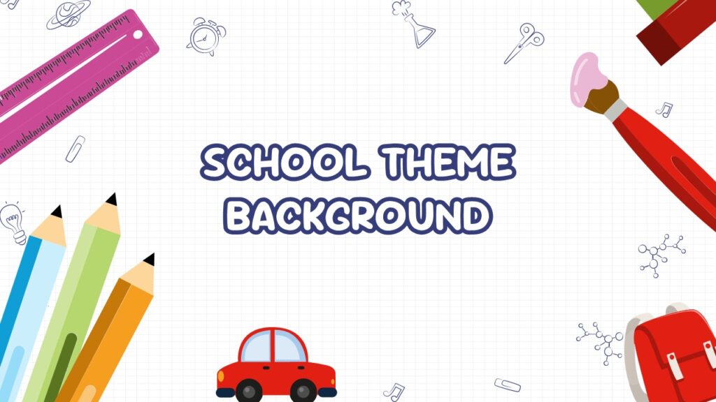
This is a category built specifically around one use case: making educational presentations feel engaging without resorting to clip art. Teachers, students, tutors, and curriculum designers are the primary audience.
The design challenge is real. Educational backgrounds need to communicate a learning context clearly, but they also need to stay out of the way of actual instructional content. A well-designed school supplies background does this by using recognizable objects like pencils, rulers, notebooks, and scissors as pattern or border elements rather than as dominant visual features.
SlidesDepot’s Colorful School Supplies Background is a practical example of how to approach this. It works across grade levels and subject areas because the design is energetic enough to feel purposeful but clean enough not to interfere with slides that carry a lot of text or visual content.
6.Superhero Themed Backgrounds
Superhero presentation themes are more versatile than their appearance suggests. The obvious use cases are school projects, children’s events, and youth programs. But they also appear in corporate training and motivation presentations, coaching and leadership content, and any context where energy and aspiration are the right emotional notes to strike.
The important thing to understand about using this style is that it commits you to a tone. A superhero background says this presentation is bold, energetic, and slightly playful. That is exactly right for some contexts and completely wrong for others.
When the tone fits, SlidesDepot’s Superhero Presentation template gives you a professionally designed starting point using original illustrated elements rather than borrowed IP.
7.Purple Aesthetic and Gradient Backgrounds
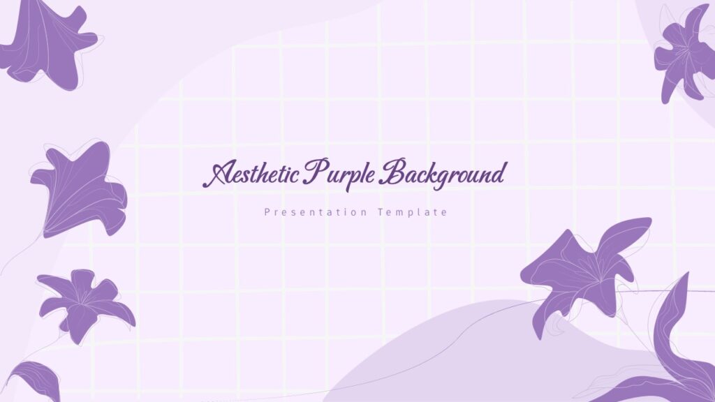
Purple has become one of the dominant colors in contemporary presentation design, particularly for technology, education, wellness, and creative fields. It occupies a useful middle ground, expressive and distinctive without being as charged as red or as neutral as blue.
Gradient backgrounds in purple tones work especially well for title slides and section headers. They create visual depth without requiring complex illustration, and they pair cleanly with white or light-toned text.
For content-heavy slides, a lighter lavender or a solid muted purple tends to work better than a deep, saturated gradient. The SlidesDepot Aesthetic Purple Floral Background blends the depth of purple tones with botanical elements, which softens the overall effect and makes it suitable for a wider range of content types.
How to Choose the Right Background for Your Presentation
Knowing the styles is one thing. Choosing the right one for a specific presentation takes a bit more thought.
Start with your audience. A background that works in a school classroom may not work in a boardroom, and vice versa. Think about who will be looking at this and what visual signals feel appropriate for that group.
Consider the content volume. If your slides carry a lot of text, data, or detailed visuals, choose a simpler background. If your slides are light on content and rely more on visual storytelling, a richer background can work without competing.
Think about where it will be displayed. Presentations shown on a laptop in a one-to-one meeting can handle more visual complexity than presentations projected in a large room. Projectors generally reduce contrast and detail. High-contrast, clean backgrounds are the safer choice when you are not sure what the display environment will be like.
Consider print and sharing. If the presentation will also be exported as a PDF or shared digitally, dark or highly saturated backgrounds create problems. They are harder to read on screen at small sizes and expensive to print. Light backgrounds with dark text are the reliable default for anything that needs to work across multiple formats.
Single Backgrounds vs. Customizable Cute Presentation Templates
One practical question that comes up often is whether to use a single background applied across slides or a full deck template designed as a system.
A single cute PPT background gives you control and flexibility. You set it once and build your own layouts around it. This is the right approach when you already have a presentation structure you are happy with and just need to improve the visual foundation.
Customizable cute presentation templates are more useful when you are starting from scratch or want a complete visual system rather than just a background. Full templates include slide variants, layout options, and typographic hierarchy already built in. Everything works together because it was designed together.
SlidesDepot offers both. Individual background templates for those who want design flexibility, and complete presentation decks for those who want a ready-to-use visual system. All of them work in both PowerPoint and Google Slides without any conversion required.
A Note on Customization
One thing worth understanding about using customizable cute presentation templates is that every element is editable. The colors, opacity, scale, and positioning of background elements can all be adjusted. A template is a starting point, not a fixed design.
This matters because it means you can take a SlidesDepot background and adapt it to match your organization’s color palette, your personal style, or the specific tone of a particular presentation. The design structure does the heavy lifting. The customization makes it yours.
Conclusion
A cute PPT background is not decoration. It is a design decision that affects how content is received, how readable the slides are, and how the overall presentation feels to an audience.
Understanding the principles behind contrast, visual weight, tone, and audience fit makes choosing a background much more straightforward. And starting from well-designed customizable cute presentation templates means you are not solving those problems from scratch every time.
The SlidesDepot background collection covers the full range of styles covered in this guide, from abstract aesthetics and florals to school supplies, beach themes, and purple gradients. Each template is built to work as a presentation background rather than just a decorative image, which means the layout, contrast, and editability are all considered from the start.
Browse the full collection at SlidesDepot.


PowerPoint Shortcuts Every Professional Should Know (And Actually Use)
Creating presentations is a core part of many professional roles, yet countless hours are still lost navigating menus, adjusting layouts, and repeating simple actions. One of the most effective ways to work smarter in Microsoft PowerPoint is by mastering essential keyboard shortcuts. The right PowerPoint shortcuts help you build slides faster, keep designs clean and…

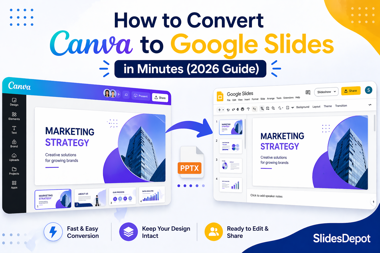
How to Convert Canva Presentations to Google Slides in Minutes (2026 Guide)
You spent hours building a beautiful presentation in Canva. The fonts are on point, the colors match your brand, and the layout looks exactly how you imagined it. Then someone asks for the file in Google Slides format, and suddenly the whole process feels far more complicated than it should be. This is a frustration…
10 Effective Presentation Skills Every Professional Should Master
In today’s competitive professional landscape, knowing how to give a good presentation is no longer optional. Whether you are pitching to investors, leading a team meeting, or delivering a conference talk, your ability to communicate with clarity and confidence can define how others perceive your expertise and credibility. The good news is that effective presentation…