


Current State vs Future State Comparison Slide Template for PowerPoint & Google Slides


Current vs Future State Comparison Presentation Template
There’s a specific kind of meeting dread that comes from knowing you need to explain why things need to change and watching people’s eyes glaze over before you’ve even gotten to the good part. The problem is usually the slide. A wall of bullet points under “Current State.” Another wall under “Future State.” And somewhere in the middle, the audience is supposed to just… feel the transformation? Connect the dots themselves? It doesn’t work. It never works.
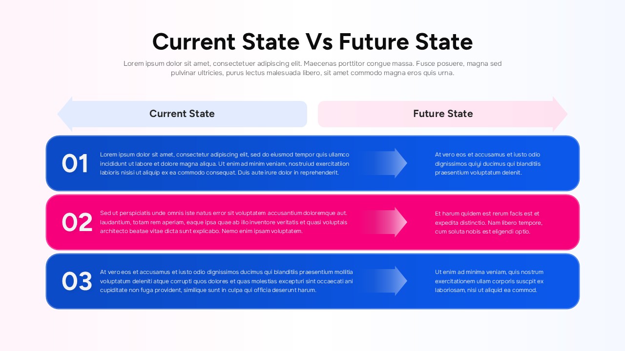
This Current State vs Future State template was built around that exact failure mode. The layout puts current and future side by side — not stacked, not separated across slides, so the contrast does the work for you. Three numbered rows, each one pairing where things are now with where they’re headed. The directional arrows aren’t decorative (well, they’re a little decorative) — they’re there because your audience’s eyes actually need somewhere to go, and “left to right” is a journey everyone already understands intuitively.
The spacing inside each block of the Current State vs Future State template is generous on purpose. Because the instinct when you’re presenting a transformation is to cram everything in — every nuance, every caveat, every reason — and that instinct is usually what kills the message. The structure kind of forces you to be concise, which is annoying during the editing process and genuinely useful when you’re actually in the room.
The Current State vs Future State template works in PowerPoint and Google Slides, the colors and labels are fully swappable according to your taste, and it fits pretty much any flavour of change being operational, strategic, organizational or whatever you’re dealing with.
Login to download this file
Related Templates

Pros And Cons List Slides & PPT Templates
Comparison


