


Business Analytics Dashboard PowerPoint & Google Slides Templates


Business Analytics Dashboard
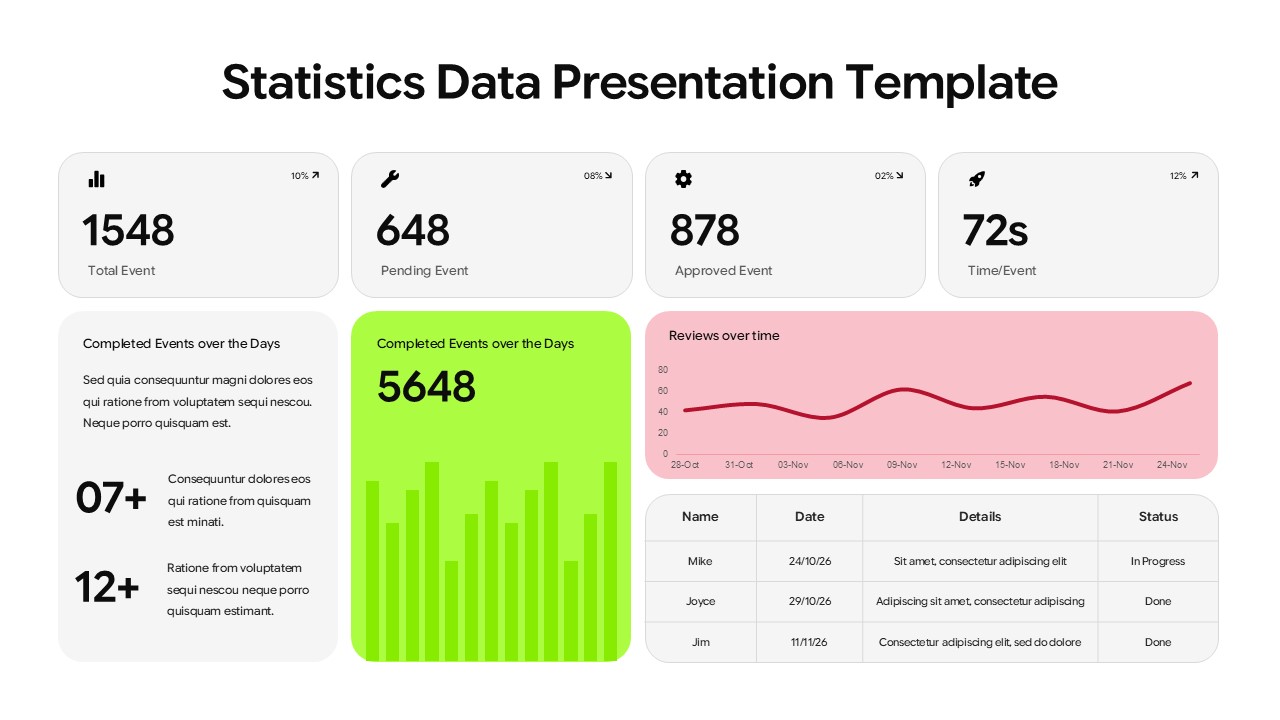
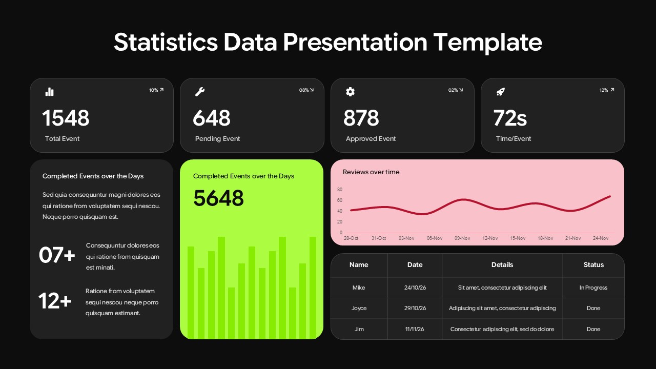
This Business Analytics Dashboard Template for PowerPoint and Google Slides gives you four KPI metric cards, an interactive bar chart, and a time-series line graph in one organized grid-based layout. Bright green and pink accent colors keep the data visually clear across both light and dark themes.
Every metric your audience needs sits in one place. Four KPI cards show percentage changes at a glance, a bar chart handles category comparisons, and a time-series line graph tracks performance over time with an integrated data table. Every chart, color, and value is fully editable in PowerPoint and Google Slides.
This template works for executives presenting quarterly reviews, data analysts communicating KPI findings, project managers tracking operational metrics, marketing directors reporting campaign performance, and consultants delivering business intelligence recommendations to clients and stakeholders.
Features of This Business Analytics Dashboard Template
Four KPI metric cards with percentage change indicators
Interactive bar chart and time-series line graph with integrated data table
Grid-based layout with clear visual hierarchy throughout
Light and dark theme versions with bright green and pink accent colors
Modern flat design with rounded corners and professional color coding
Fully editable charts, metrics, and colors in PowerPoint and Google Slides
Login to download this file


