


Revenue Graph Templates
Revenue Graph Presentation Template
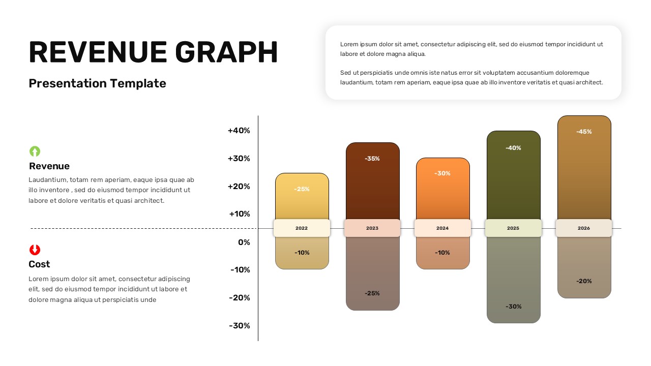
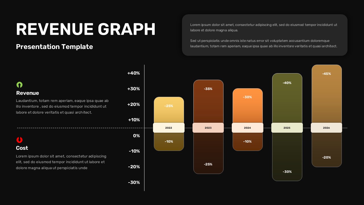
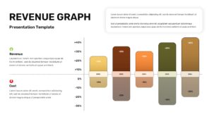
Financial reporting works best when the numbers tell a story at a glance, and this Revenue Graph Template does exactly that with a five year bar chart comparing revenue gains against cost changes for each period. The split bar design, revenue on top, cost on the bottom, lets viewers spot growth patterns and cost fluctuations without reading a single row of raw data.
What’s included in this Revenue Graph Template:
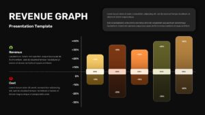
This Revenue Graph Template features a bold headline section, a supporting notes box for context or assumptions, and two labeled categories on the left side, revenue and cost, each paired with a simple icon and a short paragraph for explanation. The five year bar chart sits at the center, with each bar shaded in its own gradient tone and labeled with the corresponding year and percentage figures.
Where this Revenue Graph Template fits:
This Revenue Graph Template is built for finance directors, startup founders, and consultants who present annual or quarterly performance data. It works equally well in board meetings, investor pitches, internal budget reviews, and year end wrap up presentations.
How to customize this Revenue Graph Template:
Everything in this Revenue Graph Template lives in editable PowerPoint elements. Update the year labels, change the percentage values, recolor the bars, or rewrite the description text to match your own financial story. The file also opens cleanly in Google Slides, so remote teams can collaborate on this Revenue Graph Template without formatting issues.
Keep this Revenue Graph Template on hand whenever you need to present multi year financial trends without building the chart layout from zero.
Download this Revenue Graph Template today and start customizing it with your own figures.
Login to download this file


