



What Is a Sankey Diagram? How to Use It in PowerPoint Presentations



Some data tells a story the moment you see it. Flow data rarely does, not in a spreadsheet anyway. Numbers showing how budget moves across departments, how users drop off through a funnel, or how energy gets distributed through a system need a visual form before they start making sense. That is exactly what a Sankey diagram is built for.
This guide covers what a Sankey diagram is, where it works best, and how to bring one into your PowerPoint presentation without overcomplicating the process.
What Is a Sankey Diagram?
A Sankey diagram is a flow chart used to show how quantities move from one stage to another. The width of each band is proportional to the amount it represents, so larger flows appear thicker and are easier to spot at a glance.
It is especially useful when you want to show where something starts, how it is split, and where it ends up. Common examples include budget allocation, energy use, website traffic, sales funnels, and material movement in operations.
Sankey diagrams were first developed in the 19th century to visualize steam engine efficiency. Today, they are widely used in business, engineering, marketing, and analytics because they combine direction and quantity in one visual.
A typical Sankey diagram has nodes and flows. Nodes represent categories or stages, while flows connect them and can branch, merge, or taper depending on how much value moves forward.
The main advantage of a Sankey diagram is clarity. It helps viewers quickly identify the biggest sources, destinations, and losses without reading a table of numbers.
When Does a Sankey Diagram Make Sense?
Not every dataset needs a Sankey diagram. It is most useful when your data has a clear origin, movement, and destination, and when the relative size of those flows matters.
Common use cases include budget and cost allocation showing how revenue splits into departments and then into specific expenses, customer journey mapping that reveals where users enter a funnel and where they drop off, website traffic analysis breaking down sources and page paths, energy flow diagrams tracking how power is converted or lost, and supply chain visualization tracing materials from source to finished product.
If your data does not involve flow between categories, or if the differences between values are too small to be visually meaningful, a bar chart or table will likely serve you better. But when you have a clear directional story to tell and meaningful differences in scale, a Sankey diagram earns its place on the slide.
How to Use a Sankey Diagram in PowerPoint
PowerPoint does not include a built-in Sankey diagram chart type, which is one of the most common frustrations presenters run into. There are three practical approaches depending on how much time and flexibility you have.
Start With a Ready-Made Template
The fastest approach is to start with a slide that already has the Sankey structure built in. You replace the placeholder labels, adjust the flows to match your data, and the design work is already done.
SlidesDepot’s Sankey Chart PowerPoint and Google Slides template is a clean, designer-crafted option that works on both PowerPoint and Google Slides with no format conversion needed. The layout is fully editable from the start, so you can drop in your numbers and keep your presentation moving.
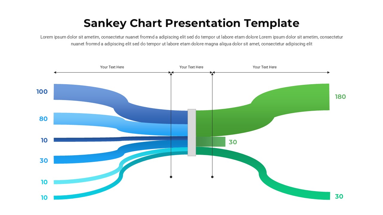
This approach works especially well when you need one strong data slide rather than a full redesign, or when you are working against a deadline and cannot afford to build shapes from scratch.
Build One Using Shapes and Connectors
For full control over the output, you can build a Sankey diagram manually in PowerPoint using shapes, custom connectors, and gradient fills. Create node rectangles, then draw trapezoid or freeform shapes between them to represent the flows. Adjust the height of each flow shape to reflect the proportional value, and use subtle opacity to keep overlapping flows readable.
This method takes more time, but the result is a fully editable diagram fitted precisely to your brand colors and slide dimensions.
Import From a Third-Party Tool
Tools like SankeyMatic, Flourish, or RAWGraphs let you paste in your data and generate a visualization you can export as an image and insert into PowerPoint. This is a solid middle ground when your data is complex but your time is limited.
The only limitation is that the imported image is not editable inside PowerPoint, so any data changes require going back to the external tool. For a final presentation where the numbers are settled, that is rarely an issue.
Design Tips for Sankey Diagrams in Presentations
A flow diagram can do a lot of visual work, but it can also overwhelm an audience if it carries too many categories. Keep these principles in mind when building or adapting yours.
Limit the number of flows. Five to eight categories is usually the readable range for a single slide. Beyond that, the diagram becomes difficult to interpret at a glance.
Use color purposefully. Assigning a distinct color to each source node and carrying it through the connected flows makes it easy to trace a single stream across the diagram. Avoid using color purely for decoration.
Label directly. Place labels on or adjacent to the nodes rather than relying on a separate legend. If your audience has to cross-reference a key to understand what they are looking at, you have added unnecessary friction.
Give it room on the slide. A Sankey diagram works best when it has space around it. Crowding it alongside heavy text or other charts reduces its impact. Let it be the focal point of the slide.
Make the Diagram Do Narrative Work
A visualization slide is only as effective as the story it sits inside. The title of the slide should state the insight, not just describe the chart. Instead of “Budget Flow 2024,” try “Operations absorbs 40% of total spend.” The diagram then confirms and details what the title already told the audience.
If you are building a full deck around your data slides, SlidesDepot offers both single infographic slides and complete presentation templates, all designer-crafted and updated weekly. There is a free plan as well, so you can explore the library without committing to a paid account.
The Sankey diagram is one of the more underused formats in business presentations, mostly because it sits outside PowerPoint’s default chart options. In practice, audiences understand it almost immediately. Wider means more. The visual logic is intuitive once it is on screen, and starting with a well-designed template means the hardest part is already handled.


What Is the Purpose of Brainstorming During the Development of an Action Plan? 5 Strategic Benefits Explained
Every great result starts long before the first task is assigned or the first deadline is set. It begins with a single question, a blank whiteboard, and a team willing to voice ideas freely that’s where real planning starts: with brainstorming. Yet many teams skip this step, eager to jump straight into execution. That rush almost always costs them later. So,…
How to Make a Link Clickable in PowerPoint and Google Slides
You’ve built a solid presentation. The slides look great, the content flows well and then someone in the audience clicks on what they think is a link, and nothing happens. It’s a small moment, but it can quietly undermine your credibility.Adding clickable links to your presentation is one of those things that feels optional until…
What Is a Multimedia Presentation and Why Does It Matter in 2026?
Picture two slide decks. One is plain text, slide after slide, in the same gray bullet format you’ve seen a hundred times. The other has a short product clip, a clean chart, and a quick voice note from a happy customer. The second one sticks with you days later, and the first one doesn’t. That…