


Data Analytics PowerPoint Templates
Data Analytics Presentation
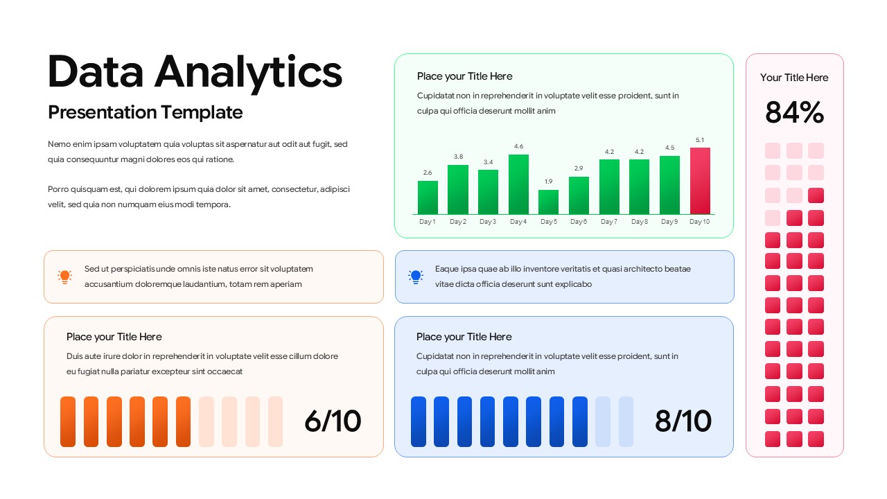
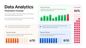
Raw numbers rarely convince anyone on their own, they need a layout that turns them into a story. This Data Analytics Presentation template from SlidesDepot arranges a full dashboard on one slide: a vertical bar chart tracking daily performance, a waffle grid chart for visualizing percentages at a glance, and a pair of color-coded progress bars scoring metrics out of ten. Forest green, coral red, orange, and royal blue keep each data series distinct without needing a legend to explain it.
The layout leans on rounded cards and generous whitespace so five different visualizations can sit on one screen without feeling crowded. A dedicated KPI callout box pulls out the headline number, in this case an 84% shown through the waffle grid, so it registers before anyone reads a single supporting detail. Two smaller insight boxes with icon accents give room for a one-line takeaway next to each chart, useful for adding context a raw number can’t provide on its own.
This structure suits a range of reporting needs:
Business analysts use it for weekly or monthly performance reviews. Marketing teams drop in campaign metrics to show reach against engagement. Financial analysts substitute the bar chart for revenue or expense tracking, and SaaS teams use the progress bars to display churn or retention scores at a glance.
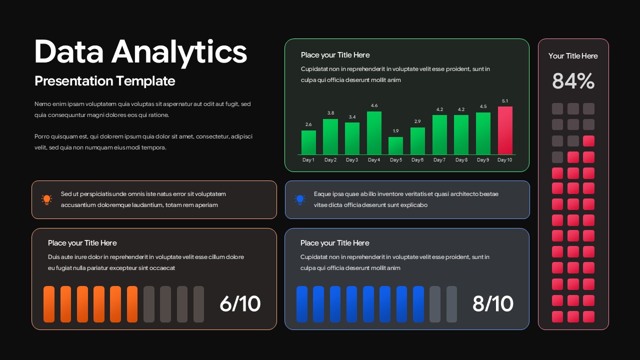
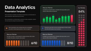
Every chart, color, and text field is editable, and the template ships in matching light and dark theme variants so it works equally well in an internal team briefing or an executive-facing deck. Built at 16:9 widescreen for PowerPoint and Google Slides. For more dashboard-style layouts, SlidesDepot’s data visualization templates collection has additional chart-based designs worth exploring.
Login to download this file


