


Quality Control Chart Templates
Quality Control Chart
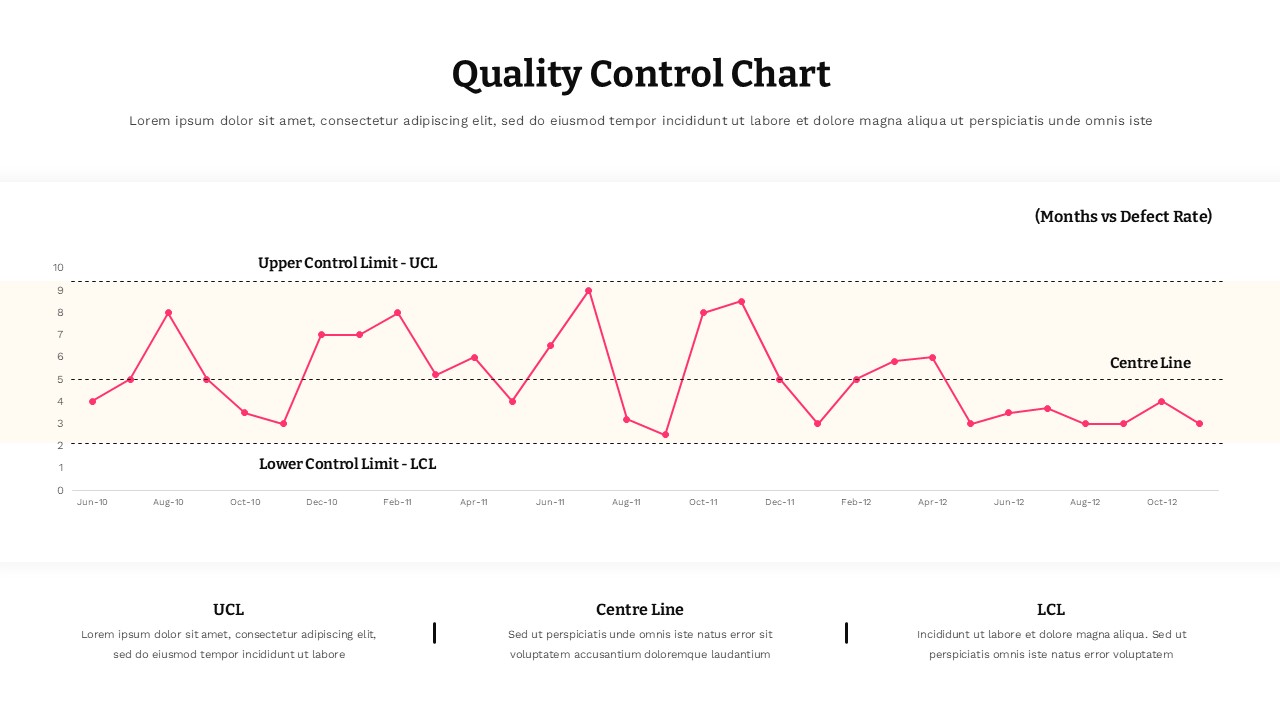
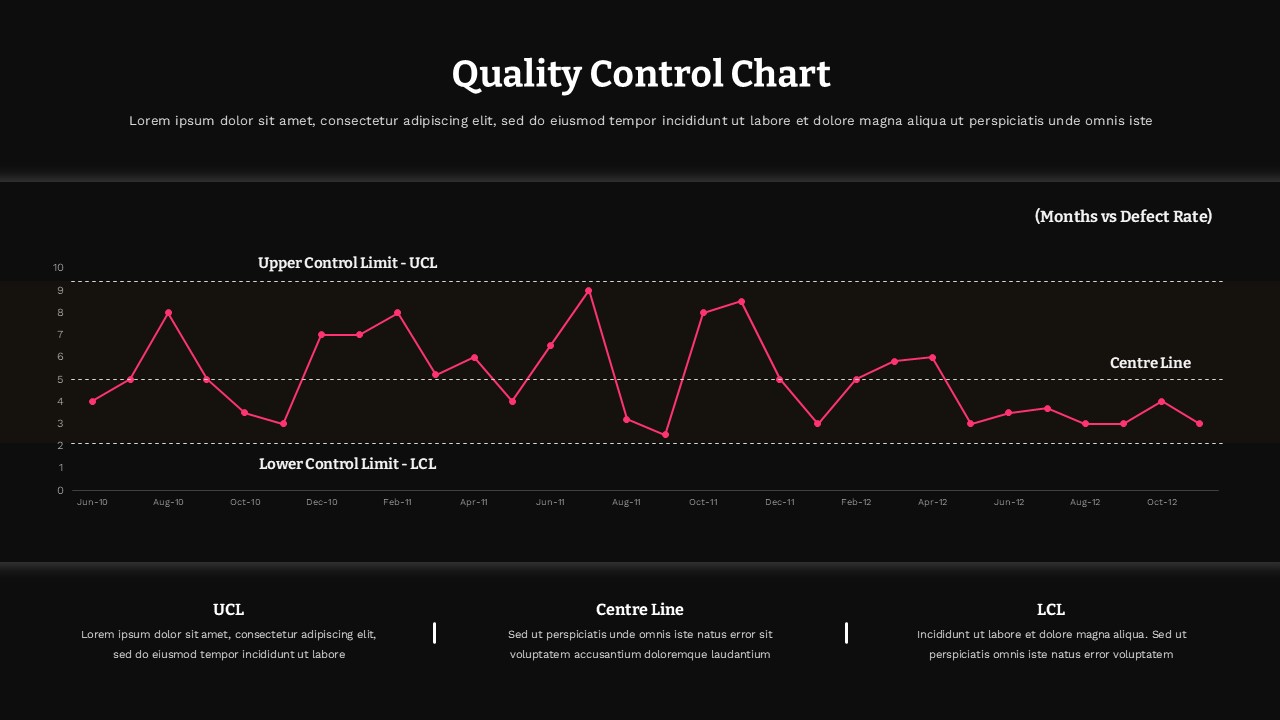
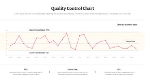
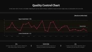
This Control Chart Template for PowerPoint gives you a ready-made way to present process performance and defect rate data over time. The slide features a monthly time-series line chart plotted against three key reference points, an Upper Control Limit, a Centre Line, and a Lower Control Limit, so viewers can instantly see whether values are trending within an acceptable range or drifting toward risk. Below the chart, a three-column breakdown explains each control limit in plain language, giving your audience the context they need without cluttering the visual itself. This Control Chart Template works well for quality assurance reporting, Six Sigma and process improvement presentations, manufacturing defect tracking, and any recurring metric that needs to be measured against upper and lower thresholds. Every element, from the data points and axis labels to the colors and text descriptions, is fully editable in PowerPoint, letting you swap in your own dataset and present a polished, data-driven slide in minutes.
Login to download this file


