
How to Present a Profit and Loss Statement in PowerPoint (With Edit Templates)
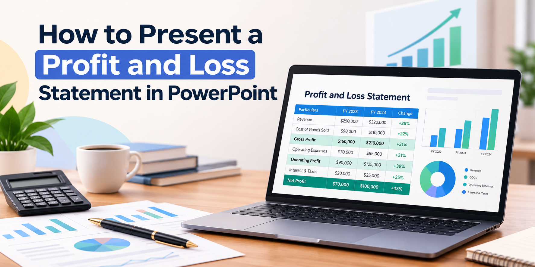


Most people don’t struggle with the numbers in a profit and loss statement. They struggle with showing them. A slide full of rows and decimals loses the room in seconds, while a clean, visual slide keeps everyone following along. This guide shows how to present a profit and loss statement in PowerPoint, which layouts work best, and how a ready-made profit and loss statement template can save you hours of design work.
Why Plain Tables Don’t Work in Presentations
Spreadsheets are built for analysis, not for audiences. When you paste a P&L table into a slide, three things usually go wrong:
- The text is too small to read from a distance.
- Everything looks equally important, so nothing stands out.
- People spend the meeting reading instead of listening.
The fix is to design your slide around what the audience should notice first, then support it with simple visuals.
The Anatomy of a Good P&L Slide
Strong financial slides share a few design elements:
- KPI cards at the top. Large numbers for revenue, expenses, and net profit with a percentage change beside each.
- One main chart. A bar or area chart that shows the trend over time.
- A breakdown visual. A donut or pie chart showing where costs go.
- A clear title and period. For example, “Q3 2026 Financial Performance.”
- Consistent color coding. Green for positive movement, red for negative, one accent color for the rest.
This layout is exactly what a dashboard-style slide does well. It puts the headline numbers first and the detail second.
How to Build a P&L Slide in PowerPoint
- Start with a clean 16:9 slide and give it a clear title and reporting period.
- Add KPI cards using rounded rectangles, with large numbers and small labels.
- Insert a chart through Insert > Chart, then paste in your data table.
- Add a breakdown chart such as a donut for expense categories.
- Match your colors to your brand and keep fonts consistent.
- Check readability by viewing the slide from the back of the room or at small size.
This works, but aligning cards, charts, and spacing by hand takes a while. That’s where templates come in.
3 Profit and Loss Templates for PowerPoint & Google Slides
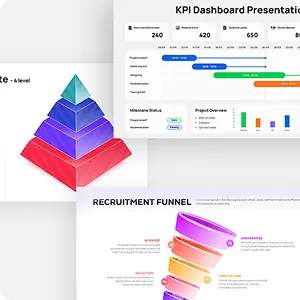
SlidesDepot has dashboard-style P&L slides that are already designed and aligned. Every chart, number, and color is editable, and each works in both PowerPoint and Google Slides with light and dark versions.
1. Profit and Loss Dashboard.
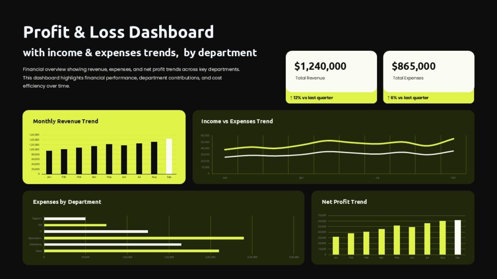
A modern minimalist layout with a 2×2 chart grid, revenue and expense KPI cards, and a bold chartreuse accent for high contrast. It’s a strong pick for quarterly reviews and executive decks. Explore the Profit and Loss Dashboard template.
2. P&L Dashboard with six KPI cards.
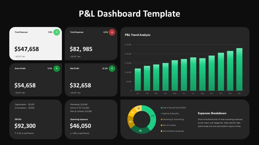
Six metric cards with green and red trend indicators sit above a 12-month bar chart and an expense donut, so you can show many numbers without clutter. Good for board and investor presentations. Explore the six-KPI P&L Dashboard.
3. P&L Dashboard Financial Overview.
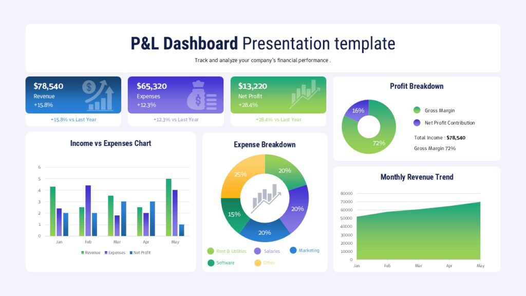
A one-slide summary with three KPI boxes plus bar, donut, pie, and area charts. It’s the quickest way to build a monthly report without a design background. Explore the P&L Financial Overview template.
How to Customize a Template in Minutes
- Download the file and open it in PowerPoint or Google Slides.
- Replace the title, subtitle, and reporting period.
- Right-click each chart, choose Edit Data, and type in your figures.
- Update the KPI values and percentage changes.
- Recolor shapes to match your brand, or switch to the dark version.
- Delete anything you don’t need so each slide carries one message.
Presentation Tips for Financial Slides
- Lead with the headline. Show net profit or the key result first.
- Limit each slide to one idea. If you need more detail, add another slide.
- Use big numbers and short labels. Audiences remember figures they can read instantly.
- Show change, not just totals. Arrows and percentages add context.
- Animate sparingly. A simple fade for each section works better than flashy effects.
- Keep a backup table. Put detailed figures in an appendix slide for questions.
Final Thoughts
A profit and loss statement only makes an impact when people can understand it quickly. Build your slide around clear KPI cards, one trend chart, and a simple breakdown, and keep the design consistent. With an editable template from SlidesDepot, you skip the layout work and spend your time on the story behind the numbers. Browse more options in the SlidesDepot dashboard templates collection.


Build a PowerPoint Bubble Chart in Minutes
A bubble chart in PowerPoint is one of the most effective ways to show three variables in a single visual without cluttering your slide. At SlidesDepot, we build a lot of data driven templates, and bubble charts consistently come up as a request from users who need to compare performance, market position, or scale across…
What Is a Master Slide in PowerPoint? How to Edit It
If you have ever opened a PowerPoint file and wondered why every slide shares the same fonts, colors, and logo placement, the answer is the master slide. At SlidesDepot, we get asked about this feature almost every week, because it is one of the most misunderstood tools in PowerPoint, yet one of the most powerful….

Types of Charts in Presentations: How to Choose the Right Chart
Picking the right chart type for presentations is one of those decisions that quietly determines whether a slide gets understood in five seconds or gets skipped entirely. At SlidesDepot, we build and study presentation templates every day, and the pattern is always the same: decks fail not because the data is weak, but because the…