

Group or Team Performance Analytics PowerPoint & Google Slides Templates
Team Performance Analytics Dashboard Template PPT & Slides
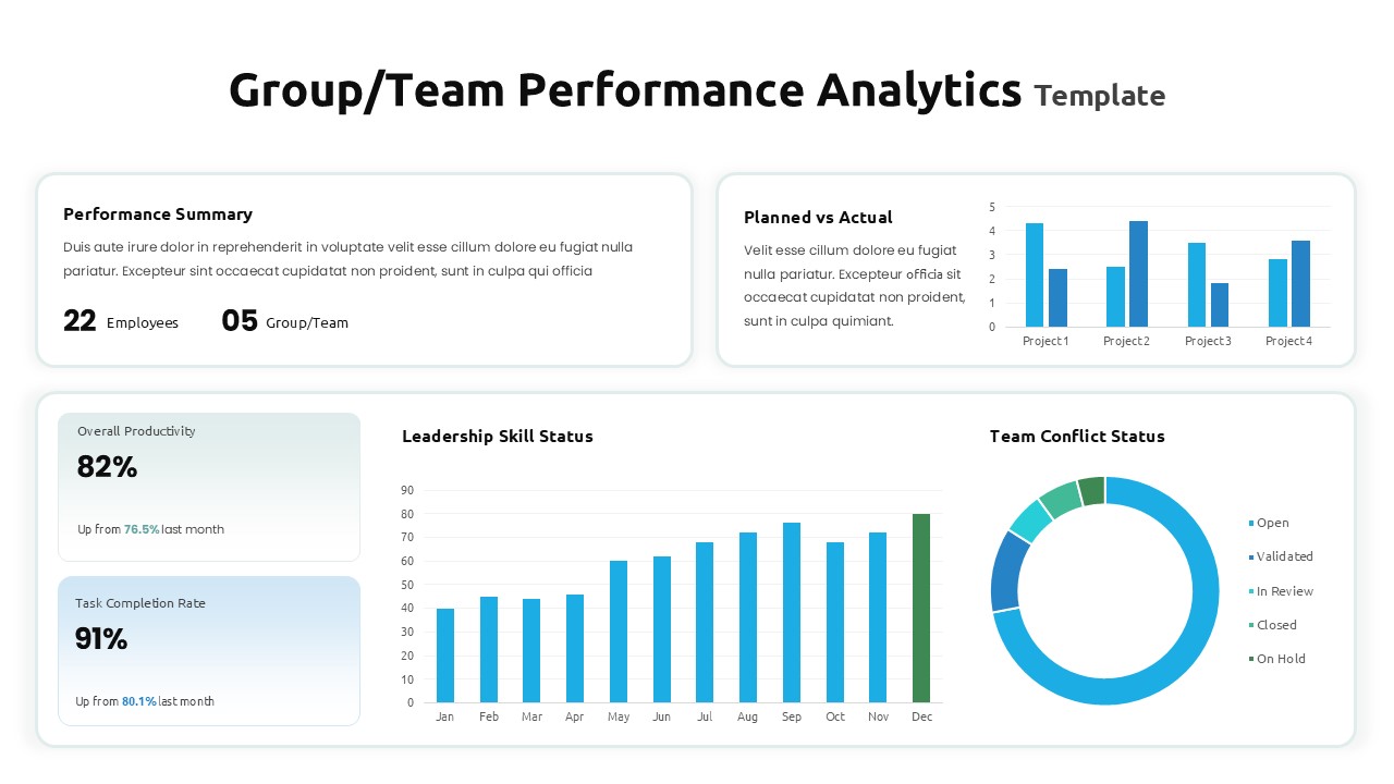
When you’re managing multiple teams and high-priority projects, data can quickly become overwhelming. This Group or Team Performance Analytics presentation template for PowerPoint and Google Slides is designed to cut through the noise. It consolidates your most critical KPIs into a single, executive-level view, so you can spend less time toggling between spreadsheets and more time driving results.
Why this dashboard works for real leaders:
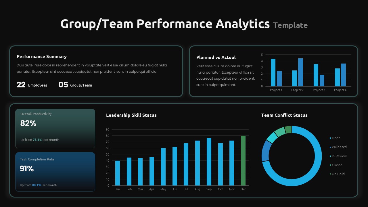
The “Big Picture” at a Glance: The 2×2 grid layout is intentionally designed to provide a 360-degree view. You can see your overall productivity metrics right next to your project-specific bar charts, ensuring you never miss a bottleneck.
Balanced Performance Tracking: We’ve included specific modules for “Planned vs. Actual” comparisons and “Leadership Skill Status.” This helps you move beyond just “output” and start looking at the health and growth of your team.
Clean, Professional Logic: Using a sophisticated blue and green palette, this template creates an immediate sense of organization. It’s high-contrast enough to stay sharp on a projector but subtle enough to keep your audience focused on the numbers.
Built for the way you present:
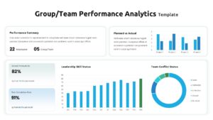
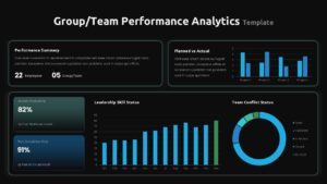
Dark & Light Mode Ready: Whether you’re presenting in a bright conference room or over a late-night Zoom call, the dual-theme options ensure your data is always perfectly legible.
Zero-Stress Customization: No need to be a designer. Every chart, card, and text box is a native vector shape. You can update percentages, swap colors to match your brand, and resize elements without losing a single pixel of quality.
Optimized for Modern Screens: Native 16:9 widescreen support means your dashboard looks crisp and professional on any HD display.
Who should use this Group or Team Performance Analytics Template?
This isn’t just a generic report; it’s a strategic tool for HR Managers, Department Heads, and Project Leads. If you need to walk into your next quarterly review or stakeholder meeting with a clear, authoritative story about how your team is performing, this dashboard provides the framework to do it.
What makes this “Human”?
Direct Problem Solving: It acknowledges the “noise” and “stress” of managing data.
Conversational Professionalism: It uses phrases like “cut through the noise” and “spending less time toggling” instead of “facilitates comprehensive data interpretation.”
Benefit-First Logic: It explains why a feature matters (e.g., “see the big picture and granular details simultaneously”) rather than just listing it.
Actionable Language: It uses verbs like anchor, track, and drive to show the user how the template helps them win.
Login to download this file


